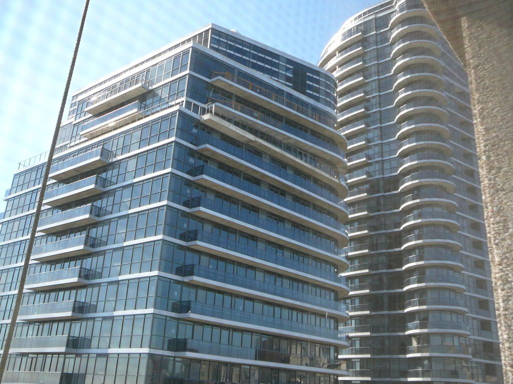
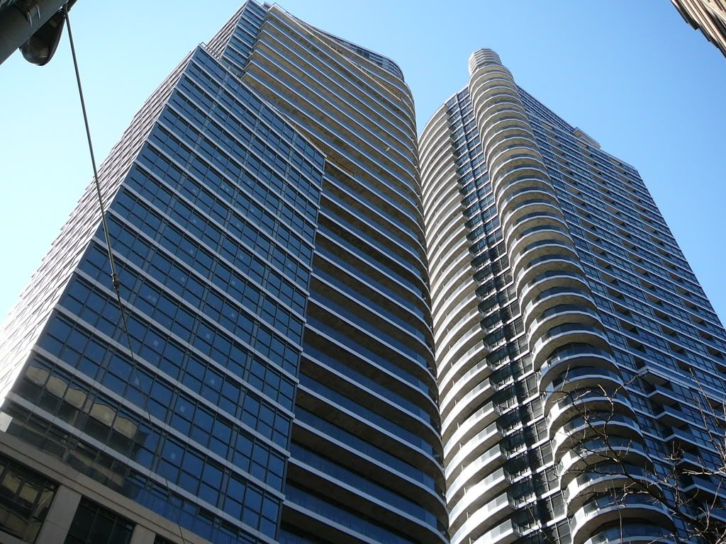
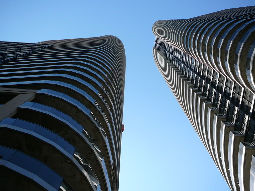
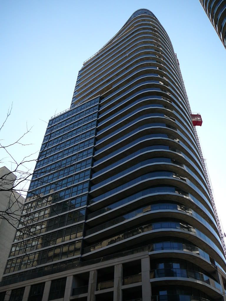
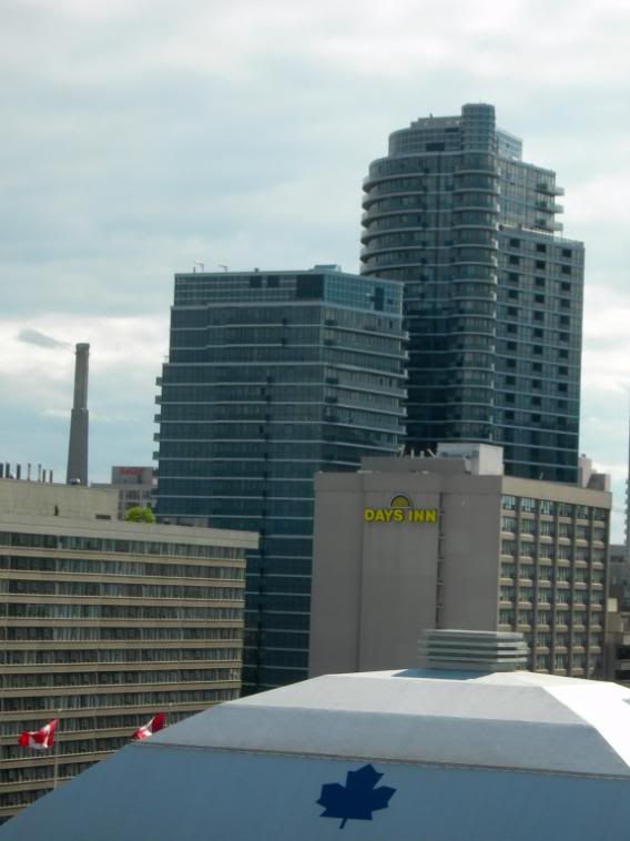
alklay appears to think that it has been claimed that 'a curve carries less weight, importance, artistry or creative imagination than any other line or shape or flourish'. Who has claimed that? The powerful appeal of a few curved buildings, in a city full of box-shaped buildings, is clearly reflected in the response to them - on this thread and others. As I've said, I adore curves. They are morally neutral. The question is, as always, with issues of originality and quality.
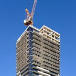
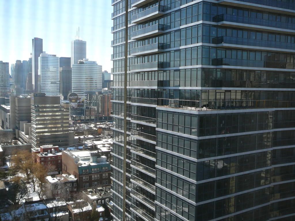
If the topic of this thread is the twin peaks of the Met, then the source of their bodacious appeal is a legitimate subject for discussion. One doesn't need to preach a tangential potted history of Modernism to stick to the subject at hand - the Met.
Quality is what counts. Gehry's vast, curved glass front to the new AGO billows like a huge sail, has ribs of wood like a ship's hull, and reflects the content of that part of the building - Ken Thomson's ship models that will be housed just inside - and is a work of art in itself. Though curves in the Met are also an easy sell, they don't automatically garner such critical acclaim or reflect much design significance however.
Deconstructing the design language used in buildings, understanding why some of those buildings work and some don't, and seeking visual literacy is no different from questioning anything else we're spoonfed in life.
