News   Nov 07, 2024
 348     0 
News   Nov 07, 2024
 370     1 
News   Nov 06, 2024
 1.5K     1 

The Met + Encore at The Met (Edilcan, 43 + 33s, P+S) COMPLETE

It'll survive. Cheap all-you-can-eat never dies when it's surrounded by students and tourists.

Plus frugal, late-night locals like my friends & I looking for a cheap, late night coronary blocker along with the "floor show" which often begins on weekends at around 2am :)
 
Most of the retail in the complex is still empty :(

All there is now is a TD.

UPS is opening an outlet in a portion of the Encore space. Odd location for it in my view: that section of Carlton is almost exclusively condo/hotel, except for the Hydro building.
 
I was standing at Yonge/College today, looking east down Carlton (just where it bends a bit so that you can't see past the Met). That small part of Carlton is so nice to look at and Met/Encore were looking beautiful. I don't think I would have noticed this before coming to this forum!
 
I've tried several times to photograph the interplay between these two buildings with nothing great resulting. Last week I was taking some friends from Calgary to have lunch at the Peach Garden restaurant on Carlton and just sort of randomly pointed my camera upwards at the towers and was pleasantly surprised...


3674899485_5ee7dc5095_o.jpg
 
fantastic shot. I'm having a difficult time figuring out which building is in front. If you were aiming for the interplay, you nailed it.
 
As I've stated before, that's my pet peeve too. Several great buildings in my nabe are like this - 22 Wellesley, The Met/Encore and Radio City suffer from this. The sealer doesn't have to be white, Radio City and 22 for example would have looked so much better had they have matched the sealer with the colour of the concrete to eliminate that unfinished, messy look. Just my preference I suppose, I'm sure it wasn't a cost cutting measure but most likely a design decision.
 
Actually, from that picture I think the unpainted looks provides an interesting contrast to the glass. It gives a sense of materiality rather then just a solid colour. Most of the time I'd say unpainted balconies look bad, but in this case it seems to work. That just me though :rolleyes:
 
I noticed this week that there is a Cora's going in to the old Harveys location next door to the MET...that will give Fran's a bit of weekend breakfast competition!

EDIT: I just noticed that there has already been an extensive dicsussion of this - my bad!
 
Last edited:
I'd take the Met off that list. Experience it in person and I'm sure you'll agree.

So what's your take on The Met and/or Encore condovo?
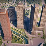
 
So what's your take on The Met and/or Encore condovo?
I find the materials really pedestrian, especially the ugly precast at the base, the retail level seems squished--should've taken up at least 2 stories--and all that dark glass really sucks the life out of that stretch of Carleton. Feels like a cash-out by the developer to me. You know--give the least, take the most. I don't mind the townhouses at the back, however.
 
I'm with you on the town homes. Check them out at night, I really love the lighting on the Granby Street side. The walkway to the towns from the drop-off area is a real treat with the art component through there (go back a page or two for photos).
I think the retail works fine if only they could get some exciting tenants in there other than another damn bank. The cladding on the first few floors is pretty good, nothing too out of the ordinary. I love dark glass separated by the white cladding and the curves are oh-so-sexy, I think it's refreshing from so many of the green glass boxes we've seen so much of. The balconies could have been treated/painted underneath, but that's a "me" thing. I'm not a height freak but Encore should have been higher. I get how they wanted Encore to step down as it moves away from Yonge Street but Encore looks a little stubby and awkward depending on where it's viewed from, The Met is slick and stands proud. Finally I like the drive around/drop off area in between the buildings, it's attractive and practical.
I'm a big fan of this project despite a few criticisms.
 

Back
Top