condovo
Senior Member
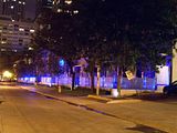
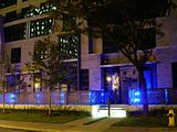
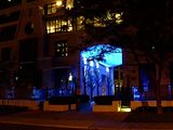
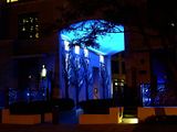
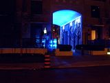
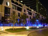
I absolutely agree that the balcony undersides should have been painted. It would have made a world of difference in lightening the buildings' bulk and could have been a design motif in itself, i.e. white/off-white balcony undersides against black glass. Hopefully, this is something that residents will do down the road.I'm with you on the town homes. Check them out at night, I really love the lighting on the Granby Street side. The walkway to the towns from the drop-off area is a real treat with the art component through there (go back a page or two for photos).
I think the retail works fine if only they could get some exciting tenants in there other than another damn bank. The cladding on the first few floors is pretty good, nothing too out of the ordinary. I love dark glass separated by the white cladding and the curves are oh-so-sexy, I think it's refreshing from so many of the green glass boxes we've seen so much of. The balconies could have been treated/painted underneath, but that's a "me" thing. I'm not a height freak but Encore should have been higher. I get how they wanted Encore to step down as it moves away from Yonge Street but Encore looks a little stubby and awkward depending on where it's viewed from, The Met is slick and stands proud. Finally I like the drive around/drop off area in between the buildings, it's attractive and practical.
I'm a big fan of this project despite a few criticisms.
Also, I agree that Encore and the Met should have been taller. The Met, especially, looks as though it was designed to be taller but had a few storeys lobbed off at the top as a 'compromise.' The proportions there seem awkward to me.
As for the retail/commercial component of the project, ideally the precast should have marked off this area, i.e. five or six storeys. A setback would have been a nice gesture to Carleton too. At the very least, the ground floor should have been double-storeyed.
As for the art component in the porte-cochère, I think it's fun lit up at night but loses its entire effect and looks cheap during the day. The wind meter at the top of the Met is awesome, however.
Finally, the townhouses look pretty good, again more so at night bathed in the otherworldly blue light coming through the railings, but some serious ivy growth is needed to mask all those ugly concrete retaining walls. More landscaping in general would do wonders here.
All told, the Met falls well short of greatness IMO. In the hands of a better developer and architect it could have soared but as built it's a missed opportunity. B-
Last edited:


