Although these town homes have not been well handled - what's with those brick mitres, or the round windows? - I don't think it's
nearly as awful as 'Windermere By The Lake'. That assemblage is so eye-poppingly bad as to practically need a new architectural term to describe it. These are just rather awkward and straining for an unwanted populism. They're oddly 80's looking in a peculiar po-mo sort of way. Besides, when I hear the term 'Windermere', all I can think of is the swampy chemical smell that used to (?) come off Windermere Basin as we drove over the Skyway in Hamilton.

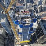
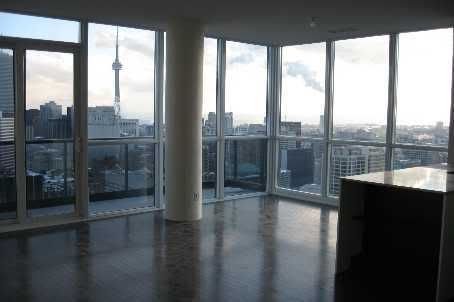
The towers themselves I like, enough. The second one would have benefitted from a bit more height, IMO.
They've got that Norman Bel Geddes/World Of Tomorrow sleek-glassine thing going on that's practically hardwired into our ideas of modernity. Not revolutionary since the 1920's, maybe, but smart and not impractical. No less contempory nor modernistic than the usual right angled stacks.
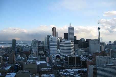
Faults? The bases have a bit too much contrast to be pleasingly integrated with the towers above them, the tops seem like a bit of an afterthought, and they seem a wee bit timid on the skyline. However, I think these buildings more than make up for these slight faults in providing an excellent, full and dynamic streetwall in what was formerly an awkward blank spot. They bring a lot more to the street in this area than their moderate size would be expected to contribute. The area that was visually irregular and merely OK became fast-integrated and visually impressive when these went up. They also bounce the light from summer sunsets down Carlton, which is lovely.
It's too bad the townhomes didn't follow the more sophisticated populism of their bigger counterparts, and cut out the nonsense. At least, however, we're not forced to see them. They're back behind, and out of the way.


