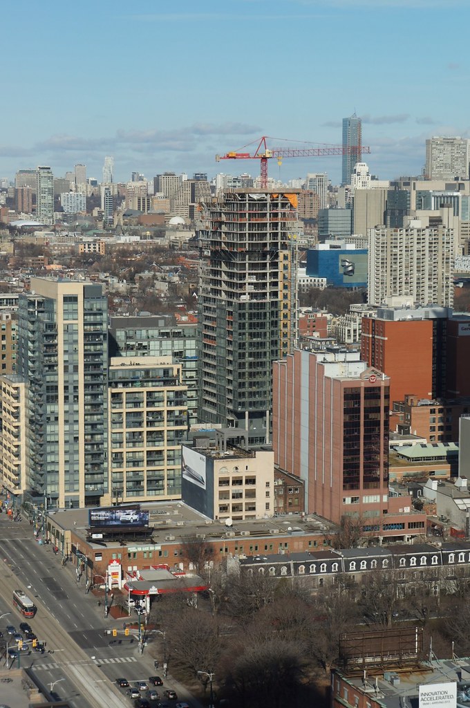
Toronto Charlie Condos | 122.83m | 36s | Great Gulf | Diamond Schmitt

3 December 2011: It's conservative to be sure, but it's also a ____:

167okk.jpg

Winner?
 
Pic taken Jan 16, 2012


KLWm5.jpg
 
As I walk around downtown west, I find myself doing double takes at Charlie repeatedly - and being surprised over and over in a good way. Perhaps it has something to do with the committed, pure modernism - rendered with a light touch. It just seems sharp to me - kind of Audi-like. In contrast, M5V washes out and the Lightbox seems crudely clunky. This handsome slab is not monolithic, in terms of both shape and colour. The grey has depth because the brick is graphite/anthracite in tone, while the upper glazing picks up sky blue (ok, perhaps only on clear days) and reads as slate.
 
Last edited:
I dont usually go for glass boxes but I would echo many of the positive comments above. This looks attractive. When looking at the pictures posted higher up showing Charlie next to The Hudson, it is the way the new glass building plays against the mixed materials of the existing building that makes such a great impact. If The Hudson had been all glass there would be no such interplay and the overall effect would be lost. This is the scenario that I would like to see repeated more often rather than cramming endless all glass buildings next to each other (see Southcore area).
 
When looking at the pictures posted higher up showing Charlie next to The Hudson, it is the way the new glass building plays against the mixed materials of the existing building that makes such a great impact.

Yes, The Hudson and Charlie are good neighbours to each other.
 

Back
Top