3Dementia
Senior Member
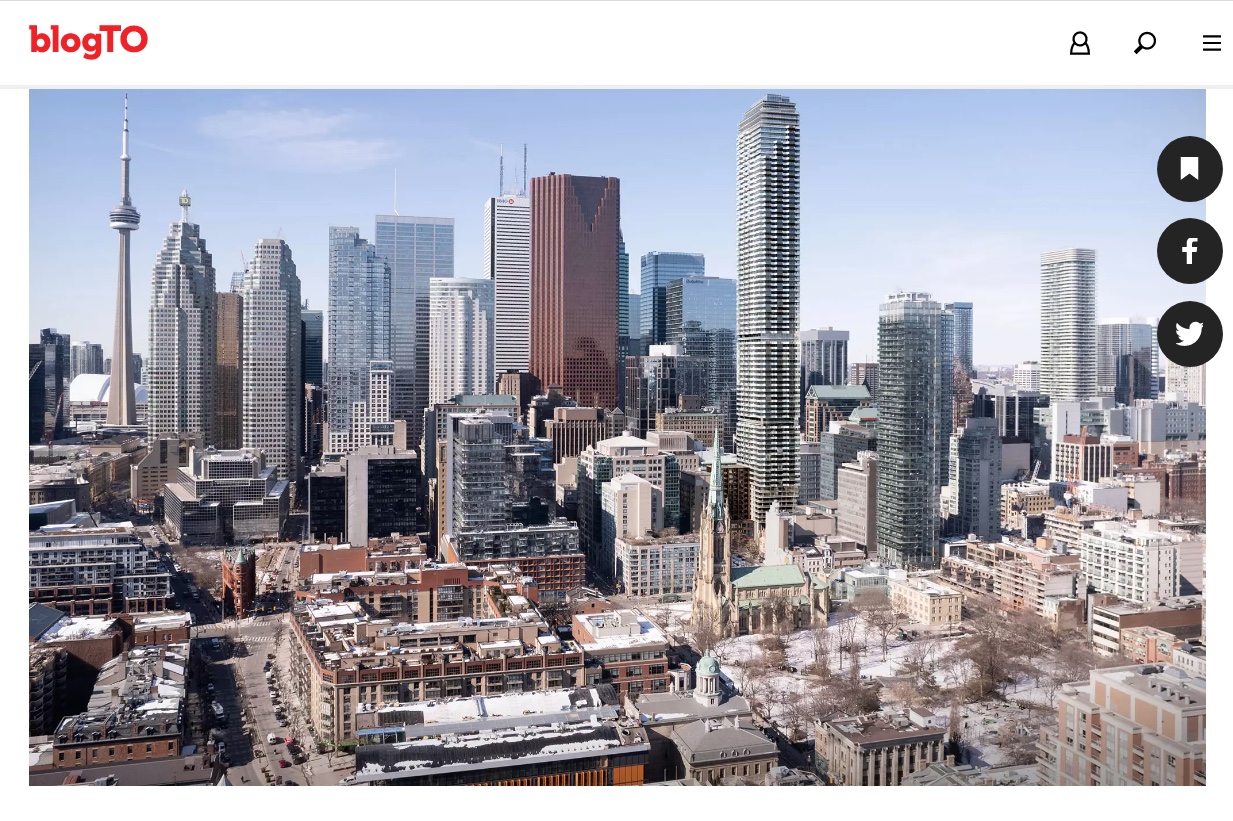
Screenshot from the article looking west.
https://www.blogto.com/real-estate-toronto/2023/04/23-toronto-street/

https://www.blogto.com/real-estate-toronto/2023/04/23-toronto-street/
|
|
| |||||||||||||||||||||
| |||||||||||||||||||||||
Screenshot from the article looking west.
https://www.blogto.com/real-estate-toronto/2023/04/23-toronto-street/
View attachment 471852
We'll actually be lucky if it's anywhere near as high quality as the rendering.I hate it as is. So unimaginative, uninterestingly chaotic & boringly dull grey- blue? Do over please.
I hate it even more after looking at it again at another site. It completely ruins the classic style & attractiveness of the heritage building. it’s astonishing how so out of place it looks. And someone on here mentioned that it’s an “interesting looking“ building up close. Well maybe if it wasn’t all bland grey(will beat that drum forever) across the whole of the exterior. Maybe some copper or bronze, other material used, added to make it look interesting would help. Same thing happening with 19 Bloor West, the brazen mediocrity with these “tall buildings” in the middle of prime downtown core is just dreadful. Quite Embarrassing for a big wealthy international city, the country’s biggest city,We'll actually be lucky if it's anywhere near as high quality as the rendering.
I would of course, prefer a RAMSA or Wengle design but what are the chances of us getting that. At least it dosent have an ugly cantilever with monster columns or jenga like YC condos. It could be much worse.I hate it even more after looking at it again at another site. It completely ruins the classic style & attractiveness of the heritage building. it’s astonishing how so out of place it looks. And someone on here mentioned that it’s an “interesting looking“ building up close. Well maybe if it wasn’t all bland grey(will beat that drum forever) across the whole of the exterior. Maybe some copper or bronze, other material used, added to make it look interesting would help. Same thing happening with 19 Bloor West, the brazen mediocrity with these “tall buildings” in the middle of prime downtown core is just dreadful. Quite Embarrassing for a big wealthy international city, the country’s biggest city,
in a G7 country. I also follow a lot of Chicago, Sydney & London architecture accounts & see the best of. Maybe it’s just me,
but Core Buildings that people are stuck looking at for 50 yrs + should be somewhat vibrant, innovative
& attractive.
Design Review Panel should be on top of this. Redesigns.
No offense, “But could be much worse” is the motto for Toronto architectural design the last 50 + years. DRP has helped that tbh.I would of course, prefer a RAMSA or Wengle design but what are the chances of us getting that. At least it dosent have an ugly cantilever with monster columns or jenga like YC condos. It could be much worse.


