News   Dec 20, 2024
 1.1K     5 
News   Dec 20, 2024
 844     2 
News   Dec 20, 2024
 1.7K     0 

TTC: Dufferin Station Modernization (TTC, U/C)

Of all the TTC stations that need fixing up Dufferin ranks near the top in my books. The colour scheme with the tiles used has not aged well in the slightest. The entrance fitted into the medical building, and the cold and utilitarian station exterior come off as depressing and uninviting in appearance.

When it comes to the 60s B-D line, to single out any individual station's colour scheme for "not aging well" misunderstands the line's entire design scheme. It'd be like deleting a track from Sgt Pepper or Abbey Road because it "hasn't aged well".

Just that if you're going to advocate renovating Dufferin, that, in particular, is a weak argument.

I understand that the station represents a different time, and that the colour scheme is symmetrical on the B-D line, however...

brick.jpg


..."retro" does not necessarily mean "classic"
 
..."retro" does not necessarily mean "classic"

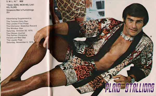
Ah, but if that's how you feel, don't single out Dufferin; condemn the whole 60s Bloor-Danforth because it's the nature of the beast. To single out any single station on colour-scheme (as opposed to deeper functional) grounds is as maladroit as the fashion image you posted. By comparison, he's Hugo Boss. (And he'd probably kick your butt so hard, you'd have to assume vomit position in order to defecate.)
 
Ah, but if that's how you feel, don't single out Dufferin; condemn the whole 60s Bloor-Danforth because it's the nature of the beast. To single out any single station on colour-scheme (as opposed to deeper functional) grounds is as maladroit as the fashion image you posted. By comparison, he's Hugo Boss. (And he'd probably kick your butt so hard, you'd have to assume vomit position in order to defecate.)

Believe me, the entire line stands as the first of MANY follies for the TTC. But there is something quite 'ghetto' about Dufferin which brings it down compared to other stops on the line.

2040793516_13c63c0ae2.jpg


106169335_0583cba582.jpg


2306989892_346d15524c.jpg


1752533213_3ffa4a4d41.jpg


77325773_cd6fa672c4.jpg

Craig White

77325658_d782a90b90.jpg

Craig White
 
Last edited by a moderator:
Except perhaps for the dungeon-of-doomness of the first image (complete w/touches of litter), I don't see anything particularly "ghetto" there--looks quite neat, actually, like it's withstood 4 1/2 decades pretty well, aesthetically even (*love* that telephone booth). Maybe you're projecting too much of your imagination (or the station's usership, esp. compounded by the heavy Dufferin Mall traffic) into the "ghetto" judgment. But on the whole, what you're presenting actually vindicates the pro-Bloor-Danforth aesthetic arguments of Joe Clark, Matt Blackett, et al. Not that you know who either of those individuals are, of course...
 
I don't see what Electrify was getting at in using the word "ghetto" beyond the grungy stairwell first photo. The rest of the photos show a standard Bloor-Danforth line station: inoffensive and unimaginative. Stations like Dufferin look ripe for enhancement but not destruction.
 
Last edited:
I don't see what Electrify was getting at in using the word "ghetto" beyond the grungy stairwell first photo. The rest of the photos show a standard Bloor-Danforth line station: inoffensive and unimaginative but inoffensive. Stations like Dufferin look ripe for enhancement but not destruction.

100% agree. There's nothing 'ghetto' about it, and it's certainly not garish or visually offensive...but it's ugly. Fugly even. I use the Lansdowne-Yonge section 10-15x per week, and this is easily the fugliest stop on that stretch. Maybe it's just a change in aesthetic sensibility though. There are a few stations that use that same look, so it must have looked good to someone, at some time. York Mills and Lawrence are basically the same, except one rocks the Dufferin-style colour scheme, and the other a tan/cream and glossy red....and to me at least, one looks like hell, while the other looks pretty sweet. Maybe 40 years from now the opposite opinion will be the norm.

But that said...who really cares. Dufferin has actual functional issues to be dealt with. Some aesthetic upgrades would be nice, but I'd prefer the actual upgrades that are being done.
 
Ironically, the evident Flickr-photogenic quality of Dufferin is the best pro- aesthetic argument the existing station could have. (Thus my earlier "so, what's the matter here?" puzzlement.)
 
I went to Dufferin Mall for the first time in a while last week and there was no sign of construction at the station - kind of disappointing. Usually the contractor at leasts puts their name up somewhere I thought.
 
The TTC only decided to award the contract in June - http://www3.ttc.ca/About_the_TTC/Co.../June_2_2010/Reports/_Dufferin_Station_Mo.pdf

There's an e-mail address and phone numbers on the project website - http://www3.ttc.ca/Service_Advisories/Construction/Dufferin_Station_Modernization.jsp you could ask them about the timetable.

I'd expect them to mobilize sometime in the next couple of months; though judging by Pape, it was months after they mobilized, before they actually started doing any construction of anything beyond the miles of hoarding.
 
Some fences have appeared on the east entrance at Dufferin Station with a posters on it, maybe work is actually starting.
 
And the bus stop has moved to the South side of the street on the east side, just got off of it. And it's not one of those temporary stops either.
 

Back
Top