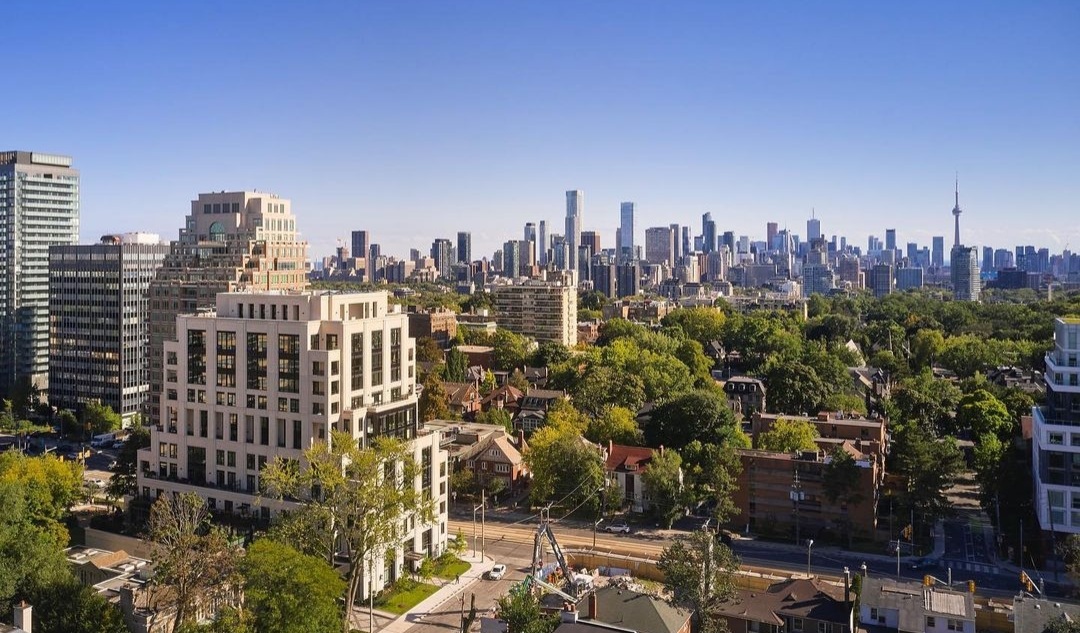
Toronto One Forest Hill | 38.6m | 12s | North Drive | Richard Wengle

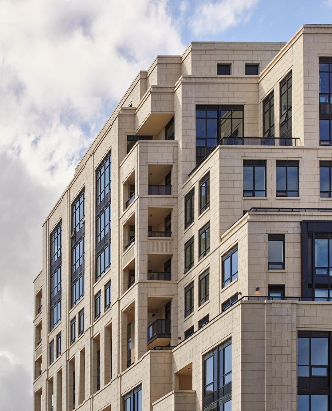
There's no doubt about the quality of the limestone. I think even some of the bigger faux skeptics on here would welcome this building if clad entirely so. It's the juxtaposition against sloppy detailing and cut corners that make this overall a miss.

Just look at that clunky, mullion-heavy, mismatched-spandrel window wall. It's like taking a wood oven Neapolitan pizza and throwing a Kraft single on top. Sure, the quality base is still there, but the whole becomes less than the sum of its parts. And I won't be surprised that the consistently ho hum slice from Pizza Pizza next door draws less criticism.
 
That's fair. But was there another way the spandrels or mullions could have been executed? In a window wall system how could it be done any better? What's an example of a building
 
That's fair. But was there another way the spandrels or mullions could have been executed? In a window wall system how could it be done any better? What's an example of a building

I'd turn your question around a bit: is the window wall system actually necessary? Some 80% of the building features precast panelling with punched windows. IMO it'd look a lot better if that were 100%.

But to answer your question, the best recent example of this style in TO has to be 1 St Thomas. Notice in particular the detailed metal panelling used as spandrel all the way up the bay windows. Really beautifully done, though obviously not cheap.

Not everyone loves these, but I also think the string of new Mizrahi builds along Davenport are better examples of this style done right. Again, no expanses of window wall (if we can just pretend not to see those top few storeys) and, where present, back-painted glass spandrel panneling is minimal and tasteful.

Really good contributions @soufflot

PS. Kraft Singles on anything is a good way to ruin it!
 
I think the proportions on the window walls on the "ends" are more successful than those facing St Clair.
The floor to ceiling spandrel panels are awkward, and on the upper levels, the proportions of the mullions give too much of a "warehouse loft" feel.

 
Last edited:
Today

F4A7EEAD-042B-4E07-8CAA-17956EE5C974.jpeg
 
From North Drive's IG:


Screenshot_20211003-080503_Instagram.jpg
Screenshot_20211003-080553_Instagram.jpg
 

Back
Top