Toronto Eaton Centre (Ongoing Renewal) | ?m | ?s | Cadillac Fairview | Zeidler

Get rid of the Yonge side parking and then maybe it can be more. I'm surprised it hasn't been done already if only to maximize CF's profits by allowing the creation of more retail space.
Apparently the retail lessees at the Eaton Centre have guarantees in their leases that X number of parking spaces will be maintained. That apparently was what scuppered the tower that was proposed by CF Residential at the southeast corner: they hadn't checked with CF Commercial that they couldn't touch any of the parking when proposing the tower…

…so that parking's going nowhere.

42
 
You like the Yonge frontage? In any of its iterations?

I'm ok w/disagreement; I've just never heard anyone say they liked it before.

LOL

****
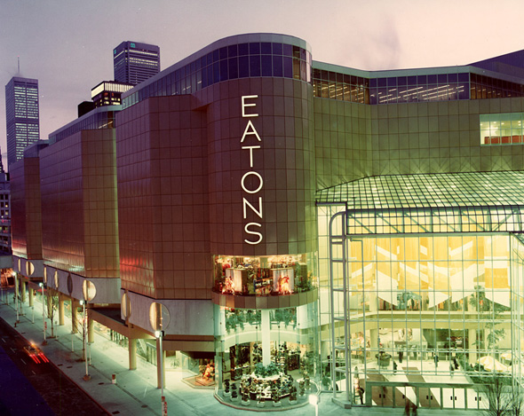
I'd at least say the original Yonge frontage had a design consistency with the interior and was interesting, if not particularly functional.

What was tacked on a generation later is a bit of a bad theme park version of a Main Street where most retailers keep their doors locked anyway. And doesn't match the design of the building whatsoever.

Not functional, and not attractive either. Just less bad in some respects than what replaced it.

1613075398041.png


From the archives via BlogTO: https://www.blogto.com/upload/2014/09/20140917-Eaton-Centre-Tower.jpg
 
Not functional, and not attractive either. Just less bad in some respects than what replaced it.

View attachment 299600

From the archives via BlogTO: https://www.blogto.com/upload/2014/09/20140917-Eaton-Centre-Tower.jpg

That Yonge frontage looked quite fine - certainly coherent with the design theme of the complex. What was tacked on later is neither original, contextual or even well-executed - and it was done at the expense of the public realm - you can thank those narrow sidewalks for it. You have to ask youself who ultimately ended up being the winner here (especially wrt the original goals of the"revitalization" project).

AoD
 
Last edited:
That Yonge frontage looked quite fine - certainly coherent with the design theme of the complex. What was tacked on later is neither original, contextual or even well-executed - and it was done at the expense of the public realm/

AoD

We agree on the latter.

On the former, I remember walking by Eaton Centre many times as a youth....a few decades back.

And.....it was dead.

The white panels and railings were rusty, there was almost no outward facing retail and none that was desirable or successful.

Yonge street was left feeling neglected and unkempt on both sides of the street there.

It's true, without question, that the original better bore the hallmarks of its time and of Zeidler.

But it wasn't pretty, nor successful.

I'm not laying that on him mind you; he had a client.........
 
All of these comments kind of cement why I think The Well will overtake the Eaton Centre in popularity, at least for visitors to the city. With Apple opening a flagship at Yonge/Bloor and The Well having that open air environment that shoppers will be looking for due to the pandemic + nicer architecture and public spaces, I think CF will have to really step up their game to keep shoppers and visitors coming to the Eaton Centre. Literally the only reason I've had to go to Eaton Centre in the past two years was to go to Apple, and I'm sure I'm not alone.

Mind you all of this relies on The Well attracting some solid retail tenants but I have no doubt there will be a good selection of shops there within a few years of opening.

I don't think the Well will "overtake" Eaton Centre simply because of the location - but you are definitely right about the need for EC to up their offerings. Other than Indigo and maybe Apple, I can't think of any reason why I would want to suffer that mall.

AoD
 
Despite the lack of reason for people here to go there, Pre-Covid, the place was always busy throughout the day.

The Well on the other hand will need to do something to make up for its location.
 
We agree on the latter.

On the former, I remember walking by Eaton Centre many times as a youth....a few decades back.

And.....it was dead.

The white panels and railings were rusty, there was almost no outward facing retail and none that was desirable or successful.

Yonge street was left feeling neglected and unkempt on both sides of the street there.

It's true, without question, that the original better bore the hallmarks of its time and of Zeidler.

But it wasn't pretty, nor successful.

I'm not laying that on him mind you; he had a client.........

I'm with you on this one. The Eaton Centre was always about the interior. The original exterior was treated as an afterthought at best, and that's exactly the impression it gave. From a pedestrian perspective, it was a miserable slog to get past for the reasons you listed. I don't miss it one bit.
 
You like the Yonge frontage? In any of its iterations?

I'm ok w/disagreement; I've just never heard anyone say they liked it before.

LOL

****

For clarification on the Dundas side, I think the original glass entry was nice; if the mustard-coloured Eatons was regrettable in its exterior choices.

But the frontage along Dundas has never really worked for me.

It was originally a single restaurant, the entry to the original cineplex of tiny boxes; a parkade and a moribund park space.

Its current incarnation essentially hid the parkade w/the Ryerson business building, with Canadian Tire and Best Buy in it; and the resto was replaced by Joey's.

I can't say that makes it appealing.
I see what you mean now...as I have been more focused on it's interior as opposed to exterior along Yonge, because that was so forgettable.

So not entirely in disagreement now...and what Mr. Paris said. >.<
 
The Eaton Centre's advantages have always been its centrality being along Yonge Street in the core of downtown, and its public transit access points of having 2 subway stations, along with connection on Dundas and Queen streetcar lines. There's also the student crowd base being beside Ryerson and relatively close to U of T, as well as being a draw for high schoolers. Additionally, there's the connection with the PATH system enabled through the Bay, plus workers in other nearby buildings in the vicinity.

Assuming some gradual return to general consumerism patterns long-term as urban life and society stabilizes post-pandemic, I believe the Eaton Centre will stick to its strengths, but the Well should find its base as well. The critical mass achieved through the residential component of the Well along with other high profile projects like KING should sustain a healthy local clientele. Combined with the employment base in the tower above, along with the Portland Commons project and what's already existent in that area.
 
Last edited:
...I deleted what I initially wrote, because my energy levels dropped and my brain started to seize up, for all the thinking and writing...
Instead, I will show a picture, which I am sure many of you have seen - of the Eaton Centre, shown sometime between 1977 and 1980(?), where I feel everything worked (mostly) as a complete package. The streetscape, the interiors, the entrance at Dundas St., the wide sidewalks, the porosity of the storefronts opening onto Yonge St., the triple height glazed cylinder space, even the pale yellow metal panels (somehow) all complemented one another and worked to form a cohesive cruise ship. I miss this.

I can absolutely imagine the compelling allure 'The Well' will have on people in the city, both resident and tourist alike - I too am intrigued to know what it will be like, but...overall, even with all its faults and f-ed up additions and iterations, I still do enjoy walking through the Eaton Centre. Although, I lament the loss of the indoor trees immensely.

As with many things in Toronto sadly, it could be so much more and something we are all proud of.

2012210-eaton-centre.jpg

courtesy of BlogTO

Nevermind the (now compromised) glass atrium - the circular glassed in section at Eaton's alone has more personality, presence and interest that the current "blob".

1613141573189.png

(via Google Maps)

AoD
 
Nevermind the (now compromised) glass atrium - the circular glassed in section at Eaton's alone has more personality, presence and interest that the current "blob".

View attachment 299694
(via Google Maps)

AoD
Absolutely - so true. I am sure this has been mentioned before, but my realization some years ago, was how other than the main atrium really, the Eaton Centre has completely lost its identity. It struggles to be relevant in today's short-attention spanned minds, which in turn pushes CF to react to trends and ridiculousness. All of the elements in themselves, are for the most part okay, or even good (ie: the new connection bridge to HBC). But the building has been broken down into all these non-cohesive elements as it tries to be everything and nothing. Yes, you can provide space for brand identity, but again, do it in a cohesive manner. Think of Mies's TD towers/path - (another CF property), they maintained the simple, refined look that Mies provided for years, then under pressure from retailers changed their tune and allowed individual branding to bust out. Now this space is quickly becoming like everything else. I digress. Cohesiveness and uniformity are frowned upon today - standing out is requested and required. This is by no means a judgement on society, but rather toward our current versions of architecture - specifically in Toronto. I have more to add to this, but should probably get back to work...ugh!

p5
 

Back
Top