TheTigerMaster
Superstar
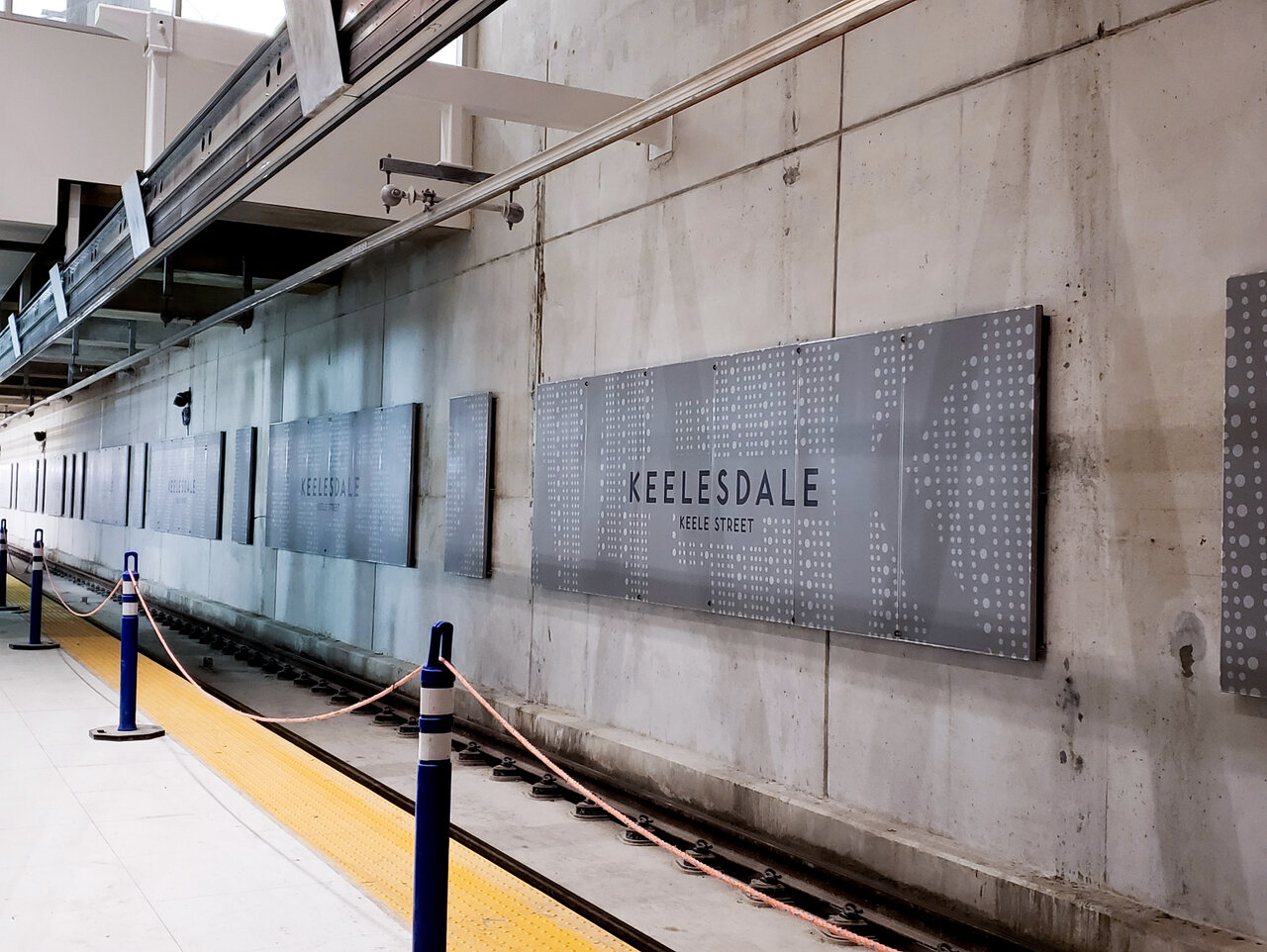
The design of the street-level buildings are nice, but the rest of the architectural design on the Crosstown is lazy. Especially at platform level, where we're getting the grey concrete treatment with the station name lazily tacked on, backed by some unimaginative artwork. This is only going to get worse as the concrete deteriorates and collects dust (and the concrete already looks like its in rough shape here).
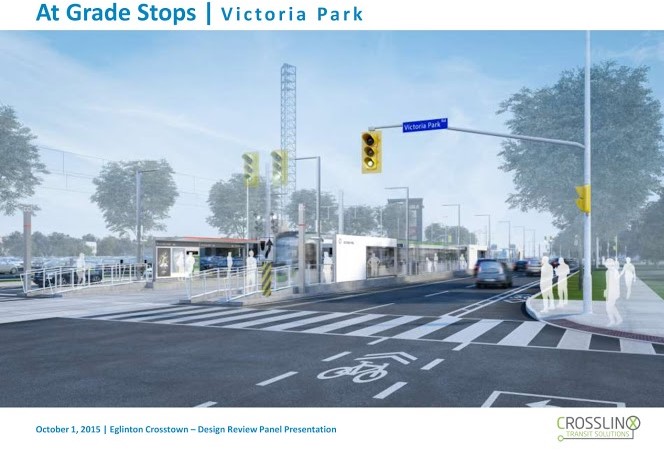
And the design of the street-level stops is disgraceful. There are no redeeming qualities about this design. We're leaving people out in the wind and cold here. Even the YRT shelters are superior to this.
This is typical Toronto ultra-utilitarian architecture. If you want to see actually impressive, yet functional, architecture, look towards London's Crossrail.
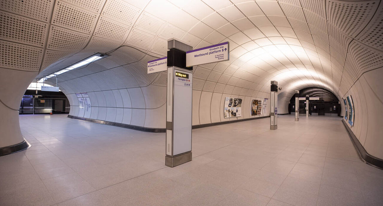
I hope MX does better with the Ontario Line, but initial renters indicate that they're sticking with their lazy, yet functional design style.
And the design of the street-level stops is disgraceful. There are no redeeming qualities about this design. We're leaving people out in the wind and cold here. Even the YRT shelters are superior to this.
This is typical Toronto ultra-utilitarian architecture. If you want to see actually impressive, yet functional, architecture, look towards London's Crossrail.
I hope MX does better with the Ontario Line, but initial renters indicate that they're sticking with their lazy, yet functional design style.


