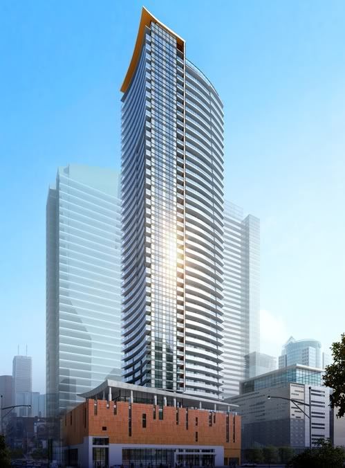
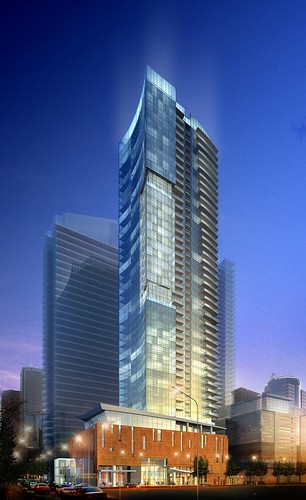
Most of of the elements remain in the design, albeit more marginally. For one, the diagonal 'cut' remains in the west balconies' profile, but now balconies extend across much more of the face: that does not strike me as The Cheapening™, since Daniels will actually have to build more balconies. One would assume that Daniels is responding to purchasers' desire more often than not to have a balcony. The notch in the north facade is still there too, but again, balconies now cover that face too, and it is less noticeable. I think those changes have cleaned up the design to a good degree, but it does beg the question as to why they still have those cut lines and notches, as they strike me as being barely noticeable now, and therefore with dubious bang for the buck now.
Overall, while I do not think those details add anything to the design, neither do they take anything away from it: there just isn't that strong a design statement here. I wish we still had the earlier concepts for this building to look at, which, while they were over the top, at least had a podium and tower that appeared as one, with curves predominating both. I don't hate this latest iteration, but neither does it add anything special to the city.
42

