News   Nov 18, 2024
 290     0 
News   Nov 18, 2024
 253     0 
News   Nov 18, 2024
 970     1 

The Tenor (10 Dundas St E, Ent Prop Trust, 10s, Baldwin & Franklin)

  • Thread starter billy corgan19982
  • Start date
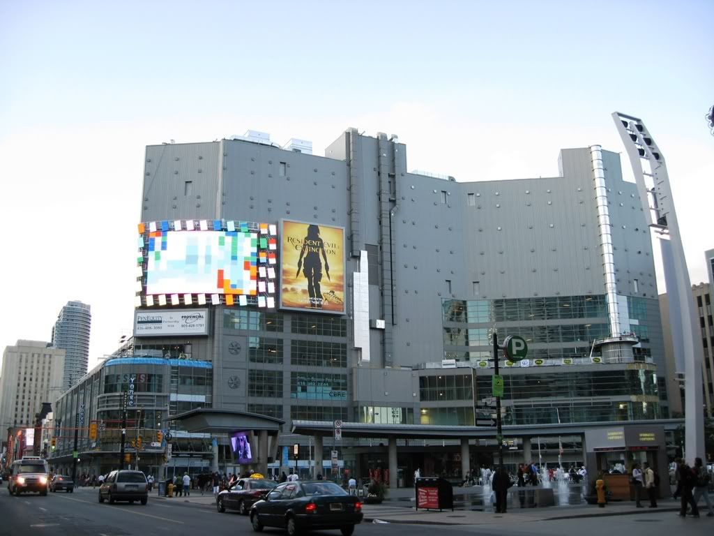
The photo is misleading.... the screen looks a hundred times better than this ... in daylight.... you don't need to wait until dark.


Off topic but... when the camera swings south... what a gorgeous friggin' building.


td.jpg
 

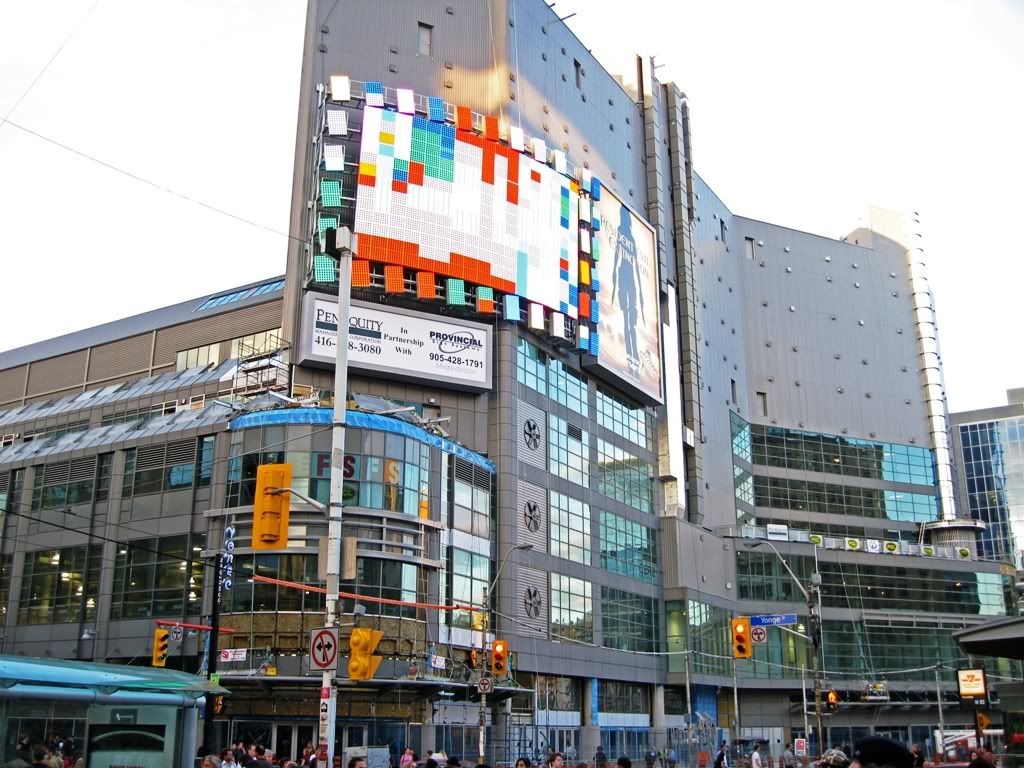
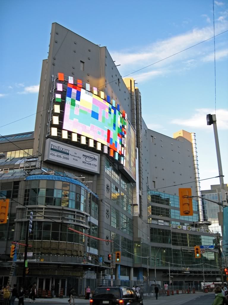
I love this screen - but they installed it incorrectly. The actual screen was obviously supposed to be installed further to the left, leaving more room on the right for the double-row of mini-screens to be properly spaced out. (rather than leaving an unsightly gap between the third and second (from the right) column of mini-screens.

I hope they fix this.

I can see what you're saying but I highly doubt that they installed it incorrectly. I think it has more to do with the angle the picture was taken from.
 
i have noticed increase maintenance workings in the general area, cleaning posts, replacing posts and such.


I think they are replacing all of the streetlights in that area as well.
 
That screen looks terrible. I hope they fix the spacing on the surrounding screens. Why on earth they would install 2 rows on the right really baffles me. It looks as if they screwed the spacing along the top and bottom and installed too many on the right when those extra ones should fill the gaps along the top and bottom.
 
I love this screen - but they installed it incorrectly. The actual screen was obviously supposed to be installed further to the left, leaving more room on the right for the double-row of mini-screens to be properly spaced out. (rather than leaving an unsightly gap between the third and second (from the right) column of mini-screens.

I hope they fix this.

Everything about this building is disproportionate, there is little to no attempt at symmetry. From the windows on one side that are different to the windows on the other side. Windows at some points don't line up. Billboards don't line up. The PenEquity sign could have been placed lower as to be centered and now the screen: why have two rows of mini screens on just one side? It makes no sense.

I wish PenEquity would have used the same architect and ad designers as the new Eaton Centre north entrance.
 
Re: new sign brackets being installed, they're likely both for FutureShop. I guess signs will be installed as stores open and FutureShop is probably the most antsy about moving into Toronto Life Sq. and out of their old decrepid building further up Yonge.
 

Back
Top