News   Dec 20, 2024
 1.6K     7 
News   Dec 20, 2024
 983     2 
News   Dec 20, 2024
 1.8K     0 

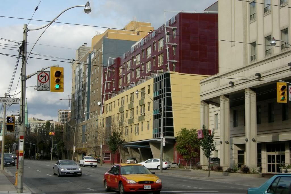
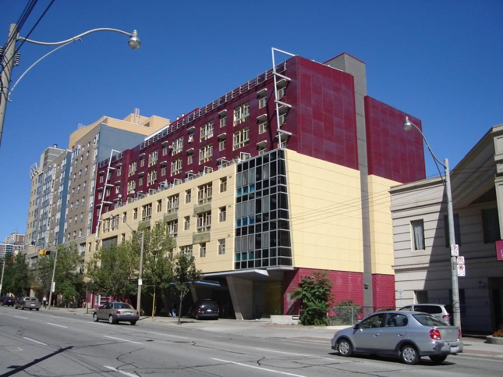
CampusCommon (50 Gerrard E, student rental @ Church St, 12s, Burgess)

Jane Jacobs did not call for uniformity. None of the complaints above are from anyone calling for uniformity.

42

No she didn;t but her work has been used that way here to fight change of a positive kind. And yes many of the objections above are about colour and the horrors of it sticking out and not conforming with the rest of the street. These are comments that are frequently made on this forum on many projects.
 
No she didn;t but her work has been used that way here to fight change of a positive kind. And yes many of the objections above are about colour and the horrors of it sticking out and not conforming with the rest of the street. These are comments that are frequently made on this forum on many projects.

I sure do not want to reread this whole thread but I do not think any of us have complained about the colour (maybe its one redeeming quality) and the fact that it apparently 'sticks out' (I for one, think this building is too uniform with the area because its just as hideous as its surrounding buildings).

The problem that some of us see, is the fact that its just cheap non-architecture and vomit inducing aesthetically (am I being too tough?).
 
Put it this way. If this were the realm of Curbed or Wired New York, something like 50 Gerrard would be slammed to blazes as spec schlock, 2007 style.

It only *seems* novel because it's new. But it's the kind of novelty straw that breaks the archi/urbanist camel's back...
 
This building is a good example of why we don't use colour much in this city: because when it has been used here normally, it is normally to cover up design deficiencies.

This building has been put up as cheaply as possible: if it came to light that no architects had been employed in its creation, I would not be surprised. The windows are cheap and nasty in terms of their construction and proportion, while the cladding was chosen for maximum coverage at minimum expense. The colour is meant to divert your attention from that fact. The bricks at ground level barely tie the building into the context of the historic structure this one surrounds, but thank goodness they are there as they are the only friendly gesture the building makes.

Interchange, I think you said it perfectly.

Although, I'm not a huge fan of the building pictured below either, I wonder if it may be a better example of what could have been done cheaply around the corner at Church and Gerrard. It certainly adds colour to this stretch of Jarvis but it doesn't make me feel as embarrassed and offended as 50 Gerrard does.

DSCN1295.jpg
 
here is a bit of a better angle of the same building.
DSC00062.jpg


i think this building is very successful. lots of differences between it and the student apartments. this co-op has a lot more detail in it. there was actually some architectural thought put into it. the different window types, the french balconies, the metal things that are on either side connecting the 2 building sections together, the glass corner, the entrance, and the colors compliment each other a lot more.

if a little more attention went into 50 gerrard, and not cheapening out on everything, it would've became a very nice building. but unfortuently they didn't, and now is just an eyesore imo. not to mention the horrific planning on the inside.
 
Im really with Smuncky here. I think the co-op looks much better than the student housing. At least with the co-op it doesn't overtly look like they went with the cheapest stuff.
 
That other one on Gerrard is lovely (why haven't we had a thread on it? Insufficiently pointy?). I could probably have done without the angular metal beams on the top part - looks like a po' man's Liebeskind - but the colour, cladding, and massing are elegant.
 
Sniffy, are you talking about the one that Casaguy and Smuncky posted the pics of? That's on Jarvis, and she's getting on in years. 15 maybe? Somebody? Anybody? Anyway, her age is why no thread, if that's the one you mean.

And yes Casaguy and Smuncky, back at you - I agree completely - that building is cheap done right - everything you both said - ditto.

42
 
50 Gerrard St

I don't disagree that 50 Gerrard is not great architecture but its use of bright colour is a real departure for Toronto. It's cheery. Scandinavians and Newfoundlanders have used bright colours on their buildings for a long time- its an antidote to a long, dark, dreary winter. Toronto has a dark, gray winter and could do with colour to spice it up. My point is that there isn't enough of it and that's partly because it sticks out and this is not a city that tolerates that kind of thing. There's a dour, Scottish functionalism that has dominated the aesthetic here for a very long time.

I'm really talking about something very different from what the rest of you seem to be getting all worked up about. Sometimes a building isn't great but there's an element that is novel, given the context, and worth celebrating.
 
If you like bright colours then praise 490 Sherbourne or even the freshly painted concrete of the Ramada Hotel but not this acrylic (or the cheaper fake) stucco abomination
 
Sniffy, are you talking about the one that Casaguy and Smuncky posted the pics of? That's on Jarvis, and she's getting on in years. 15 maybe? Somebody? Anybody? Anyway, her age is why no thread, if that's the one you mean.

Oh, for serious? 15 years? Wow. I'm constitutionally averse to Jarvis, so I have a bit of a blind spot in that regard.
 

Back
Top