News   Dec 20, 2024
 2.5K     8 
News   Dec 20, 2024
 1K     2 
News   Dec 20, 2024
 1.9K     0 

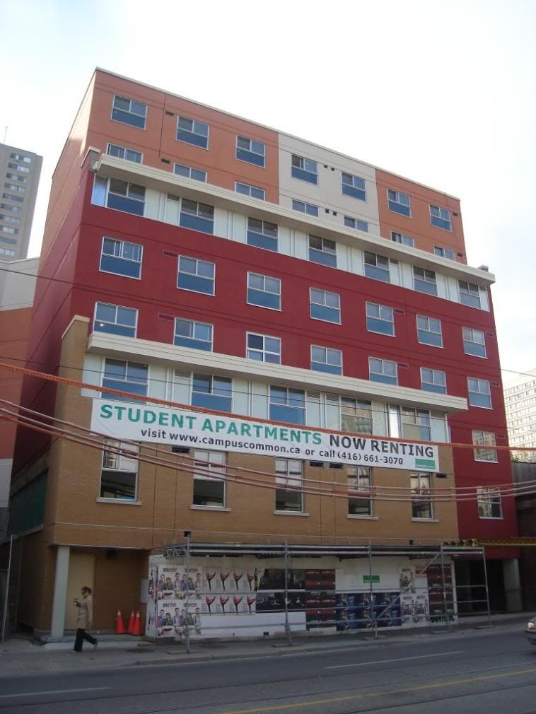
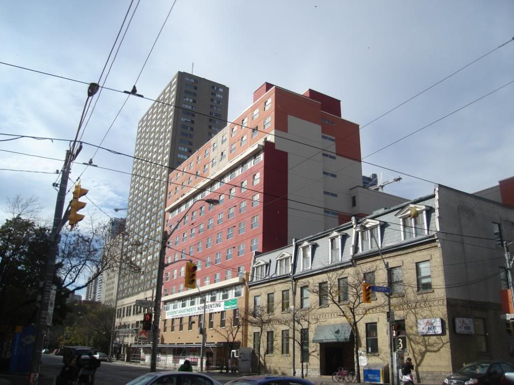
CampusCommon (50 Gerrard E, student rental @ Church St, 12s, Burgess)

The tag on the image on this page reads "The ideal building?" - http://www.campuscommon.ca/index.php/building/

I can just imagine three students loving this lifestyle. A second bathroom might be nice.

Triple_Standard_F.gif

So one poor kid has to have his room constantly invaded by the kid who lives in what appears to be his grossly oversized closet?

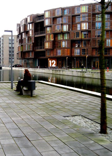
how the HELL did this ever happen; even though its an 'affordable housing' thing there are plenty around the world which completely transcend that title - didn't cost a lot to build and don't cost much to live in - but they look AMAZING...

take this example in Copenhagen...
url


396252305_38e6c3beb8.jpg


274449194_c334521268.jpg


....I just don't get it
 
I think if this building was all grey it would be dull, but at least it has colour to it which many buildings in t.o. are lacking, i love the colourful buildings/houses on the east coast of canada, looks inviting and interesting, i'd rather have this building go up then just another typical glass condo, this changes it up a little bit.
 
So one poor kid has to have his room constantly invaded by the kid who lives in what appears to be his grossly oversized closet?

how the HELL did this ever happen; even though its an 'affordable housing' thing there are plenty around the world which completely transcend that title - didn't cost a lot to build and don't cost much to live in - but they look AMAZING...

They're not affordable at all, that "standard triple" suite starts at $1700 a month, plus utilities.
 
They're not affordable at all, that "standard triple" suite starts at $1700 a month, plus utilities.

And this is my beef with this project: they are offering substandard housing at deluxe prices to out-of-towners who do not know the rental market. I can pretty much guarantee that this project will be producing a steady stream of hacked-off students (and their parents), once they realise that they are being ripped off (probably not long after they signed their leases).

Bill
 
I like the colour, its a nice element. The shape of it really comes across as if it was done in 3 or 4 stages of add-ons. It doesnt look too terrible in the picture directly above, on the diagonal from Church / Gerard. The lowest level that looks like it is tan brick just looks hideous though on both the entrances...
 
If only they gone with different colours and flipped the windows, it wouldn't have been as hard on the eyes. They tried to spice it up a little, but they didn't use the right spices.
 
One of my favourite new buildings in Toronto! Love the colour! Just wish they'd kept the same vibrant red on the top portion (that bland beige/orange is timid.) There's a reason many people don't like it: it doesn't fit in with the beige aesthetic that is Toronto--it looks more like something from Tirana or Spain than conservative little Toronto.

Sure it's a ripoff to live there; but more bright colours is what I'm seeking to brighten up the streetscape!

Now here's where I compare two new buildings (based on exterior) and give you a demonstration of my value system: 50 Gerrard East=7/10 (would be higher if red was the sole colour) vs. Element (@Blue Jays Way and Front)=0/10.
 
People are too hard on this building. It's not bad at all. The colour really brightens up the area. I like it.
 

Back
Top