News   Jul 17, 2024
 429     0 
News   Jul 17, 2024
 939     0 
News   Jul 16, 2024
 1.1K     2 

Bay Adelaide Centre West Tower (Brookfield, 50s, WZMH)

Version One is best. Sure it reflects the late eighties obsession with PoMo but at least it makes a strong(er) statement. Version two was bland and version three atrocious (reminds me of why I hate Aura's design so much.) Today's final version is extremely cautious... :(

I agree completely!

Caltrane - What is Scotia Plaza if not PoMo? I thought you liked Scotia?
 
So is Royal Bank Plaza. The difference between those and the original BA is that BA was bad PoMo. I can't stand the pointed roof. As someone said (42?) last time that 4-stage BA comparison was posted, Atlanta can keep that style of architecture.
 
I know it's all subjective, but what about the Petronas Towers? Do you not like them either? They have pointy hats similar to Atlanta's Bank of America Plaza. I don't mind PoMo too much, but prefer when it's a bit more reserved, like the first BA design, which I think is the best. One Canada Square is still my fave (modern) pointed roof tower.

With regards to the potential shadowing of NPS, I don't think BA was that big of an issue. It received a lot of density bonusing and they spread it out over the 3 buildings. FCP was the culprit for causing such a stir over shadowing over at NPS. The City didn't take shadows into account until after it was built and loomed over the Square. I believe that was mentioned as part of the reasoning why Sapphire wasn't approved due to shadowing effects.
 
I agree completely!

Caltrane - What is Scotia Plaza if not PoMo? I thought you liked Scotia?

I love Scotiaplaza!!

If all PoMo was like Scotiaplaza, then I'm sure nobody would have a problem with it. - But most of the PoMo that sticks out in our minds is the crap that goes on in Atlanta.
 
I am not sure if anyone here has viewed the videos on the Bay Adelaide Centre website, but the render shows Bay St lined with trees.

Does anyone know if this is part of some sort of official plan for the street, or if they were included in the render for aesthetics reasons?
 
So is Royal Bank Plaza. The difference between those and the original BA is that BA was bad PoMo. I can't stand the pointed roof. As someone said (42?) last time that 4-stage BA comparison was posted, Atlanta can keep that style of architecture.
Agreed. The first BAC design has as much in common with bad 80s small town hospitaltecture as with Scotia Plaza. IMO, the second design was more clean and graceful, and more textured and interesting than the current design.

I know it's all subjective, but what about the Petronas Towers? Do you not like them either? They have pointy hats similar to Atlanta's Bank of America Plaza. I don't mind PoMo too much, but prefer when it's a bit more reserved, like the first BA design, which I think is the best. One Canada Square is still my fave (modern) pointed roof tower.
It's all about proportions. The Petronas towers are designed to a tip from the ground up. The taper looks completely natural. It's not just a "pointy hat".
 
FCP was the culprit for causing such a stir over shadowing over at NPS. The City didn't take shadows into account until after it was built and loomed over the Square. I believe that was mentioned as part of the reasoning why Sapphire wasn't approved due to shadowing effects.

Actually at the meeting where Sapphire was rejected (for shadowing reasons) Kyle Rae mentioned the Sheraton as the main culprit and not FCP.
 
These shadow provisions are going to lead to some bizarre skyline patterns when the city becomes as dense as Manhattan in the distant future. But it will never be a perfect sea-like wave of building tops, because there will be the handful of towers that manage to circumvent limitiations set by the city at the OMB.

So what if a building casts a shadow on NPS for 20 minutes in the afternoon? Sunshine is totally overrated. It's probably a PR tool used by city politicians to make it look like they're doing something beneficial.

"We didn't approve this development because it blocks :):):) sunshine :):):) from the Square!"

I think people forget how annoying sunshine actually is. I intentionally walk down Bay Street which is a shaded canyon of towers because otherwise I get frigging intense, blinding sun in my eyes. If anything, I wish the Square was MORE shaded. It still gets plenty of light all day anyway.
 
I love walking in the shade of buildings! I hate bright direct sunlight (it gets so bad sometimes I just sleep all day and go out at night.)

And knowing Toronto's history of destruction, who can guarantee NPS will not be destroyed before the next century begins? (Personally, I hate NPS....:)
 
I'd rather not. It may be unique, creative and innovative but like the majority of unique, creative and innovative projects out there, Torre Agbar is also incredibly ugly.

What's the ugly part?

That it doesn't fit into an incredibly narrow little world of acceptable design choices? How dare anyone build anything unique, creative or innovative!

I have my biases too - I wouldn't like a craptacular PoMo monster here - while I would like something modern and daring while still restrained, like Torre Agbar. Restrained doesn't have to mean dull as dishwater rectangular boxes.

42
 
I agree completely!

Caltrane - What is Scotia Plaza if not PoMo? I thought you liked Scotia?

ScotiaPlaza is far too restrained to be considered true PoMo. It's a simple box, interestingly staggered to achieve multiple corner offices, sheathed in a consistent grid of windows, and only accented by a simple V cut into it's top. To be PoMo you hafta have flourishes or practically a plaid pattern of window treatment or some such.

I say ScotiaPlaza is closer to Mo - and not full blown PoMo.

42
 
Work Moves Skyward

150.jpg

WILLIAM CONWAY/PROGRESS PHOTOGRAPHY
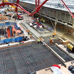
Work moves skyward at the new Bay Adelaide Centre office tower.
Daily Commercial News, Canada - 9 Apr 2008
 

Back
Top