

caltrane74
Senior Member
And I do not recall the city rejecting any design because of shadowing.
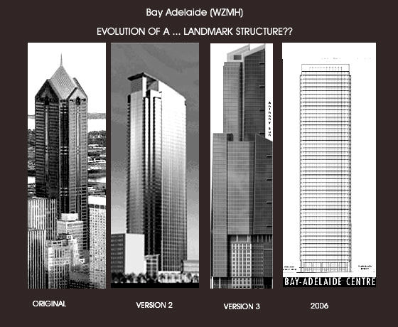
Brookfield is building (BA1) to the maximum allowable hieght which the city gave. Their first proposal was between 280 Meters and 300 Meters. At Bay an Richmond and office tower at that size, we can all assume the city decision would have been automatic.
Again, I'll give credit to Brookfield for trying. But I'm not at all disappointed with what is going up. - Boring ,Safe, Timeless & Classic is always better than crapola.