News   May 21, 2024
 202     0 
News   May 17, 2024
 3.2K     5 
News   May 17, 2024
 2.2K     3 

TTC to retrofit stations with "classic" wall panels

Those are the original Vitrolite tiles that they're taking inspiration from for the new panels. But the new panels aren't particularly impressive and will probably look dated soon after they're installed. The TTC generally does an uninspired job at renovating their stations. The good renovations like Victoria Park are an exception to the rule. If they want to do well, they should use durable and attractive materials like natural stone, brick, textured precast concrete, metal panels, terracotta and contemporary tiles that look better those in public washrooms. They should then get designers and architects to arrange the finishes and integrate art.
 
Plans got shelved because of no money. The TTC can barely maintain what they have. Given the choice between service and aesthetics, service wins. Not to say that is the way it should be, just that we have our governments perpetual funding cuts to blame for the shabby state of the system. Changing the tiles is one incredibly cheap way to renovate (it's basic maintenance masked as an upgrade).
I don't think the TTC paid for the Museum renos though. It was the Toronto Community Foundation if memory serves. I think they were also thinking about offering money for St. Patrick, etc. too, but I guess it never came to fruition.
 
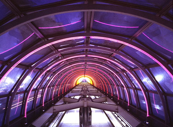
Now if only they could put LED lights in at the Yorkdale station and turn them on. Yorkdale station used to have neon lights that soon burnt out and were never replaced.

HA01.jpg

20101029-subway_arc.jpg
 
Those are the original Vitrolite tiles that they're taking inspiration from for the new panels. But the new panels aren't particularly impressive and will probably look dated soon after they're installed.

I'm not sure if "dated" is the proper word; or at least, they're *meant* to be "dated", i.e. 50s-subway-aesthetic retro.

But one thing I do find about the new St Andrew cladding is that it seems more "unrelenting" than it really needs to be--this particular aesthetic really requires the inherent visual articulation of the old Vitrolite-scale panel system, or the 60s concrete-block system. Otherwise, it just reminds us of how the aesthetic came to be pigeonholed as bland and sterile in the first place...
 
Oxford Properties was unable to pay the TTC to install new lights in the station.

LED light bulbs are still expensive, but the prices are going down.

Incandescent light bulbs are to be banned starting January 1, 2013. Only halogen incandescent light bulbs will continue to be sold, for now.

I'm guessing that they are waiting for the LED prices to come down even more than they are now. How long? That is the question.

The TTC still has incandescent light bulbs that slowly have to be replaced. Likely they are in the same boat, waiting for the prices to come down even more. Only replacing as needed.

BTW. If you still have incandescent Christmas lights, better stock up on the replacement bulbs. If you can find them.
 
Last edited:
Those are the original Vitrolite tiles that they're taking inspiration from for the new panels. But the new panels aren't particularly impressive and will probably look dated soon after they're installed.

More like look dirty. The test panels they put up several years(!) ago were covered in brake dust and turned dark gray in a few months. I am assuming they have no intention of washing these, but would be happily surprised if they did.
 
I don't think the TTC paid for the Museum renos though. It was the Toronto Community Foundation if memory serves. I think they were also thinking about offering money for St. Patrick, etc. too, but I guess it never came to fruition.

Yes and the foundation pulled their funds. Frankly I'm sort of happy they did. I don't like what they did with museum, and I think it looks cheesey. It speaks to the incoherent haphazard vernacular that occurs all over Toronto.

I like the idea behind what the TTC is doing with St. Andrew but I do not trust their execution at all. When the subway first opened it was extremely well designed, from their typography to the vitrolite. It held a coherence and a functional modernism that is now valued. But it's long since lost by the TTC's lack of care for details, coherent signage and any overall design skill. I think if the original stations were well maintained to their original state with specific technological updates we would have one very attractive system today.
 
Pleasantly surprised to see the walls (looked to be) completed. I don't much like the black ceiling, but I can appreciate why they did that.

482471_10153675492770431_1922856994_n.jpg

1604892_10153675492855431_946247611_n.jpg


Apologies for the phone pics. No camera and had to catch a train.
 

Attachments

  • 482471_10153675492770431_1922856994_n.jpg
    482471_10153675492770431_1922856994_n.jpg
    33.6 KB · Views: 604
  • 1604892_10153675492855431_946247611_n.jpg
    1604892_10153675492855431_946247611_n.jpg
    43.8 KB · Views: 640
the offset between the "s" and "treet" pretty much sums up the TTC's usual attention to detail
 

Back
Top