News   May 21, 2024
 902     0 
News   May 21, 2024
 584     0 
News   May 21, 2024
 459     0 

TTC to retrofit stations with "classic" wall panels

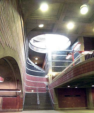
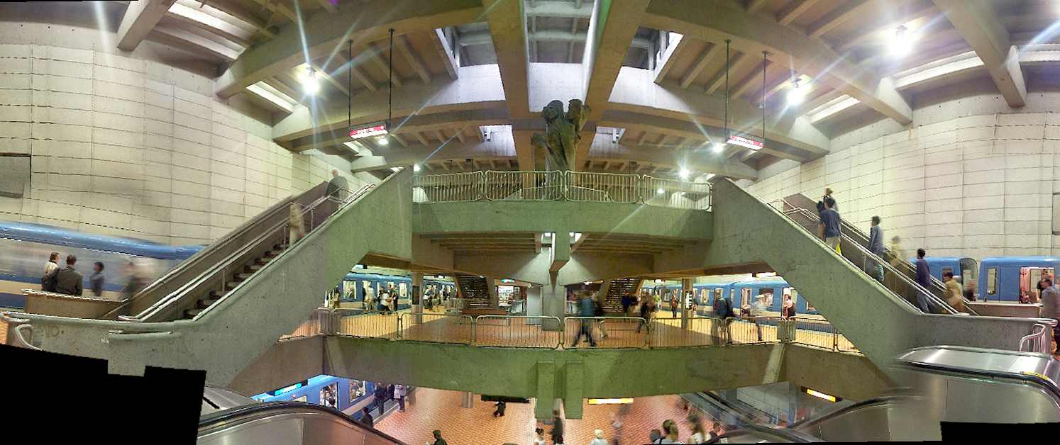
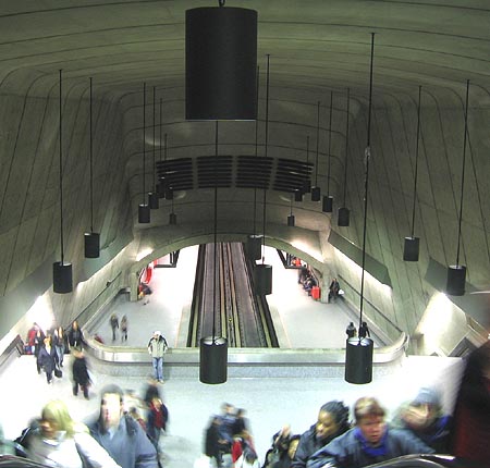
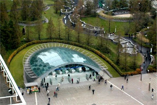
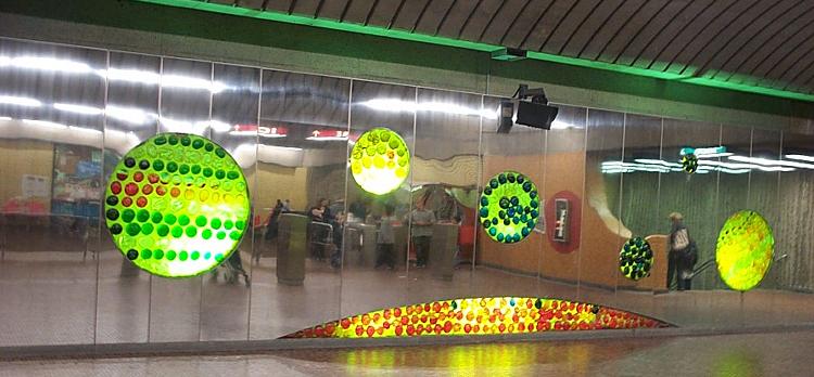
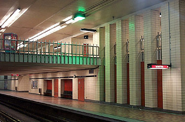
This is where I get to show off Montreal's stations:

platform-overview.jpg

mural.jpg

escalator-foot.jpg

pelican.jpg

walls.jpg

circles.jpg

funnel.jpg


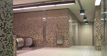
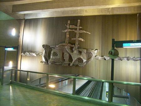
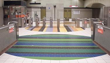
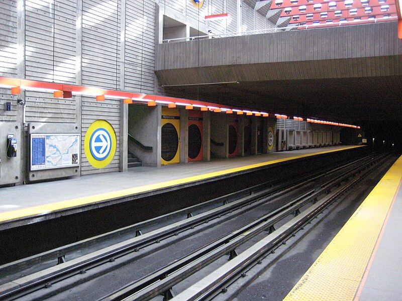
And these are supposedly the ugly ones...
 
My Top 10 best looking Montreal Metro station

Outremont
lightshaft.jpg


De la Concorde
20121031423_955.jpg


Monk
monk-metro-1.jpg


Lionel-Groulx
Lionel-groulx-montreal-metro.jpg


Radisson
volume.jpg


Place St-Henri
j2274-312_QC-STM_20110515-091120_StationStHenri-pano.JPG


Prefontaine
800px-PrefontaineStationMetro.jpg


Bonaventure
800px-Bonaventuremetro2011.jpg


Berri-UQAM
800px-Berri-UQAM_Metro_station2.jpg


Georges-Vanier
757px-Montreal_metro_georges_vanier_interior.jpg
 
Last edited:
highway 407 is probably my favourite, and it will likely be the least used haha.

Dupont isn't even that nice I find, I like Downsview a lot more.

I think Dupont just needs a good power wash and it would look as great as Montreal. But Downsview is definitely one of the best looking stations, and I'm fortunate enough to use it everyday.


We actually tried a bit with Spadina extension stations. There were far more complaints about the 5% cost bump than praise for the designs.

Some on this forum use those stations as an example of poor capital spending. So no, we probably can't have that, although I would very much like to see more.

When I look at the renders, the main thing I notice is not the extravagant architecture but rather the sheer size of the stations. They will be huge and deep, which is really expensive, and meanwhile the busy downtown stations are tiny and simplistic.

I also have to wonder how well will the stations be maintained over the long term. At York University for example, the public art that will be installed is "a series of glass panels on the east walls at concourse and the smoke duct above the east trainway. Mounted to the back of these panels are an array of Liquid Crystal Displays (LCDs) which can dynamically vary in tone between black and white. The result is a huge electronic screen that is capable of showing images." Something of this much complexity can easily get ruined, which is exactly what happened to Arc En Ciel. Sometimes simple is better. Not everyone like the architecture of the BD line, however the tiles have lasted amazingly well in my opinion.
 
When I look at the renders, the main thing I notice is not the extravagant architecture but rather the sheer size of the stations. They will be huge and deep, which is really expensive, and meanwhile the busy downtown stations are tiny and simplistic.

Building Code would not allow us to build the downtown stations today. You might say the people that influence the building code (fire chief mostly) have learned from those mistakes and made modifications.

The depth is chosen by the ground. Only some materials create a stable tunnel and it sits at a certain depth; even then Toronto has lousy dirt for tunnelling which is why single bore for Eglinton was rejected (building foundation instability; 2 smaller bores is more stable).

The size of the platform, and vertical access has to do with the crush capacity of the trains.

Depth, width, and length of the excavated box is largely out of the hands of the designers.
 
Last edited:
That list of best stations is great, but one that I used quite a bit and would add is Canary Wharf:

foster-canary-wharf.jpg


3061804354_1d14d9819b.jpg


sg-canary_wharf_tube_station.jpg


It is a breath of fresh air that the Spadina extension is going for good design though.
 
That list of best stations is great, but one that I used quite a bit and would add is Canary Wharf:

foster-canary-wharf.jpg


3061804354_1d14d9819b.jpg


sg-canary_wharf_tube_station.jpg


It is a breath of fresh air that the Spadina extension is going for good design though.

By far one of the best looking station there is. It's great that the TTC is trying to down that route as well. I would have preferred that they invest to renovate the existing downtown stations. We can do better than that. When will they bring back the Yorkdale rainbow light show?
 
The 1950s vitrolite was done as a big improvement over dirty bare concrete as seen in Chicago in the 1940s. The materials used in Toronto were selected for ease of cleaning and maintenance, (e.g. terrazzo floors, stainless steel turnstiles etc.). Imagine the TTC trying to keep those European or Montreal stations clean with its bare bones maintenance. Arc-en-ciel was scrapped, focused lighting at other Spadina line stations was scrapped or doesn't work. Imagine what would happen with those expansive complex stations? I think they'd look pretty crappy by now.

The Sheppard line bare concrete was a response to the Downsview station that was decried at the time by the Harris-era penny pinchers as "grandiose". So decades after the TTC led the way with tiled walls instead of concrete, everyone else moved on to bigger and better, Toronto went to the 1920s concrete look. Some even defended it saying that passengers don't stand over there so who cares what the outside walls look like, and there's all kinds of artwork throughout the stations.
 
Last edited:
AHW:

That said, given advances in lighting technologies (long-life, multicolour and high luminosity LEDs), I think the time is ripe to rethink how it is done at the stations.

AoD
 
It's the station renovations that concern me. We can make the older stations look great with sophisticated finishes and bold art, but the TTC's approach to renovations has been inconsistent. Museum's columns and panels are decent, but the rest of it seems like they cheaped out--the ceiling and the benches, in particular. The TTC did a great job renovating Victoria Park with subtle and sophisticated enhancements to the original design throughout the station. Dufferin, on the other hand, looks mediocre if not ugly. Pape looks good, but somewhat conservative in style with its white panels and modest works of art. It's amazing that it took so many years for the TTC to add public art to the Bloor-Danforth line. Even the post-Spadina line stations from the early 1980s--Kennedy and Kipling--were built looking cheap and generic.
 
The columns should have had the coloured details in it. Otherwise it looks like part of a cheap pre-fabricated set for filming.
 

Back
Top