You are using an out of date browser. It may not display this or other websites correctly.
You should upgrade or use an alternative browser.
You should upgrade or use an alternative browser.
Toronto YC Condos -- Yonge at College | 198.42m | 62s | Canderel | Graziani + Corazza
- Thread starter urbandreamer
- Start date
raptor
Senior Member
BEHR calls this color 'Emergency Zone'
https://www.behr.com/consumer_ca/ColorDetailView/P190-6
https://www.behr.com/consumer_ca/ColorDetailView/P190-6
whatever
Senior Member
Even if they did something simple like change out the grey snap caps for bronze the whole wall would look a million times better
TheKingEast
Senior Member
Even if they did something simple like change out the grey snap caps for bronze the whole wall would look a million times better
I just don't get how they thought the orange along with the mullion barf was a good idea. People get paid good money to come up with this kind of stuff. Baffling.
Last edited:
PMT
Senior Member
Your podium:
vs. the podium she tells you not to worry about:Orange is one of my favourite colors, but not this shade.
View attachment 156425
cityspace
New Member
not sure why so much bitter discontent..Perhaps because of the very high expectations or the potential this tower had. It's faaaar from an eyesore and even fairly striking with its block texture and slim profile. I too find the color choice of the podium a little on the cheap side and sort of out of place but seeing how much dislikes the crown is getting I think the only explanation is that aesthetics is subjective, at least in part.
innsertnamehere
Superstar
Yegger
Active Member
not sure why so much bitter discontent..Perhaps because of the very high expectations or the potential this tower had. It's faaaar from an eyesore and even fairly striking with its block texture and slim profile. I too find the color choice of the podium a little on the cheap side and sort of out of place but seeing how much dislikes the crown is getting I think the only explanation is that aesthetics is subjective, at least in part.
Opinions are subjective but quality materials are very real and are utterly absent from this development
TheKingEast
Senior Member
not sure why so much bitter discontent..Perhaps because of the very high expectations or the potential this tower had. It's faaaar from an eyesore and even fairly striking with its block texture and slim profile. I too find the color choice of the podium a little on the cheap side and sort of out of place but seeing how much dislikes the crown is getting I think the only explanation is that aesthetics is subjective, at least in part.
The expectations have always been low. The crown makes no sense. I see it every day from my living room and don’t understand it. It doesn’t tie in with the rest of the building and looks like an afterthought. Just like the podium which we can all agree is a mess. I could forgive the crown if the podium wasn’t so bad. There was no attention paid to detail and that’s the part we all will see the most. Aesthetics at the street level should be very important but can’t say the builder feels the same way.
Benito
Senior Member
ProjectEnd
Superstar
not sure why so much bitter discontent..Perhaps because of the very high expectations or the potential this tower had. It's faaaar from an eyesore and even fairly striking with its block texture and slim profile. I too find the color choice of the podium a little on the cheap side and sort of out of place but seeing how much dislikes the crown is getting I think the only explanation is that aesthetics is subjective, at least in part.
It's garbage. End of story.
maestro
Senior Member
It's a massive eyesore not deserving its location or its height if buildt anywhere. That extends to the colour block design, the engineered rather than designed elements and, the window wall cladding. My opinion, of course. Someone on Urbantoronto using "striking" for this pile is a cause of concern for me as well. Sorry if that comes across as harsh.
Lachlan Holmes
Active Member
My feelings on this project are mixed. I really like the concept with the black and white blocks, but damn, this was really poorly executed. The podium, the mullions, the differently-sized heights on some floors, and the crown take away from the mostly attractive tower, in my opinion. Good in concept, terrible in execution.
67Cup
Active Member
The concept of the black and white blocks is a repeat from Lago at Humber Bay Shores. It looks as if G & C couldn’t come up with something new for this project. Lago isn’t brilliant but I think its tower portion is okay. This one is not executed as “well”, using the word well generously. And, as with most other posters, I think the podium is weird.
Logan
Active Member
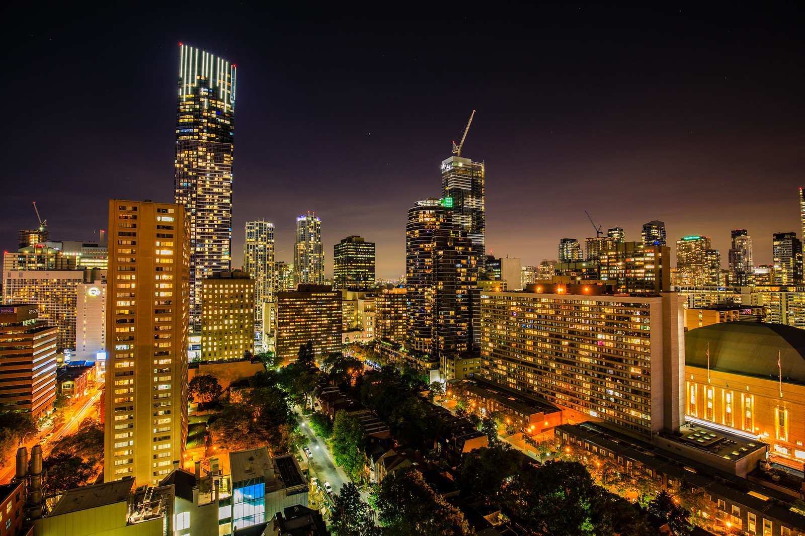
 1W2A0027 by Clement Lo, on Flickr


