Amare
Senior Member
^Well he does raise a good point. It's like each successive building that gets built around Yonge-Dundas Square gets worse and worse in design and quality. This building simply builds upon that trend.
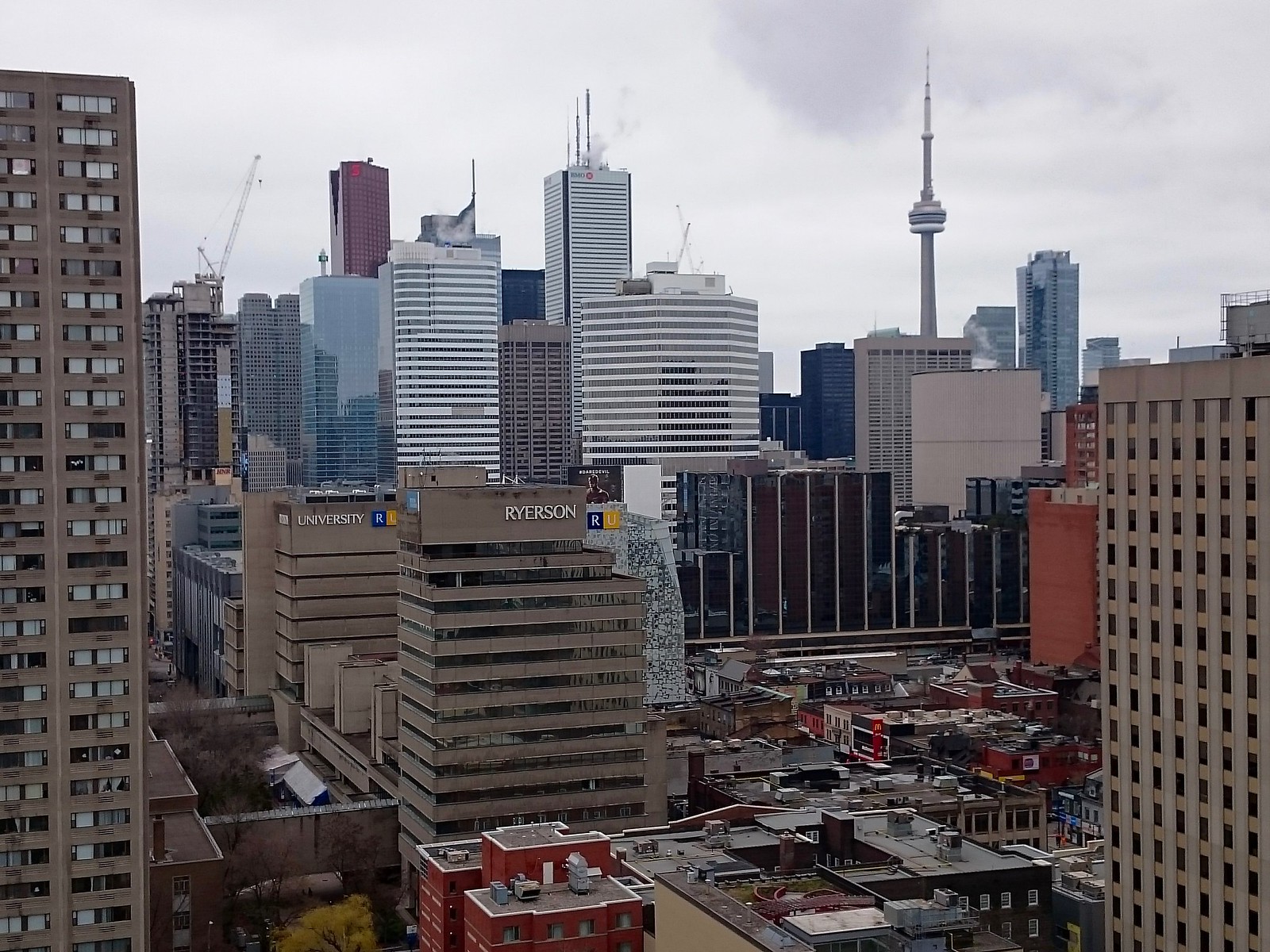
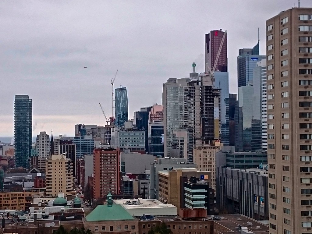
Of course this building is ... aweful. No question about it. What I am saying is, these kind of buildings are practically everywhere in downtown, and there is no reason to be particularly offended by it. Is there anything that's worth looking at nearby? 10 Dundas East? Atrium on Bay? That dreadful OMNI TV building? 277 Victoria? Bond Hotel? YD Square itself? 1 Dundas? ALL of them are either boring or ugly. "velocity" doesn't exactly stand out as an eyesore, does it? Or we can walk along Dundas toward east or west, and see if there is tall building that can be considered better than this one? None.
Of course it is a waste opportunity for this location, but I am afraid even a spectacular master piece can't save this dreadful intersection.


They really should try to install electronic bill boards all the way up and down those blank walls that are facing YD Square. It would really be in keeping with the "Times Square-esque" ethos. It would also be a source of advertising revenue for the landlords.
Huh? Um... Come again? Anchored? Screws bolts etc...And it would blind us to what's holding up those signs.