ptbotrmpfn
Senior Member
Why would they come up with just the base like this. Why not the entire tower? Looks like a bad after thought.
It does remind me of the seventies somehow. I find it amazing that there is still a market for the amount of condos going here in this price range.

Stores don't want you looking at the view. They want you looking at the merch!The screens on the podium remind me of 1960s designs that try to hide undesirable uses (like parkades).
(i.e. the building at Yonge & Carlton)
The corner of Queen & Yonge also comes to mind:
I wonder what the view will be like from those high end retail stores after a few years when dirt builds up behind the screens?
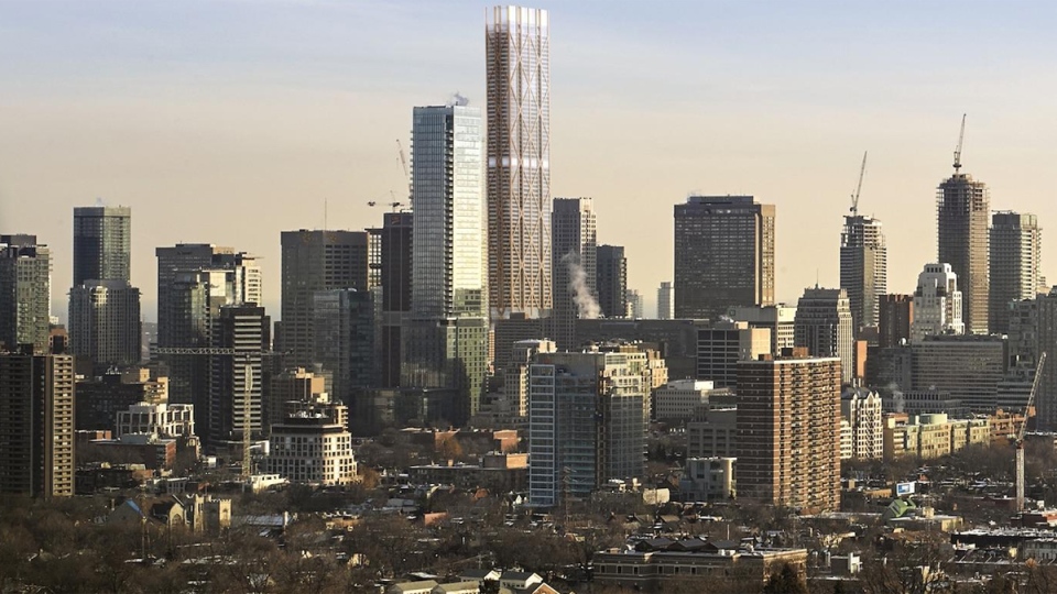
I want the ad campaign to be Eaton's Aubergine meets Marilyn Monroe singing Diamonds Are A Girls Best Friend.First iteration was definitely the best. I'm cool with this one... But the podium looks like it was designed to appeal to rich old women. It's like a gold knit granny sweater. I'm happy with it simply because it's different for Toronto. But the original exoskeleton in that warm tone was best.
I was never a big fan of the original, but I do think the original design looked more powerful than the current one. (pun not intended). Seen from a distance it looked impressive, and not just because of its height.