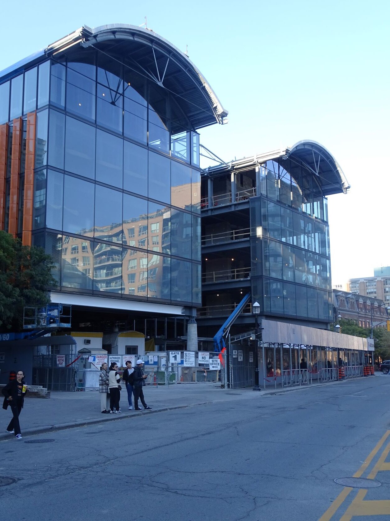
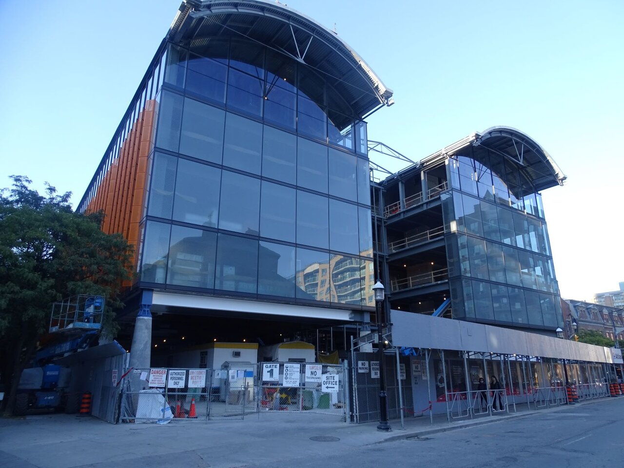
Toronto St Lawrence Market North | 25.3m | 5s | City of Toronto | Rogers Stirk Harbour

Northern Light

Superstar
Member Bio
Joined
May 20, 2007
Messages
25,539
Reaction score
68,661
Location
Toronto/EY
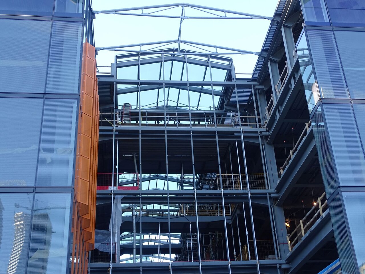
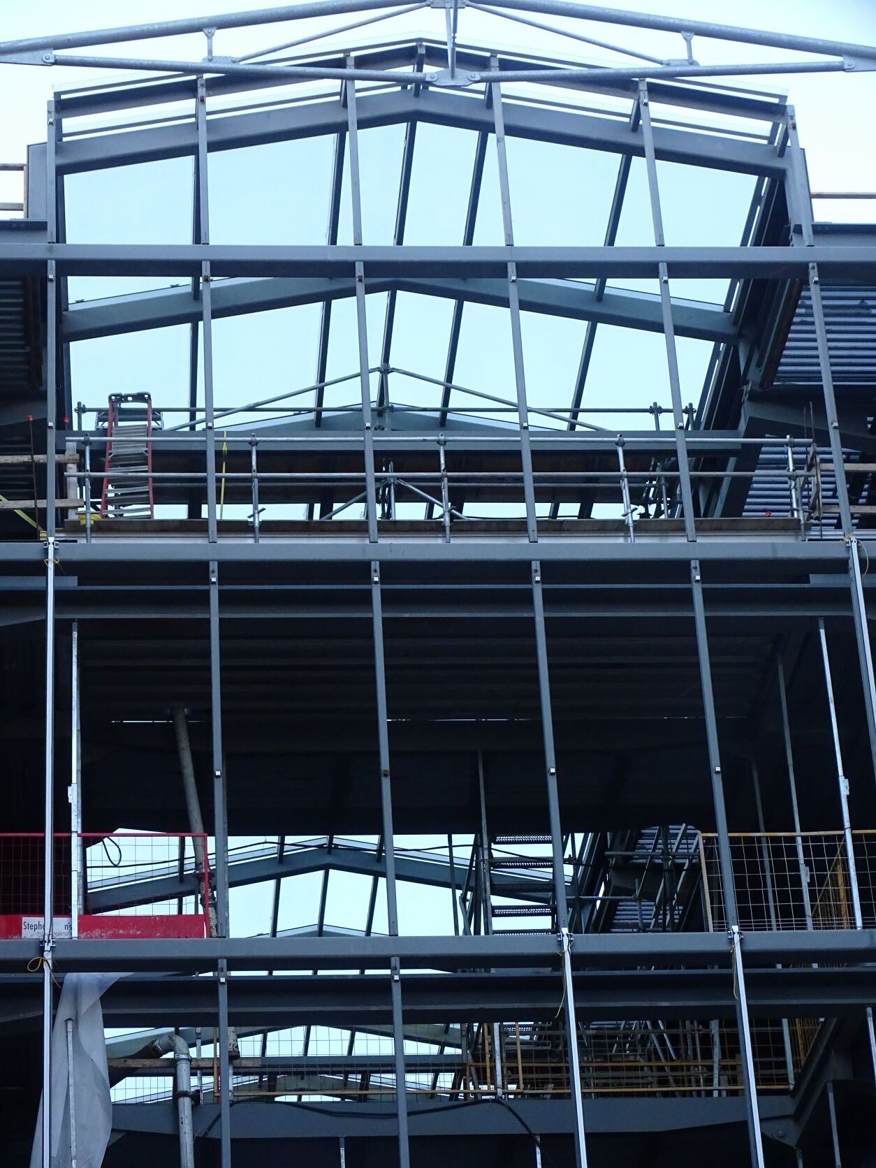
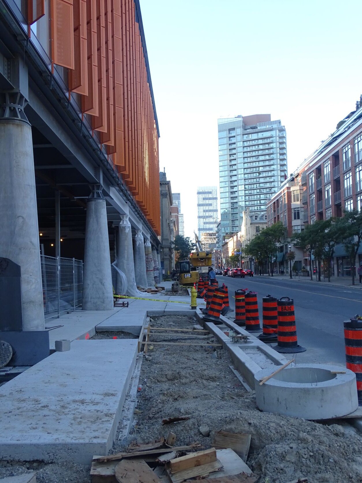
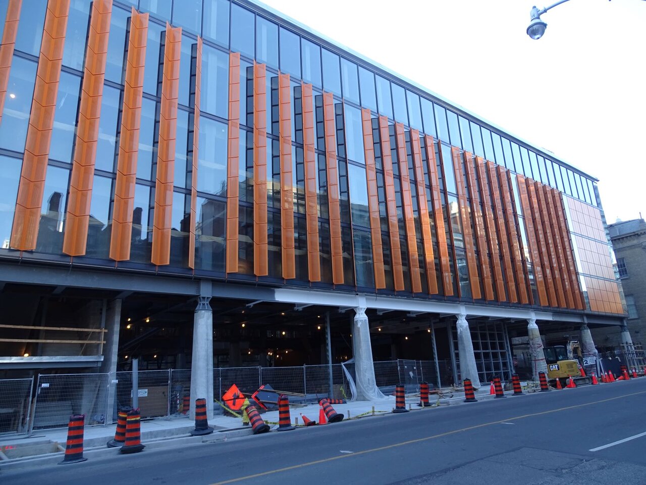
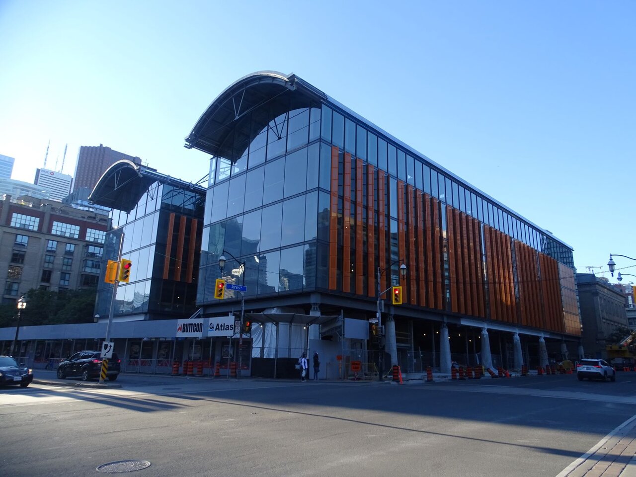
Photos taken October 2nd, 2022:

DSC09836.JPG


DSC09837.JPG


DSC09838.JPG


DSC09839.JPG


DSC09840.JPG


DSC09841.JPG


DSC09843.JPG
 

condovo

Senior Member
Member Bio
Joined
Dec 2, 2007
Messages
3,754
Reaction score
6,623
Location
St. Lawrence
I don't think the blue compliments the orange or the remaining grey framing / I-beams at all. Frankly, I'm puzzled by the colour choice. I'm hoping this is some sort of primer for another colour.
 

3Dementia

Senior Member
Member Bio
Joined
Apr 24, 2007
Messages
3,568
Reaction score
5,611
The latest rendering shows a tone of grey around the steel necklace of the building... though the render may have the slightest hint of blue insinuated. ;)

In Vision and Perception neuroscience circles, seeing that hint of blue may be an "aftereffect"... since I was staring slicecom's photo before clicking on the rendering (it's a thing).
 

AlvinofDiaspar

Moderator
Member Bio
Joined
Apr 22, 2007
Messages
32,514
Reaction score
27,166
Location
Toronto
I don't think the blue compliments the orange or the remaining grey framing / I-beams at all. Frankly, I'm puzzled by the colour choice. I'm hoping this is some sort of primer for another colour.

Actually if you look at the colour wheel the blue would be pretty much a complementary to the orange.

AoD
 

condovo

Senior Member
Member Bio
Joined
Dec 2, 2007
Messages
3,754
Reaction score
6,623
Location
St. Lawrence
It may compliment the orange according to colour theory but it doesn't compliment the gunmetal grey. I don't know why it was necessary to go this route at all with such strong colour coming from the orange brises-soliel. But if you're going to add colour here too, go all the way. Don't choose a colour that's barely distinguishable from grey. It looks almost like they ran out of grey paint and had to pick the closest colour available.
 

Lenser

Senior Member
Member Bio
Joined
Dec 7, 2011
Messages
3,227
Reaction score
4,044
Location
Leslieville
Not that particular shade of blue, methinks. Too grey and washed out - no match for the vibrant saturation of that orange. Blue is indeed opposite orange on the colour wheel, but the devil's in the details. Yeah, colour is a subjective thing, for sure. But in my eyes, it's an unfortunate pairing. I'll have to see it on site though.
 

egotrippin

Senior Member
Member Bio
Joined
Jul 7, 2007
Messages
2,585
Reaction score
1,522
I'll have to side with the 'blue is too muted' crowd here, to be properly complementary they should've chosen an equally bright/saturated blue- turquoise on the colour wheel would be appropriate.

martian_colour_wheel_24_hue_f.png


You can see how well it works on this turquoise building with the orange terra cotta shingles.

ed4324302b8b9b2cf99b1724d0ee9d16.jpg


But all that aside, there's no way I'm complaining since we're starved for colour in Toronto and that orange is nice and bold. Anything else is gravy.
 

Top