Toronto Spadina Subway Extension Emergency Exits | ?m | 1s | TTC | IBI Group

Bill Davis? Is this some kind of odd joke about his transport minister and the concrete colour of the overpass carrying the parkway named in his honour over the 401, after that huge fire?
It was a play on words, but one would have to be able to read more than 140 characters at a time to get it. "See" is a homophone for "Sea"...Billy. Perhaps it was from before your time? Left you a little short of words? Or are you always predisposed to being so?
Terrazzo would be an inexpensive improvement.
It can be made to resemble granite.
Exactly. Terrazzo was featured in one my choices, Dupont Station, which remains an absolute gem, albeit it needs some TLC to restore its full charm. In Dupont's case, it's fine Terrazzo tiles. And they've stood up very well over the decades. The benches show absolutely no sign of wear.
How the TTC lost and found its subway style
NOVEMBER 25, 2015 | BY CHRIS BATEMAN
20151123-Vitrolite-Sign-600x328.jpg

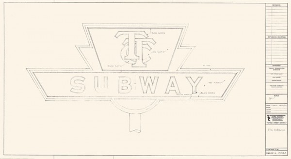
Blueprint of the TTC subway sign, which debuted in Toronto in 1954. Courtesy: TTC.

Not many people could have known that behind the advertising billboards on the platform of College station was something no-one had seen for more than three decades. Last week, workers upgrading the metal hardware that covers large portions of the station walls revealed a little bit of Toronto history that was long presumed destroyed.
There, covered in a thick layer of dust and grime, was the station’s original glossy blue-green vitrolite tile. A little cracked and worse for wear, but still firmly affixed to the walls.
For almost half the stations existence, this stuff covered the entire station, including the ticket hall. And then, in the 1980s, the TTC covered it up during an aesthetically misguided modernization effort that also drove its famous subway font to the brink of extinction.
[...]
http://spacing.ca/toronto/2015/11/25/ttc-subway-style/

DESIGNERS SUBVERT THE SUBWAY BLAHS
(Published by Toronto Star on August 4, 1998 1:03 AM)
TTC strives to make Sheppard line appealing
By Joseph Hall - Toronto Star Transportation Reporter
Tuesday, August 4, 1998
[...]
Forced by provincial cuts to forgo the geometrical and artistic extravagances that earmarked the TTC's 1970s Spadina line, Sheppard will most certainly be a square-cut, right-angled continuum of basic building materials.

But its concrete, tile, terrazzo and lighting components will be configured in an imaginative way to give the line personality and appeal, said TTC transportation co-ordinator David Hopper.

"While keeping the stations at a fairly basic level, we have tried, where possible, to make it an aesthetically pleasing environment," Hopper said.

"And one of the ways we're going to do that is to use the ceramic tiles on the walls to create integrated artworks much like the (Spadina line's) Dupont station."

TTC staff paired each station's architect with a visual artist to design patterns that would be incorporated into the tiles that cover much of the concourse and platform walls.

And what they've come up with is eclectic, to say the least.
[...]
https://transit.toronto.on.ca/archives/data/199808040103.shtml
 
Last edited:
"See" is a simile for "Sea"...
How is "see" a simile for "sea"? Surely "see" is a homonym for "sea". Not sure how that's a play on words ... .

... oh wait, you are referring to that fish commercial with the odd sexual abuse vibe, and then referring to the Holy See, because that's what their priests do .... very dark. Not sure the relevance though ... but impressive!
 
Agreed!

Finally, the entire TYSSE, best I can figure, doesn't have any of the one-stop screens. Instead, Transit Information Screens dominate, which are ad-free, continuously offer the time, and the next three train times.

I like this, I also like they are much more frequent, so you've always gone one in readable distance. Let's ditch one-stop at go this route everywhere.
I agree 100% on the legibility , and the new screens are necessary on the extension when frequencies drop after peak hours.

IMG_2593.JPG vs IMG_2366.JPG
 
I took the Barrie Line southbound to Downsview Park GO today at 8:45 AM. There were about 30-40 people getting off the train. This is surprising because this was one of the trains that does service York University GO as well, and a few dozen people got off there. Most of the passengers seemed to be going southbound on Line 1.

After getting off, I caught a southbound Line 1 train at 8:47 AM, and I'd say about 80% of the seats were taken, and there were maybe 4 or 5 people standing per car. I doubt any of these people really got on at York U, going southbound during the AM peak. I think most of the passengers either came from parking, dropoff, or connecting bus routes at VMC, 407, PV, and Finch West.

Seems very well-used, to me, any busier and there wouldn't be room for downstream riders (as it is, today at Sheppard West almost every seat filled up and there were a decent few standees; Wilson added quite a few more standees, and it got crammed to full at Eglinton West). We wouldn't want it to be like the Yonge line where all the seats fill up at Finch and people can't get on south of Sheppard, sometimes even at North York if there was a little bit of a gap.
 
Yes, the YorkU GO shuttle was packed the last time I saw it a few weeks ago compared to about half full in the spring.
 
Just wondering, on the existing Line 1, where are Sheppard, North York Centre, and Finch stations located within the Yonge Street corridor?

Are the stations on the east side (i.e. under the northbound car lanes), on the west side (i.e. under the southbound car lanes), or in the middle of Yonge Street?

Thank you.

All three are directly below Yonge Street.
 
This link to the Vaughan agenda (it's Item #11) might work better.

the interesting part is Vaughan asking for a (relatively rarely used) Ministerial Zoning Order to permit the move. Screenshot of the request below.

Also interesting (if we're going a BIT into VMC developments), item #3 here is a pretty big one: 993 housing units split between townhomes and 3 towers, kind of down around where the Ikea is. Unless you count the cancelled tower that was up near 7, it's the biggest development proposal so far in the south part of VMC.


1543931732523.png
 
This link to the Vaughan agenda (it's Item #11) might work better.

the interesting part is Vaughan asking for a (relatively rarely used) Ministerial Zoning Order to permit the move. Screenshot of the request below.

Also interesting (if we're going a BIT into VMC developments), item #3 here is a pretty big one: 993 housing units split between townhomes and 3 towers, kind of down around where the Ikea is. Unless you count the cancelled tower that was up near 7, it's the biggest development proposal so far in the south part of VMC.


View attachment 166047
item #3 you are referencing above has this thread:
https://urbantoronto.ca/forum/threads/vmc-block-2-quadreal-turner-fleischer-architects.28300/
 

Back
Top