Toronto Sixty Colborne Condos | 82.29m | 25s | Freed | a—A

I don't mean to be so... persnickity, but I think the reason I'm picking on this building is because I think it has a lot of potential! I like the orange glass, and the main floor texture (whatever it will be in reality) and I actually thought about one of the units here, but the floorplans! So I love the idea of a slide-away window wall, as opposed to an actual balcony- I think it can make the whole space feel almost outdoors, and it doesn't block your view with the backs of outdoor furniture- but the problem with the way they've done it on this building- is the structural column!

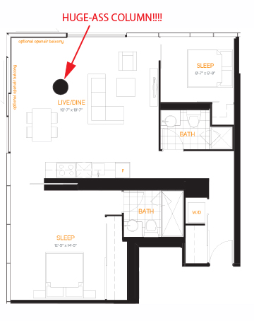
Screen Shot 2015-07-04 at 3.53.05 PM.png

sixtycolborne1.jpg

I guess you wont be able to see that from the outside.... but come on- you're telling me Aa thinks about details? thats just ridiculous.
 

Attachments

  • Screen Shot 2015-07-04 at 3.53.05 PM.png
    Screen Shot 2015-07-04 at 3.53.05 PM.png
    1.6 MB · Views: 636
  • sixtycolborne1.jpg
    sixtycolborne1.jpg
    66.6 KB · Views: 1,962
This one is better if you really like columns... And a washroom that is almost as large as your bedroom.
15_2br_1219.png
 

Attachments

  • 15_2br_1219.png
    15_2br_1219.png
    28.6 KB · Views: 1,970
Starting Monday, they will start building the lane way bridge that will connect to Church St.

Once that is built, the lane way to the west off Colborne will be close so the rest of the site can be excavated.

The post are 75' long and in place that will support the bridge.

Had to a lot of cutting to get the new hording up yesterday.
 
I don't mean to be so... persnickity, but I think the reason I'm picking on this building is because I think it has a lot of potential! I like the orange glass, and the main floor texture (whatever it will be in reality) and I actually thought about one of the units here, but the floorplans! So I love the idea of a slide-away window wall, as opposed to an actual balcony- I think it can make the whole space feel almost outdoors, and it doesn't block your view with the backs of outdoor furniture- but the problem with the way they've done it on this building- is the structural column!

I guess you wont be able to see that from the outside.... but come on- you're telling me Aa thinks about details? thats just ridiculous.

Where would you have put the column?
 
Bridge work from this morning.

FullSizeRender 2.jpg
FullSizeRender 3.jpg
FullSizeRender copy.jpg
 

Attachments

  • FullSizeRender 2.jpg
    FullSizeRender 2.jpg
    2.5 MB · Views: 1,615
  • FullSizeRender 3.jpg
    FullSizeRender 3.jpg
    2.2 MB · Views: 1,583
  • FullSizeRender copy.jpg
    FullSizeRender copy.jpg
    1.9 MB · Views: 1,548
This one is better if you really like columns... And a washroom that is almost as large as your bedroom.
View attachment 49837

I like this layout. However, I can't stand sliding doors especially the ones that slide into the window and just dangle in the open space. It's very lazy design and I see it in way too many condos. On top of that they're not functional. It's a large 2 bedroom suite, a real door would be nice for privacy purposes. This should all go into the design of the building. The bedrooms are also tiny. I wonder what this unit is priced at. 6-700K+?
 
Some pics from yesterday, some of which are included in this front page story (which details what's going on right now).

DSC03415.jpg
DSC03416.jpg
DSC03417.jpg
DSC03419.jpg
DSC03421.jpg
DSC03422.jpg
DSC03423.jpg


42
 

Attachments

  • DSC03415.jpg
    DSC03415.jpg
    378.5 KB · Views: 1,320
  • DSC03416.jpg
    DSC03416.jpg
    486.2 KB · Views: 1,294
  • DSC03417.jpg
    DSC03417.jpg
    460.7 KB · Views: 1,306
  • DSC03419.jpg
    DSC03419.jpg
    491.2 KB · Views: 1,313
  • DSC03421.jpg
    DSC03421.jpg
    481.4 KB · Views: 1,306
  • DSC03422.jpg
    DSC03422.jpg
    448.8 KB · Views: 1,309
  • DSC03423.jpg
    DSC03423.jpg
    392.7 KB · Views: 1,286
I don't mean to be so... persnickity, but I think the reason I'm picking on this building is because I think it has a lot of potential! I like the orange glass, and the main floor texture (whatever it will be in reality) and I actually thought about one of the units here, but the floorplans! So I love the idea of a slide-away window wall, as opposed to an actual balcony- I think it can make the whole space feel almost outdoors, and it doesn't block your view with the backs of outdoor furniture- but the problem with the way they've done it on this building- is the structural column!

View attachment 49834

View attachment 49836
I guess you wont be able to see that from the outside.... but come on- you're telling me Aa thinks about details? thats just ridiculous.


Perhaps it's a challenge to the creative.

I can imagine putting a nice chair and ottoman there - for a quiet spot to read and/or listen to some music and stare off into the distance. The column will make the corner feel very private, but retains the room's open construct.

Visual obstructions work to make a space feel larger. When we can see the entire area in one glance, we immediately think it's smaller. When walking around or viewing from different angles is required, it creates an illusion of space.
 
Excluding some unique structural system that would be ridiculously expensive, how would the critics here propose designing a unit with a large open space and no columns? Keep in mind that the building needs a structural grid that is efficient and can support the required loads, while still allowing for different floorplans on different levels. I eagerly await your answers.

In the case of the column placement in the unit with the operable glazing at the corner of the building, they've left enough of a perimeter around the column that you can still do lots with the space. I actually feel it is more useful than having a typical corner column because this way, you can actually stand at the corner of your unit and have a completely unobstructed view- no column, yet the corner of the unit is fully glazed. That's a true open-plan in your condo's living room if I've ever heard of one.

I actually feel like complaining about a traditional corner column is more reasonable than the critiques being offered above, since it shifts the structure into your floorplan, just to allow the corners to be continuously glazed. The unit in 60 Colborne with the column closer to the kitchen is a net gain for useable space in the corner of the unit.
 
They paved the bridge today.

IMG_5689 1 copy.JPG
IMG_5680 1 copy.JPG
IMG_5686 1 copy.JPG
IMG_5688 1 copy.JPG
 

Attachments

  • IMG_5689 1 copy.JPG
    IMG_5689 1 copy.JPG
    676.5 KB · Views: 632
  • IMG_5680 1 copy.JPG
    IMG_5680 1 copy.JPG
    639.2 KB · Views: 646
  • IMG_5686 1 copy.JPG
    IMG_5686 1 copy.JPG
    715.6 KB · Views: 652
  • IMG_5688 1 copy.JPG
    IMG_5688 1 copy.JPG
    661 KB · Views: 639
First venture out on to the bridge this morning:

IMG_6987.jpg
IMG_6988.jpg
IMG_6990.jpg
IMG_6993.jpg
IMG_6994.jpg
IMG_6995.jpg
 

Attachments

  • IMG_6987.jpg
    IMG_6987.jpg
    1.2 MB · Views: 2,761
  • IMG_6988.jpg
    IMG_6988.jpg
    1 MB · Views: 2,776
  • IMG_6990.jpg
    IMG_6990.jpg
    1.1 MB · Views: 2,760
  • IMG_6993.jpg
    IMG_6993.jpg
    1.1 MB · Views: 2,773
  • IMG_6994.jpg
    IMG_6994.jpg
    1.2 MB · Views: 2,737
  • IMG_6995.jpg
    IMG_6995.jpg
    1.3 MB · Views: 2,766

Back
Top