| NEWS | DATABASE | MAP | FORUM | DASHBOARD |  | SERVICES | UTPro | LOG IN | CITIES |
|
|
| |||||||||||||||||||||
| |||||||||||||||||||||||
Toronto Richmond Adelaide Centre: 120 & 130 Adelaide West Recladding | 136.85m | 35s | Oxford Properties | WZMH
- Thread starter ChesterCopperpot
- Start date
Amare
Senior Member
While the Simpson Tower re-clad is an unmitigated disaster, this one wont be very far behind in that category that's for sure.
The least they could have done is make the towers in the complex have some kind of matching aesthetic which would tie them in neatly.
The least they could have done is make the towers in the complex have some kind of matching aesthetic which would tie them in neatly.
salsa
Senior Member
cd concept
Senior Member
Can someone tell me why every new building in this city has to have a metallic look to it !!!
DSCToronto
Superstar
Member Bio
- Joined
- Jan 13, 2008
- Messages
- 20,361
- Reaction score
- 30,298
- Location
- St Lawrence Market Area
It's 2018?Can someone tell me why every new building in this city has to have a metallic look to it !!!
stjames2queenwest
Senior Member
Black was so much better
A Torontonian Now
Senior Member
maestro
Senior Member
Just in case..
Those are the back pans from the curtainwall. We are actually losing a metallic look (black in this case) for more spandrel glass.
Those are the back pans from the curtainwall. We are actually losing a metallic look (black in this case) for more spandrel glass.
Bogtrotter
Senior Member
Ultimately this may not look terrible but judging from the renderings there's surely going to be a lot sameness and probably less interesting. Spandrel seems to work better in black or a very dark gray so it is a shame they didn't go that route. While refreshing the exterior with more modern cladding it would also have been more respectful to the original design as well.
maestro
Senior Member
It's a new skin on an old curtain wall facade. Would have been much better if they had ripped off the facade with the change in direction to glass.
LUVIT!
Senior Member
This is one building that I've always liked the way it WAS.
Amare
Senior Member
Trust me many of us did, but the trend in Toronto lately has been to re-clad buildings that look fine just the way they are to some off-putting standard.This is one building that I've always liked the way it WAS.
Irishmonk
Senior Member
This was always my favorite of the 400 - 500 foot towers during the classic CBD years. It's slight resemblance to the Sears Tower made me wish it was much taller. Now it's being airbrushed out of history like so much else. The more things change the more they start looking like everything around them.
mrxbombastic
Active Member
steveve
Senior Member
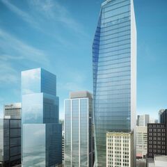
This is on WZMH’s website. Was this an early version of EY tower that I’d never seen before? Or is this something else entirely?
Source http://www.wzmh.com/projects/richmond-adelaide-centre-1?cat=commercial

Source http://www.wzmh.com/projects/richmond-adelaide-centre-1?cat=commercial


