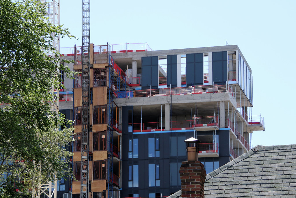
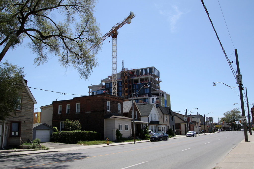
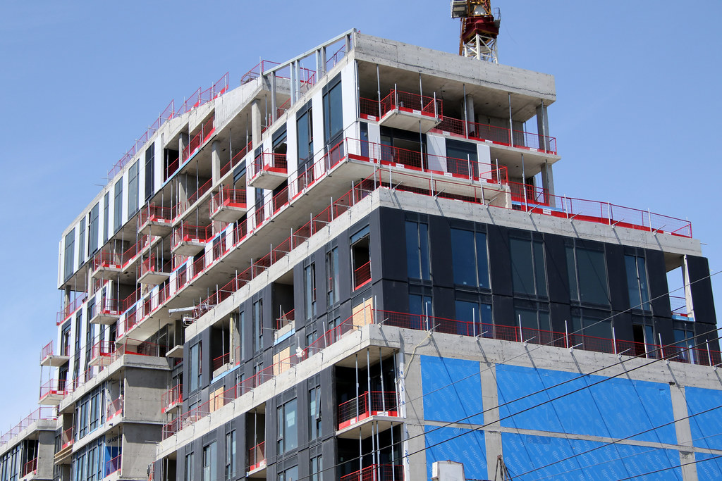
Toronto Reunion Crossing | ?m | 11s | Diamond Kilmer | Giannone Petricone

Lot more up on my site
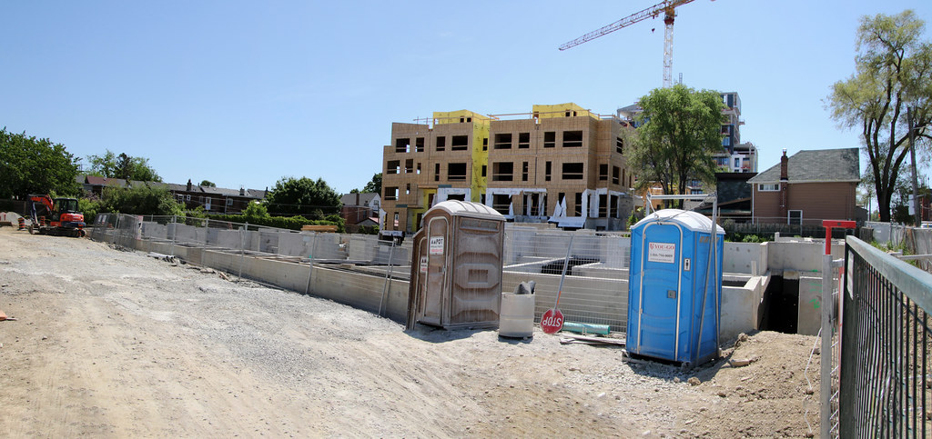
52142377506_3f6b279ff3_b.jpg

52142394773_9cc4449704_b.jpg

52142376986_aa81382cc2_b.jpg

52142394393_7444067472_b.jpg

52142394333_0949a2a741_b.jpg

52142376491_e8f628032e_b.jpg

52142394018_b5416bba57_b.jpg

52142376076_b62101d006_b.jpg

52142612064_287f2548fe_b.jpg

52142375716_e14a32fbbe_b.jpg

52142393128_640f3731a5_b.jpg

52142858875_74e41b6980_b.jpg

52142392898_c15d2a66b4_b.jpg

52142858595_e10908e5b3_b.jpg
 
Looking decent. Will be interesting to see if it all hangs together in the end. They went a bit ham on the mullions in the midrise (what else is new in Toronto). Curious to see how the townhome cladding turns out. The density is great. Love seeing this and the building across St. Clair going up at the same time. Very nice.
 
Looking decent. Will be interesting to see if it all hangs together in the end. They went a bit ham on the mullions in the midrise (what else is new in Toronto). Curious to see how the townhome cladding turns out. The density is great. Love seeing this and the building across St. Clair going up at the same time. Very nice.
Agreed - I actually think it is coming together more coherently and nicer than I expected. However, I am concerned about the lack of progress over the last few months. Seems like there has been very little progress on the other rows of townhomes, and the Midrise saw minimal additions to the cladding. I am curious what is causing the delay.
 
Anyone took photos recently? It's looking further along now when I just drove by last week. Too bad I didn't get a chance to stop for a closer look!
 
I drove by this morning - they added some weird bar-code looking design on the side of the building that I kind of hate LOL - but progress is looking great!
 
The unique shape of the building and the vertical stripes make it an interesting landmark from many vantage points. It draws you into the area visually, which is what's needed. There's a walkable retail strip here that's quite similar to the vibrant retail areas to the east along St. Clair West (e.g. Wychwood and Corso Italia), but most people seem to avoid it.

Anything that can enliven the area, whether in terms of architecture, density, or retail, will help. But ideally, you want all three of those elements, which seems to be what's coming with this project and the one across the street.
 
^ I loved the easy access to ca$h shot (photo 2) which no doubt helped the project sell out.

And of course the inspiration message to would-be buyers from a very well-known historical figure (photo 5). 🙏
 
Nice little passage. Don't know why they used the type of white brick for the mosaic - looks ok but this white brick seems to age terribly, fast. Just look at scoop. A little grocery with some fresh healthy options would be nice to have in the area.

The use of polychromatic brickwork with a Neo Modernist design language is brilliant. Interesting design details like those are sadly rare among condo buildings at street level in Toronto.

I'd sooner associate those kinds of design details with a city known for investing in design like Montreal. I'm delighted that Diamond Kilmer made it happen here.
 

Back
Top