You are using an out of date browser. It may not display this or other websites correctly.
You should upgrade or use an alternative browser.
You should upgrade or use an alternative browser.
Toronto Reunion Crossing | ?m | 11s | Diamond Kilmer | Giannone Petricone
- Thread starter ProjectEnd
- Start date
sebajun
New Member
Maybe I'm in the minority here, but I actually think this is turning out nicely. The street-level bricking looks beautiful. I know the cheaper cladding used above is not as nice, but at least the building is architecturally interesting in its overall design. It's not a classic building, but I like its uniqueness, and think its turning out well.
mdim15
New Member
i love the way it looks tbh ... i just want it to be done at this point lol!
mdim15
New Member
any chance someone can get pics of the back?
adHominem
Senior Member
Anybody else try (and fail) to scan the barcode, or just me?
A Torontonian Now
Senior Member
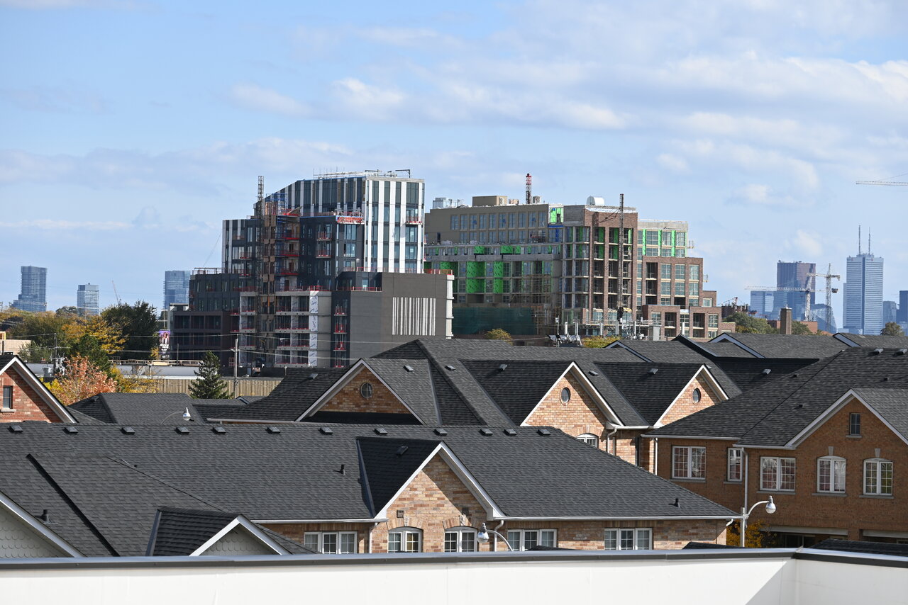
Taken back on October 22:
sebajun
New Member
From today. Looks like:any chance someone can get pics of the back?
(a) The interiors on the lower floors of the condo done (I could see drywall done, pot lights in the bedroom, and mirrored closet doors). I noticed some people on the balcony across the street at Scout (which seems similar level of completion) - so I think some move-ins have started there, and suspect lower floors will start moving in to Reunion Crossing imminently.
(b) One townhome row is fully bricked, one has a full structure with windows, and being bricked next, the other two are at their second floor, but with active work being done, so I suspect they will be completed soon too.
(c) The driveway seems to have been paved and is open now when you walk by with a curb. I didn't notice side-walk yet.
Exciting progress in my opinion!
ProjectEnd
Superstar
A Torontonian Now
Senior Member
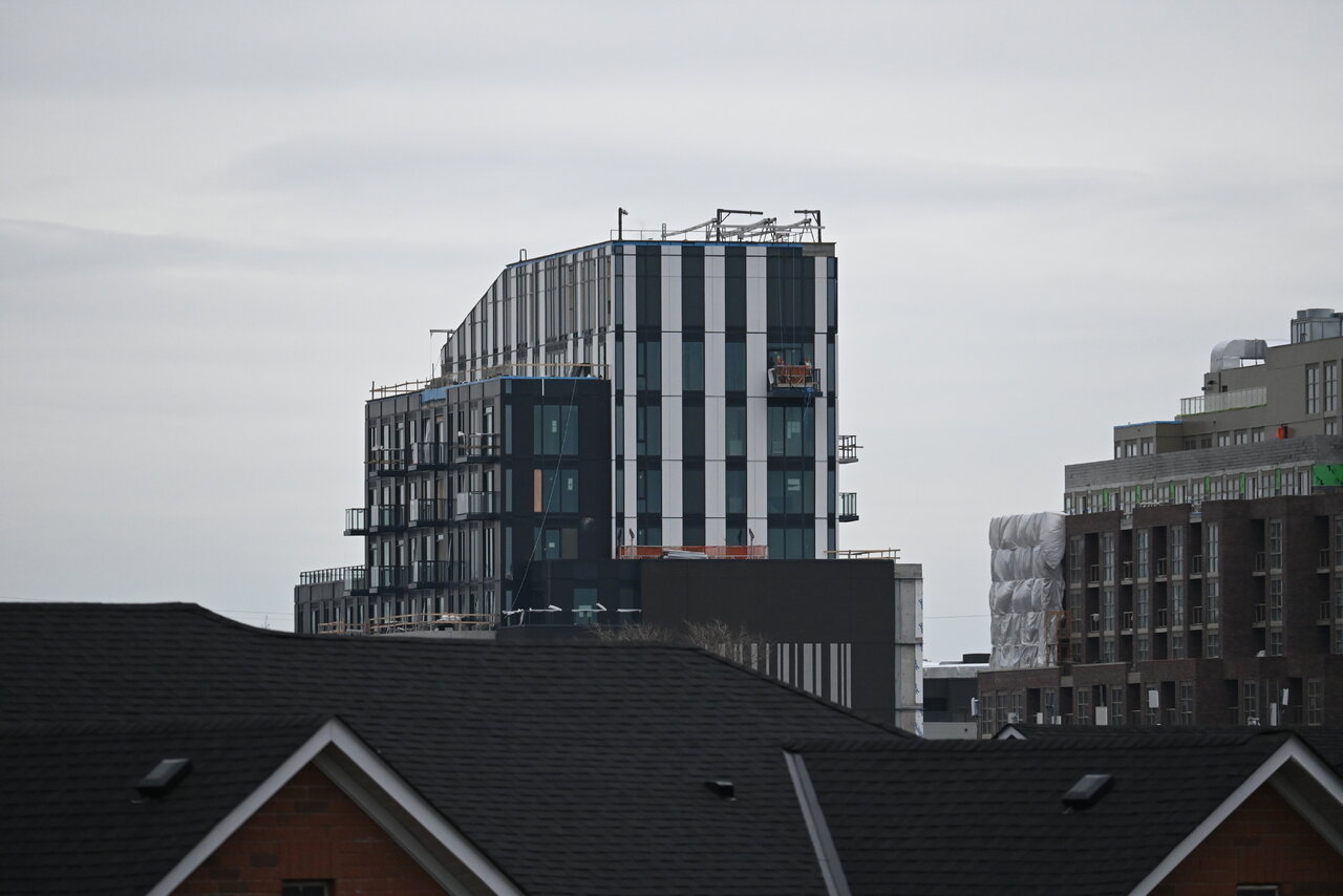
Yesterday:
AlbertC
Superstar
rdaner
Senior Member
sebajun
New Member
I am very curious about what they are doing to the sides. The barcodes on the west and east side of the building were not in the original renders. Now, we see dots being added and part of the "barcode" removed. Interested to know what is going on here if anyone knows.
Dan__Sar89
New Member
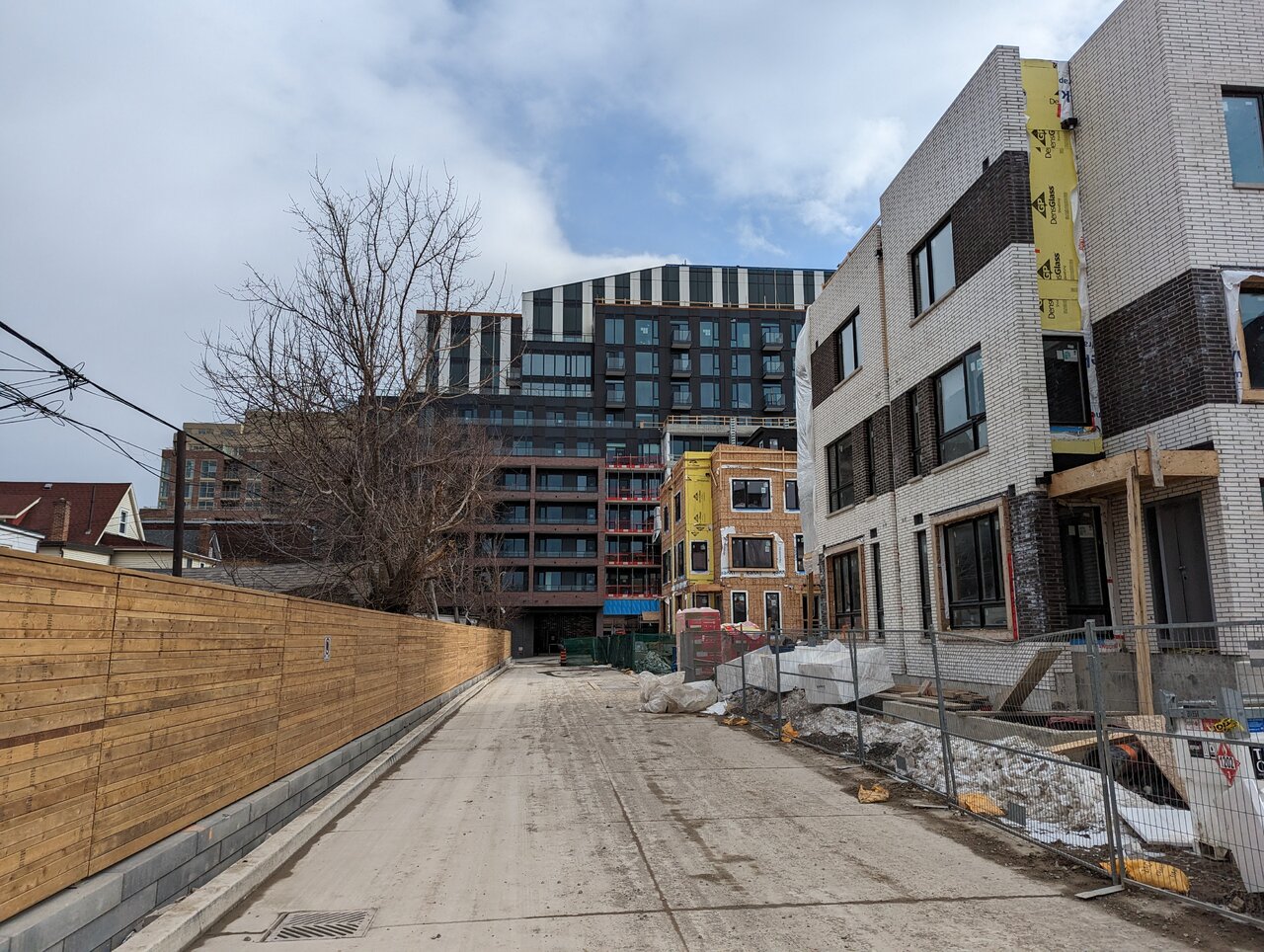
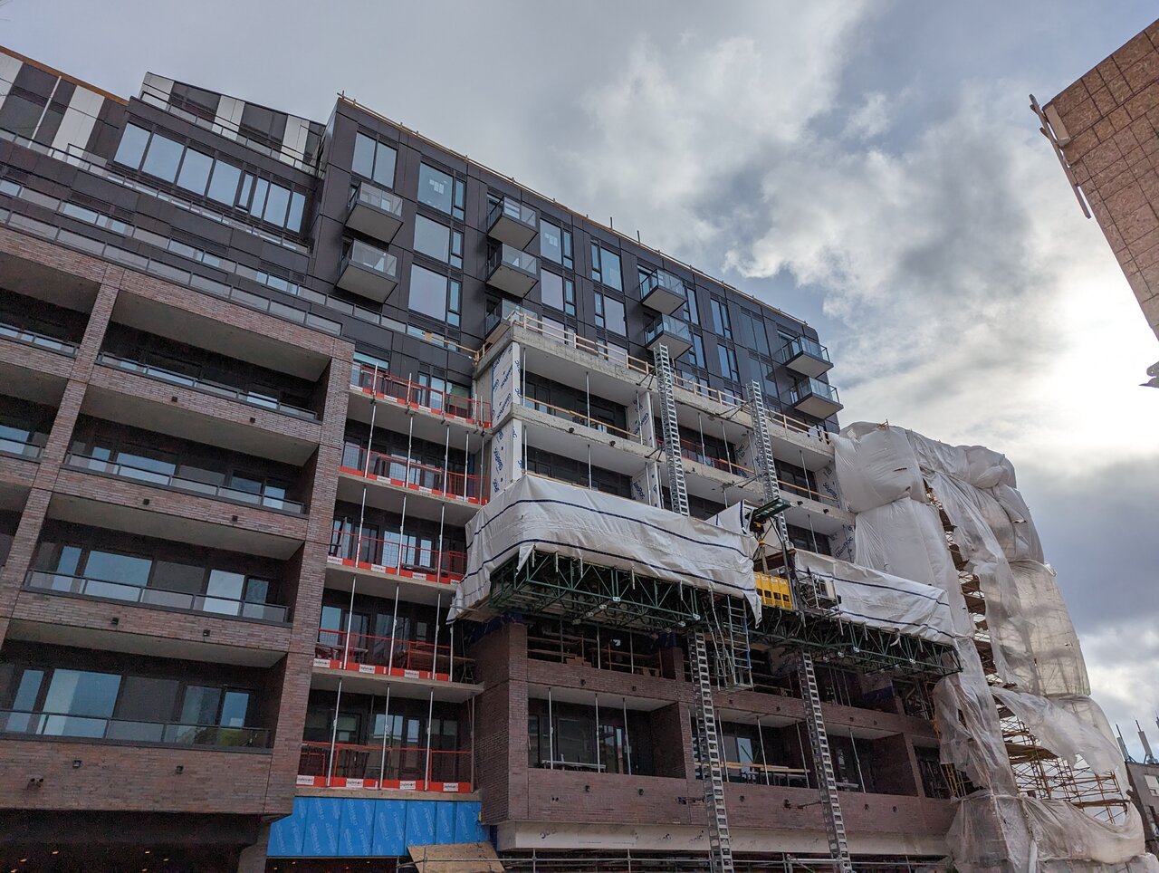
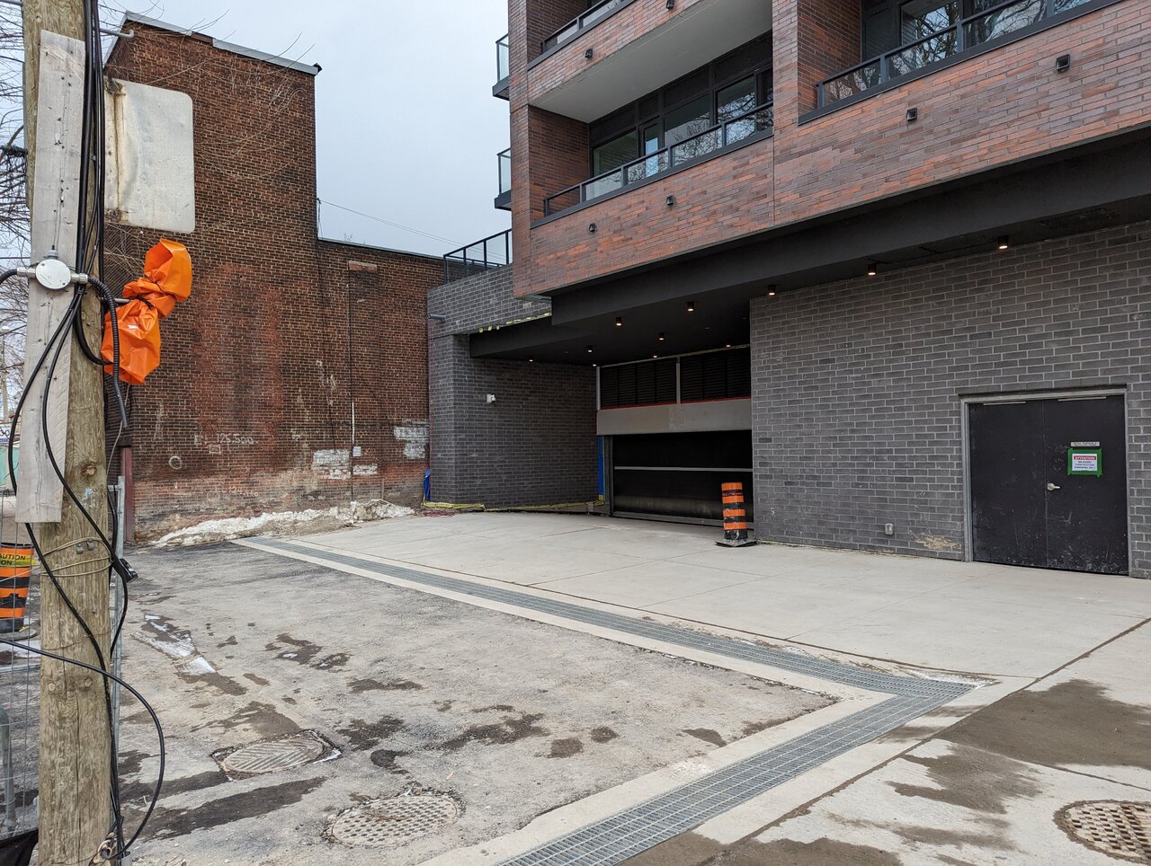
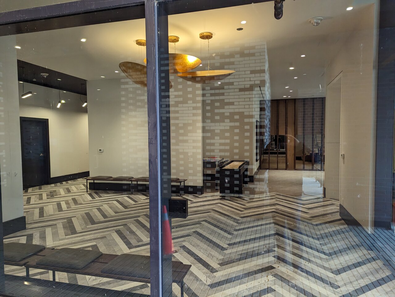
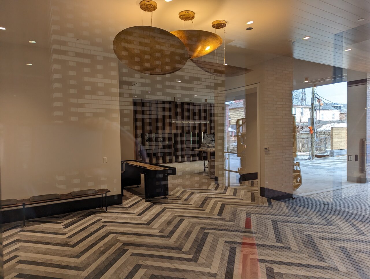
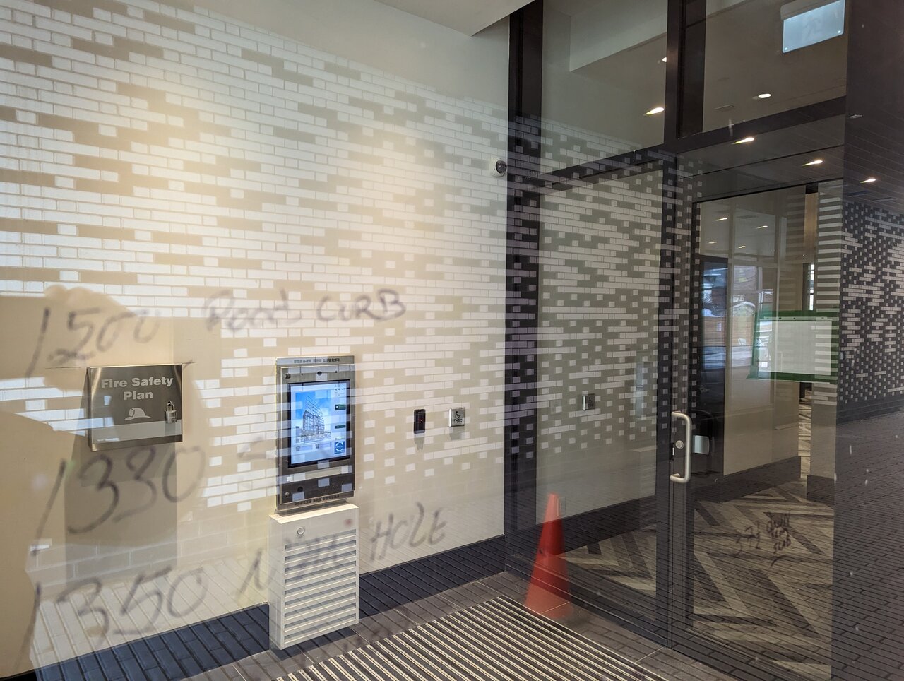
I was in the area and took quick photos yesterday. You can now stroll through the front or back (via Ed Clark Gardens townhouse entrance).
AlbertC
Superstar
The brick on the rear of the building looks nice. I would've preferred if they used that material for the front facing St. Clair instead.
sebajun
New Member
They used the same brick on the front as well, it's just not shown in the pictures, above, because it was not yet completed.The brick on the rear of the building looks nice. I would've preferred if they used that material for the front facing St. Clair instead.