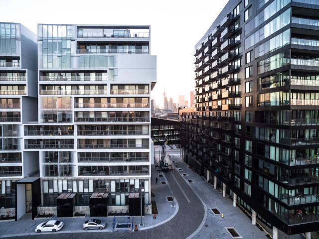
Toronto Pan Am Village in the West Don Lands | ?m | ?s | DundeeKilmer | KPMB

We notice all the greys in the photos, but there are pops of colour in the neighbourhood in the public art and various exterior cladding accents like the red frame on YMCA's facade. The public realm also makes up for any aesthetic deficiencies in the architecture. The various textures of fine pavers, granite curbs, quality public art and extensive landscaping are all engaging for the eyes.
People keep saying that, but at the risk of being repetitive, a neighbourhood with some colour in the buildings can have all those things too. The public realm is only a part of the neighbourhood; the buildings make a significant part of it too. And while I agree that the public realm is generally very good (aside from the awful River Square), why settle for only one of those two parts being engaging? We can have both. The few splashes of colour on the buildings do very little to reduce the oppressive character of the place. Hopefully newer buildings will be more colourful.
 
Why did I open this thread? It's the usual suspects having a good time at it.

It's grey. It's hardly the end of the world especially when there are many development sites still available. Need I remind you that attempts to introduce colour in Toronto have not turn out that well. There are few spandrel colours that look good. Greys on RCMI received positive reviews. Blues on 210 Simcoe, Periwinkle on Posthouse received negative reviews. (and there are many more)

Seriously, What do you guys want from a mass produced and investor driven market? All things considered, things are pretty damn good even if it doesn't compare well to a few cherry picked international developments. Just spend a month on the growing international forum.

So....basically. We should be happy with this dreary development because of a couple of other colorful developments that didn't turn out well? Is this what you're trying to say?

If you look around the world there are many beautiful buildings that make great use of color. Thing about this area isn't JUST the color. It's boring design with the most boring color of all (grey). On EVERYTHING! I don't mind whites, blacks, greys, etc, but must be done well. Red brick adds color without having to do much:

Mill-Ext.jpg


White may be boring, but with great design you get this:
75portland.jpg


Or this:
18705-63002.jpg


So it's a mix of boring design with meh materials and then add more grey from the streets, sidewalks and just about everything else. People and trees are not enough "color".

if your'e going to use greys and blacks you better have some good design and materials.
 
In other words, the problem here isn't colour or materials, it's the design. That stupid blue statue thing adds colour, but doesn't take away from the soulless feeling of the place. It adds to it. More poor design.

Thankfully the park is pretty great and the river city buildings are spectacular. We just have to hope for some equally beautiful buildings on the remaining sites - black and white or otherwise.
 
Europeans seem to like colour. I don't know why Torontonians have issues with it. For me, the grey in the Pan-Am Village feels oppressive. I am very effected by light and colour. This much grey just irritates me. I could never live here.

Black and white are the basic of colours, and grey is a mix between the two, add on top the buildings themselves aren't unique architectures and a blind person could see they cheeped out on an architect for bare basic modern pre-fab buildings with some public art stuck in between.
 
Well, my recollection of colour theory course never included the description of black and white as being " the basic of colours." That's a primitive understanding of colour, CodeMonkey. It's baseless denigration, too. White and black are pretty distinctive things in their own right. In terms of light, white is the combined presence of all colour and black is the absence of it.
 
Yeah, there's still a ton of remaining sites here, hopefully they at least add some red brick, if not great designs.

Well, hopefully they use the right firms to come up with some great designs. Back to River City.... Urban Capital seems to be doing some good things in terms of developing some really nicely designed buildings.. from RC 1,2,3, tableau, Nicholas, etc. Wonder what they'd do if they could work with this entire area.
 
Well, my recollection of colour theory course never included the description of black and white as being " the basic of colours." That's a primitive understanding of colour, CodeMonkey. It's baseless denigration, too. White and black are pretty distinctive things in their own right. In terms of light, white is the combined presence of all colour and black is the absence of it.

I'm talking more from an accounting standpoint than artistic standpoint, adding additional colours into the design would mean additional costs to the architect, so the went more for an basic design.

Come to think of it, isn't black an mixture of three colours? Cyan, magenta and yellow, not a absence of? Unless we're talking about colour light, then it would be absence of all colours.
 
I'm not bothered by the colour as much as the super-wide sidewalks. Nice but going always going to look empty. Certainly not very urban.
IMG_8420.JPG


The kids had fun with these columns. But putting retail behind them? I certainly wouldn't want to have a store back here.
IMG_8424.JPG
 

Attachments

  • IMG_8420.JPG
    IMG_8420.JPG
    387.6 KB · Views: 1,040
  • IMG_8424.JPG
    IMG_8424.JPG
    205 KB · Views: 1,041
I'm talking more from an accounting standpoint than artistic standpoint, adding additional colours into the design would mean additional costs to the architect, so the went more for an basic design.

Come to think of it, isn't black an mixture of three colours? Cyan, magenta and yellow, not a absence of? Unless we're talking about colour light, then it would be absence of all colours.
There's colour in terms of light and then colour in terms of pigment. Pure white light contains all the colours in the visible spectrum, or that's my understanding. So in that sense black does not contain all the colours combined.

In terms of pigment, if you added up cyan, yellow and magenta paint in equal amounts, you'd not get black - you'd get a pretty unattractive and dark mucky colour. Pigment's a far trickier affair than light.

But back to your point about additional colours in an architectural project costing more money - I dispute that. I don't think it's true at all. But that said, I do believe there's a historical propensity in this good, grey city to be fairly conservative in terms of our comfortability with vivid colour. It goes back an awful long way. bright, vibrant colour in our civic discourse tends to have a tough time of it here, for whatever reasons. I'm hoping that changes up (and possibly it's underway even now), but I'm expecting it to be a slow and painful transition.
 
Why did I open this thread? It's the usual suspects having a good time at it.

It's grey. It's hardly the end of the world especially when there are many development sites still available. Need I remind you that attempts to introduce colour in Toronto have not turn out that well. There are few spandrel colours that look good. Greys on RCMI received positive reviews. Blues on 210 Simcoe, Periwinkle on Posthouse received negative reviews. (and there are many more)

Seriously, What do you guys want from a mass produced and investor driven market? All things considered, things are pretty damn good even if it doesn't compare well to a few cherry picked international developments. Just spend a month on the growing international forum.
What do I want from a mass produced product? Well just sticking to the same general part of the city, how about this, with three different colours working together with the design and massing to create an engaging streetscape. Or this, with a variety of colours and textures creating an interesting building. Or even this, which is a bit of a dud at street level but is otherwise quite attractive thanks in no small part to its use of colour. All of these buildings are mass produced residential products, and there are many, many more around the city. There's nothing about mass production or an investor clientele that dictates a sea of grey. And there's a lot more to colour than adding a few red spandrel panels.

Hopefully we'll see some better design in future buildings in this area.
 
Last edited:

Back
Top