Toronto Pan Am Village in the West Don Lands | ?m | ?s | DundeeKilmer | KPMB

I really wonder how retail will do here; Longer term I think it'll be great but in the short term I wonder how they'll manage to stay open given the very little foot traffic I envision will be in the area for the first 5/10 years

I recall reading here that in addition to the developers selecting or curating the retail for this neighbourhood that the rents were lower initially as well and would increase over time as the area developed further. This may have encouraged retailers to take a more long term view of things. Someone else may be able to provide more info.
 
I recall reading here that in addition to the developers selecting or curating the retail for this neighbourhood that the rents were lower initially as well and would increase over time as the area developed further. This may have encouraged retailers to take a more long term view of things. Someone else may be able to provide more info.
That is certainly a very common practice and I suspect it's the case here.
 
Yeah, the retail was huge—the easy thing would've been to go Shoppers, Starbucks, RBC, Winners, see 'ya later, thanks. I'm actually more bullish about the prospects here than I was about DD because of the better integration of mixed uses, especially the Y and George Brown.

When there's nothing going on at Sugar Beach, the students milling about around Corus Quay are pretty much the sole contributors to that mini-hood's vibrancy. I expect GB's presence will have a similar impact here, although you've got the benefit of better retail, housing, and the Y.

Fully agree ADRM. The full GB residence plus the huge new Y should do wonders. Students are the ultimate 'animaters', adding youthful vibrancy. Plus the spillover from Distillery dog walkers, the burgeoning Corktown/River City/RP community, etc. Not to mention a great new short cut from River City/Riverside to the Distillery. And I can't wait to see the lighting at night. Hopefully up-and-coming retail will accelerate, if it's as successful as it should be.

As for the architecture, I don't actually mind it. It's more important to me that the whole area feels cohesive, and it appears to. Add sunshine, filled-out foliage, the planting of annuals, colourful retail canopies, and pedestrians in their colourful spring attire and this new hood may not look so dreary.
 
Last edited:
That really is depressingly grey; I know it doesn't help that the day was overcast, but it was just so underwhelming and neutered the shapes of the building.

Once the place gets bustling with more people and retail, and vegetation planted, it should be a lot better.
 
I love your videos @Torontovibe , and thank you for them, but could I give you a little friendly critique? Would it be possible to maybe use a more readable font? It becomes a little difficult to read when there is a lot of text on one screen. (Sorry, I don't want to discourage your posts and realize this criticism can be annoying.)
I like criticism, so no problem there. Which font would you prefer?
 
I like criticism, so no problem there. Which font would you prefer?

I guess if I had my say, I would go with a sans-sarif font, (I'm simple and like Calibri a lot) and take off the any condensing or bolding you might be using. Again, this stuff is so subjective and I think it's only when there is a lot of print in one small area that it really becomes an issue. Then again, I am just one man... ;)
 
Canary.jpg
 

Attachments

  • Canary.jpg
    Canary.jpg
    1.4 MB · Views: 862
Completely agree with the comments on the colours. The first word that comes to mind is bleak. Such a contrast to the Distillery with its warm reds with white and green accents, or any random traditional retail strip with a smorgasbord of colours even within a single building.

As for the architecture, I don't actually mind it. It's more important to me that the whole area feels cohesive, and it appears to. Add sunshine, filled-out foliage, the planting of annuals, colourful retail canopies, and pedestrians in their colourful spring attire and this new hood may not look so dreary.
You can have all these things with colourful buildings as well. And as it's been mentioned, Toronto has pretty bleak (there's that word again) weather for half the year and the tree foliage only lasts from May to October. I have no idea why modern architects think that muted and dreary colours for an entire neighbourhood are in any way desirable.
 
Completely agree with the comments on the colours. The first word that comes to mind is bleak. Such a contrast to the Distillery with its warm reds with white and green accents, or any random traditional retail strip with a smorgasbord of colours even within a single building.


You can have all these things with colourful buildings as well. And as it's been mentioned, Toronto has pretty bleak (there's that word again) weather for half the year and the tree foliage only lasts from May to October. I have no idea why modern architects think that muted and dreary colours for an entire neighbourhood are in any way desirable.
Give it a chance. People and retail will provide lots of colour and activity.
 
You can have all these things with colourful buildings as well. And as it's been mentioned, Toronto has pretty bleak (there's that word again) weather for half the year and the tree foliage only lasts from May to October. I have no idea why modern architects think that muted and dreary colours for an entire neighbourhood are in any way desirable.

I visited a relatively new area in Hamburg, Germany this October [Williamsburg], and found no shortage of colorful buildings. Would have been neat to see in the pan-am village.

upload_2016-4-9_19-27-39.png
upload_2016-4-9_19-27-47.png
 

Attachments

  • upload_2016-4-9_19-27-39.png
    upload_2016-4-9_19-27-39.png
    179.8 KB · Views: 765
  • upload_2016-4-9_19-27-47.png
    upload_2016-4-9_19-27-47.png
    189.6 KB · Views: 754
^Nice pics. Not only do those buildings have some colour, but they've been visually broken up into smaller horizontal pieces, at least the one on the right. That's something that a lot of modern architects don't seem to care about but it makes a big difference.

This whole place is the same shade of grey as the weather. Awful architecture, especially this gem.

View attachment 71990
photo by achender
lol...I'm trying to figure out what that two storey building is supposed to be. It wouldn't work well for retail, and it doesn't look like a very nice place to live. Either way it's not exactly an engaging streetscape to walk past. It looks like someone piled up some shipping containers and then just left them there.

Give it a chance. People and retail will provide lots of colour and activity.
The point is that you don't need to rely on seasonal vegetation and retail to make the neighbourhood look inviting. Having buildings that don't look like they were designed by Darth Vader makes a world of difference. The vast majority of neighbourhood main streets in the city have not only trees, people and retail, but also colourful buildings. There's no reason that the West Don Lands has to be any different.
 
Europeans seem to like colour. I don't know why Torontonians have issues with it. For me, the grey in the Pan-Am Village feels oppressive. I am very effected by light and colour. This much grey just irritates me. I could never live here.
 
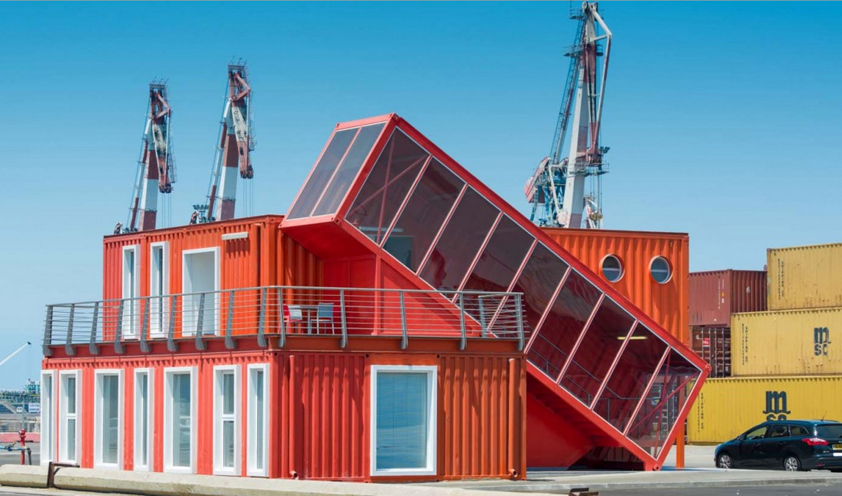
Actually I take that comment about shipping containers back. Comparing this street frontage to shipping containers is an insult to shipping containers. This is more visually interesting than any building I've seen so far in the WDL:

Shipping-Container.jpg

http://brainrack.co/finding-the-right-shipping-container-for-you/

I'm only half kidding.

Europeans seem to like colour. I don't know why Torontonians have issues with it. For me, the grey in the Pan-Am Village feels oppressive. I am very effected by light and colour. This much grey just irritates me. I could never live here.
I don't think Torontonians as a whole have issues with colour. Most of the pre-WW2 neighbourhoods have lots of colour, in the brickwork, trim, and storefronts. Ontario is supposedly the biggest market for red brick in the world, and red brick is synonymous with Toronto. But in the modern era architects and developers seem to want nothing to do with it, preferring grey concrete, pale green glass, and black brick.

I think if you compared the tastes of architects with the majority of the population you'd see very little in common.
 
We notice all the greys in the photos, but there are pops of colour in the neighbourhood in the public art and various exterior cladding accents like the red frame on YMCA's facade. The public realm also makes up for any aesthetic deficiencies in the architecture. The various textures of fine pavers, granite curbs, quality public art and extensive landscaping are all engaging for the eyes.
 

Back
Top