LowPolygon
Senior Member
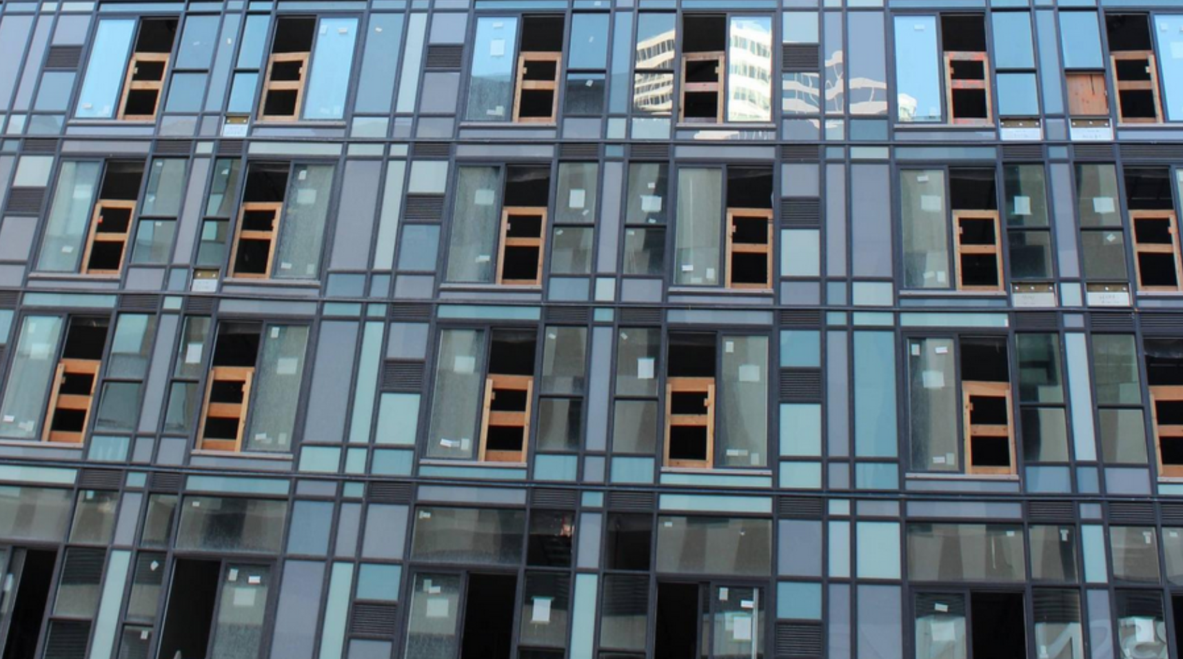
I find this thing to be tragically reminiscent of a cheap and tasteless Dollarama version of the ‘arts and crafts’ aesthetic. To me its just incredibly cheap and awkward looking, especially in person.
The larger point here is: I really hope that developers don’t start going ‘all jazzy’ with the spandrel.
With this building, as with 300 Front St West, and the YMCA Elm Centre around the corner, we are starting to see designers trying to be creative and colorful with a cut-rate looking material that doesn’t lend itself to colour or creativity.
What they will learn—hopefully sooner rather than later—is that it is impossible to use colour in an effective and interesting way when you are committed to using this particular cheap window wall and spandrel system.
The little bitty boxes of colour surrounded by heavy black, silver, white, or beige mullions is anathema to the elegance, beauty, mood and movement that colour can produce in a building. The only way to use this kind of heavy frame properly is through the principles of harmony and proportion--but that's way over the head of the modest talents who are responsible for these buildings.
Colour is already one of the harder things to handle, even for the best architects. The last thing we need are in-house design-build guys or middling journeymen trying their hand at creating "exciting buildings" through the use of colour.
Give me one of the all-grey aA boxes over this dreck any day…
(there are obvious exceptions. the Sick Kids Research building is one, for obvious curtain walled reasons. X uses its limited colours well. even Paintbox on Dundas East works, in its way...)