Toronto Montgomery Square | 84.12m | 27s | Rockport Group | RAW Design

Today.
D88AA687-AC75-4551-87FA-C829C7E21A30.jpeg
5C6E8D4A-7400-4D91-AE57-43196954A33E.jpeg
33516217-7125-4BA1-94ED-B2D63B7CD193.jpeg
A4D47137-2468-4D01-AF37-F17EC0945923.jpeg
0B2A9D51-105F-47E0-89F9-F0BF4E92CBEA.jpeg
60A04A14-7815-48E8-9189-C63EA89F1CA8.jpeg
34CC85A2-8250-4428-B115-5C523198D312.jpeg
 
Short of painting the limestone, what's a developer to do? I say three cheers for the materials, and the tower's a 7/10 for me (three points off for being a fairly boring box).

I think a darker spandrel colour could have allowed the limestone to visually 'pop' a bit more.
 
It's worth more than 5/10: there are no waist-height mullions to junk it up, and it's got real limestone spandrels and soffits.

A nice material like limestone doesn't get points just because it appears somewhere on the tower. Taken in abstract, the use of stone is nice, but is it conceptually relevant to the design of the tower here or something that was just slapped on? A developer would give this 7/10. An architect would have a different take. And I hope our standards on UT can be higher than "They tacked some limestone onto it... 7/10”.

The mullions and spandrel are all too light in colour, and the tower would look better without the limestone inserts which are really reaching for something and ultimately look cheap. A heavy limestone panel which is conceptually heavy doesn't "want" to be set into what is conceptually a light spread of glass over a building. There should be much more limestone on the tower to create the idea of chipping away or some sort of dialogue between the glazing and the stone. Instead it just looks like the developer and designers felt that tossing some limestone at the window wall system would somehow make it appear richer or as if they threw an extra 20 bucks at it. It teases the idea of something better (a tower with a substantially solid facade that gives way to some glazing, but falls very short of that.

On a more positive note, I do think the lower levels / podium are very nicely handled. The limestone soffit/frame detail is also well done, and the overall scale feels appropriate here. This feels like a better way to preserve a heritage building than a lot of what we see in the city, and the podium feels warm and part of a neighbourhood context.
 
Last edited:
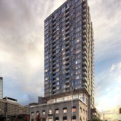
The box above may have been improved by making entire piers of limestone standing proud of the windows all the way to the top, but understanding that they've already put more money into this development's envelop than the average, I have a hard time criticizing anyone for going to the expense of including limestone in a window wall system. They have upped the quality of the facade and connected the tower to the base with the stone, and that should be recognized. Maybe all of the spandrels should have been limestone, and yup, the mullions really should have been darker: matching those of the windows in the heritage facades would have improved the tower. 7/10.

42
 
I'm a fan. Just wish there was a bit more activation to the plaza through some sort of sidewalk cafe but i understand there may be issues and difficulties due to the heritage building
 
Good to see progress on the retail, but it would have looked cleaner without the green flaps over the windows IMO.
 
Good to see progress on the retail, but it would have looked cleaner without the green flaps over the windows IMO.
The windows also had those little awnings before the redevelopment, except they were blue.
 

Back
Top