You are using an out of date browser. It may not display this or other websites correctly.
You should upgrade or use an alternative browser.
You should upgrade or use an alternative browser.
Toronto Max Condos | 113.99m | 36s | Tribute | Graziani + Corazza
- Thread starter AlbertC
- Start date
ShonTron
Moderator
Member Bio
- Joined
- Apr 24, 2007
- Messages
- 12,538
- Reaction score
- 9,534
- Location
- Ward 13 - Toronto Centre
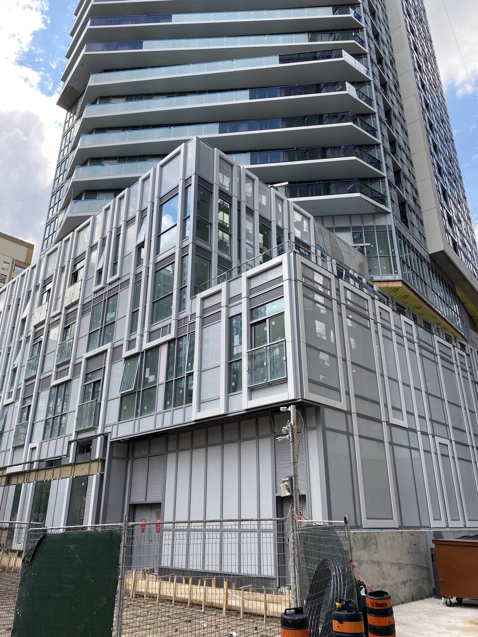
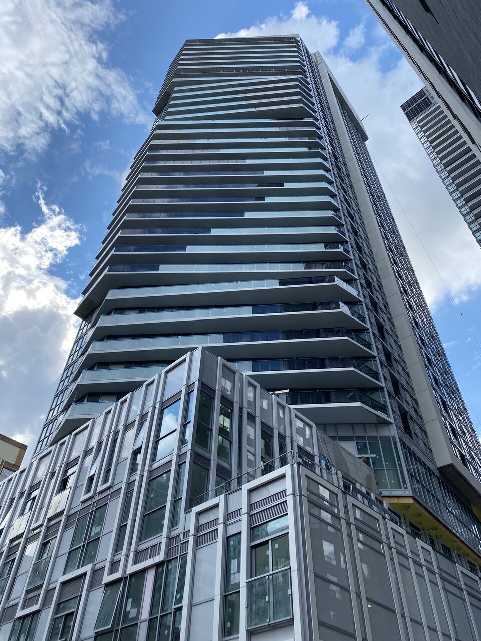
A million mullions. Here’s the view from the back alley.


ProjectEnd
Superstar
Utter horrorshow. Could very well be a new low in this cycle...
Rascacielo
Senior Member
And that's the most flattering view of this abomination.A million mullions. Here’s the view from the back alley.
View attachment 260105View attachment 260106
Amare
Senior Member
What did we do to deserve this? I nominate this for the worst new build of 2020.
Tribute should get a plaque plastered right in front of this development to celebrate their abominable accomplishment.
Tribute should get a plaque plastered right in front of this development to celebrate their abominable accomplishment.
Midtown Urbanist
Superstar
There will be some tight competition this year.What did we do to deserve this? I nominate this for the worst new build of 2020.
Tribute should get a plaque plastered right in front of this development to celebrate their abominable accomplishment.
isaidso
Senior Member
We build so many that look like that it's almost 'Toronto Style' at this point.
I made the mistake of perusing New York development threads the other day. It was uplifting looking at so many wonderful looking buildings but depressing when I returned back to look at ours. We're doing much better than 10 years ago and have some gems. That said, there's still a considerable drop off in quality and design standards between the 2 cities. We're supposedly building a premier global metropolis here. We need to do better.
I made the mistake of perusing New York development threads the other day. It was uplifting looking at so many wonderful looking buildings but depressing when I returned back to look at ours. We're doing much better than 10 years ago and have some gems. That said, there's still a considerable drop off in quality and design standards between the 2 cities. We're supposedly building a premier global metropolis here. We need to do better.
Last edited:
GenerationLee
Senior Member
Between 365 Church and this, I still have to say the former is worse..but barely. At least the balconies are...just a titch more creatively done, atleast in placement. The wave of colour thing is disgusting, but it distracts from the bad cladding of two sides of this tower....whereas 365 Church is painful on every side.
I don't get Tribute...I really don't. They did an alright job with Stanley Condos...the tower is great, the podium is meh...but then they have this....thing to further degrade any sense of architectural quality from this area.
I don't get Tribute...I really don't. They did an alright job with Stanley Condos...the tower is great, the podium is meh...but then they have this....thing to further degrade any sense of architectural quality from this area.
Midtown Urbanist
Superstar
I see your 365 Church and raise you one Design HausBetween 365 Church and this, I still have to say the former is worse..but barely. At least the balconies are...just a titch more creatively done, atleast in placement. The wave of colour thing is disgusting, but it distracts from the bad cladding of two sides of this tower....whereas 365 Church is painful on every side.
GenerationLee
Senior Member
At least Design Haus retains a facade and has a better street level than the other two projects. It's easily the same as 365 Church by materiality and creativity, but the retention of the facade at least saves the street corner from being a total disaster...you just gotta remind yourself to not look up unless it's pitch dark out haha.
Design Haus did not retain a facade. What's there now is a mediocre-to-poor replication of a facade that was torn down… it's little consolation, but yes, it's better that it's there.At least Design Haus retains a facade and has a better street level than the other two projects. It's easily the same as 365 Church by materiality and creativity, but the retention of the facade at least saves the street corner from being a total disaster...you just gotta remind yourself to not look up unless it's pitch dark out haha.
42
UtakataNoAnnex
Senior Member
I dunno...as a turd, this building has way more polish than "Design" Haus.
Last edited:
GenerationLee
Senior Member
Apologies...I totally forgot. I haven't really gotten to know the prior building too well. I think even if I had, the lack of sobriety I had passing by it on occasion would've warped my idea of whether or not this building currently going up was retaining it or not.Design Haus did not retain a facade. What's there now is a mediocre-to-poor replication of a facade that was torn down… it's little consolation, but yes, it's better that it's there.
42
GenerationLee
Senior Member
Retained*
coreybrendan
Active Member
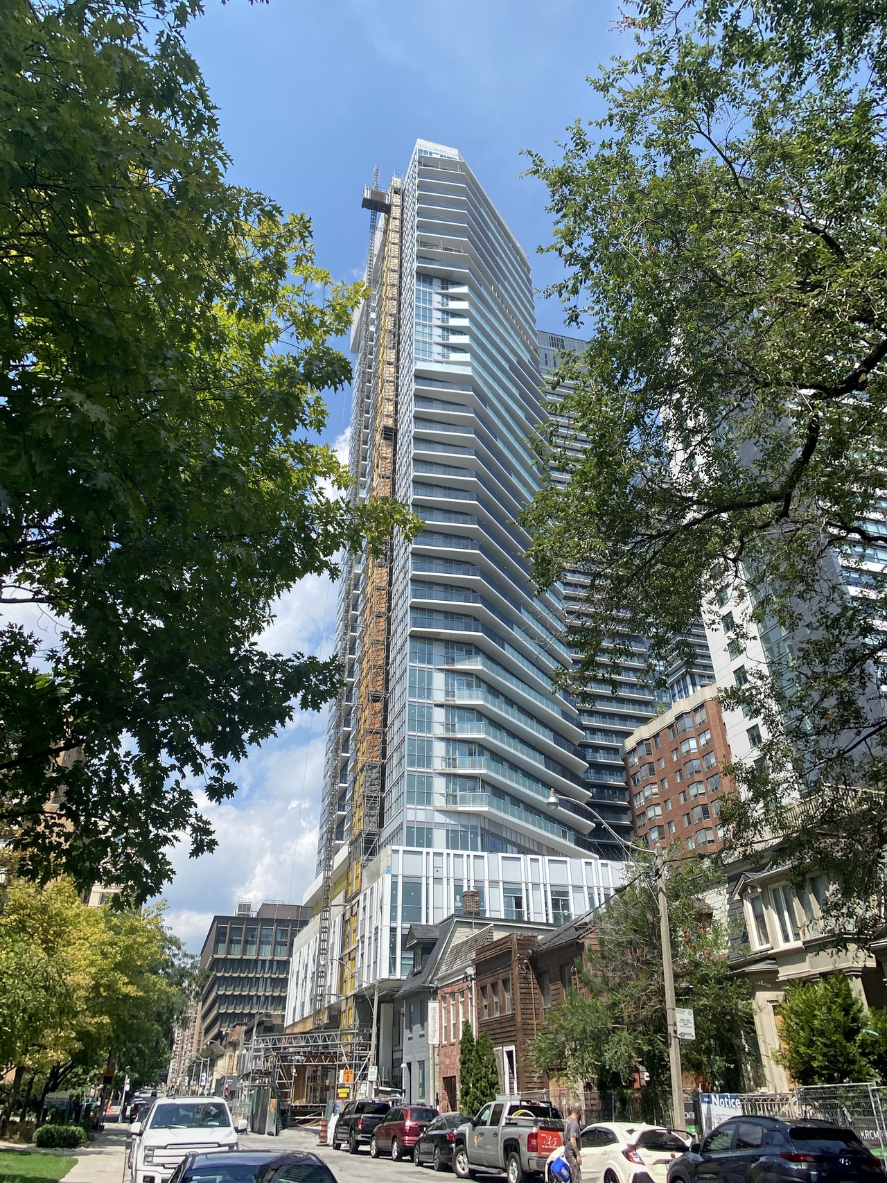
Taken – 08/10/2020
