Bogtrotter
Senior Member
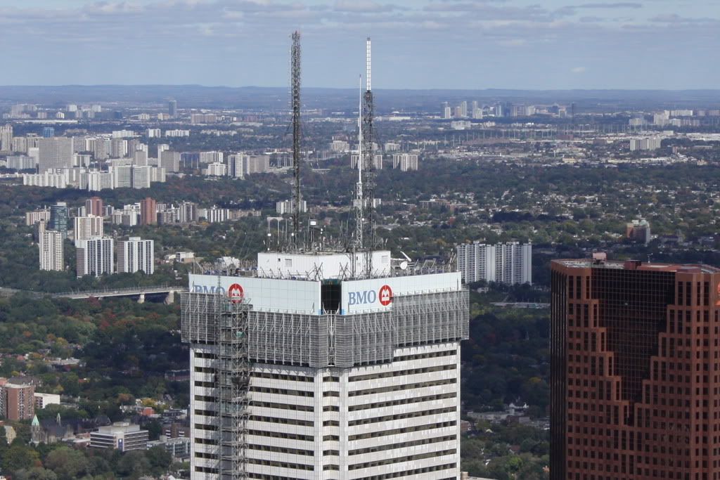
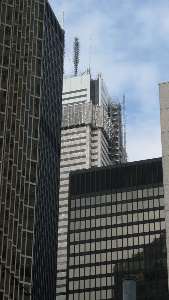
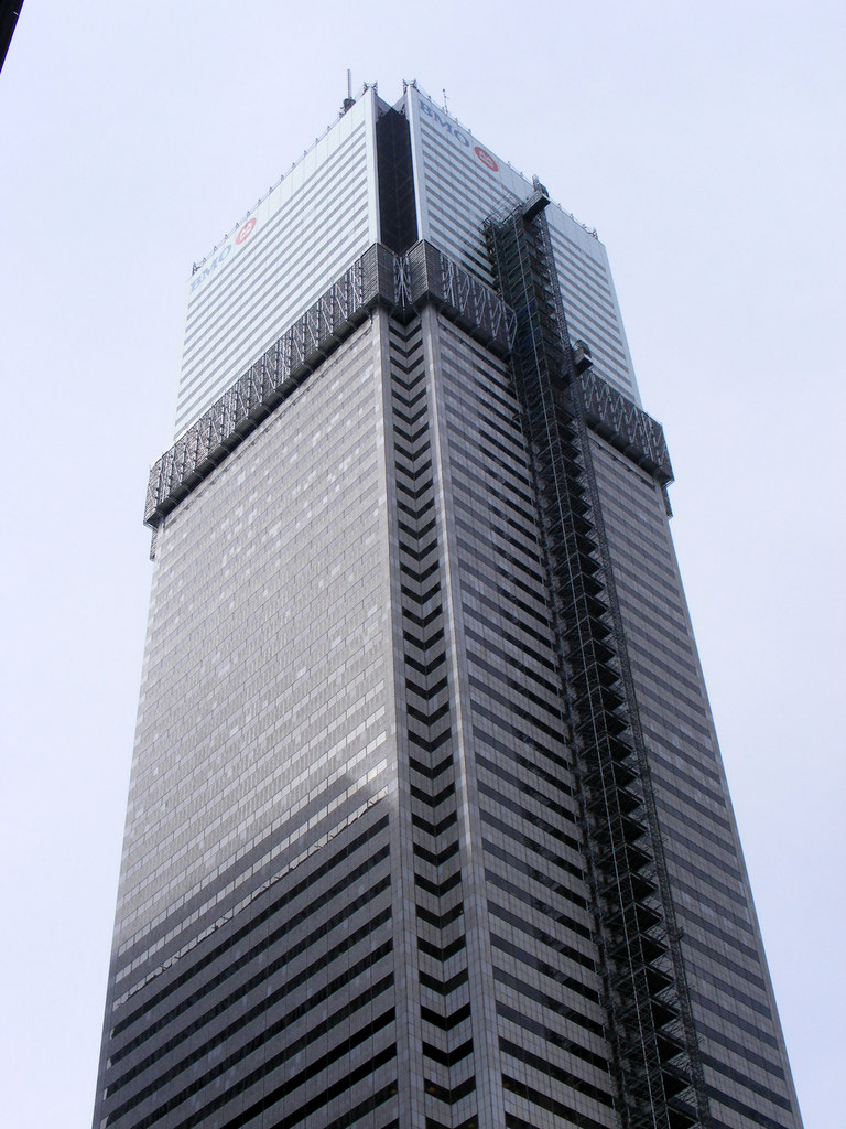
I've always liked this tower, despite the grumblings from the architectural experts that it is a clumsy example of the Int'l style. For me it was our equivalent of the old Standard Oil building or perhaps even the WTC in Manhattan. As the largest tower in Commonwealth and the tallest skyscraper in the world out side of NY and Chicago at the time, it was a symbol for Toronto that we were also a dominant centre of finance and influence. I would have liked it to have been restored to its original white as built by Olympia and York. As it stands now it looks less than the solid 'ivory tower' that was intended by the Reichmann's. Yes it's cleaner looking, but the dark corners now force the white to register as a greenish paneled facing- and with this, for me anyway, the overall presence of the building has been diminished.

")


.jpg?psid=1)