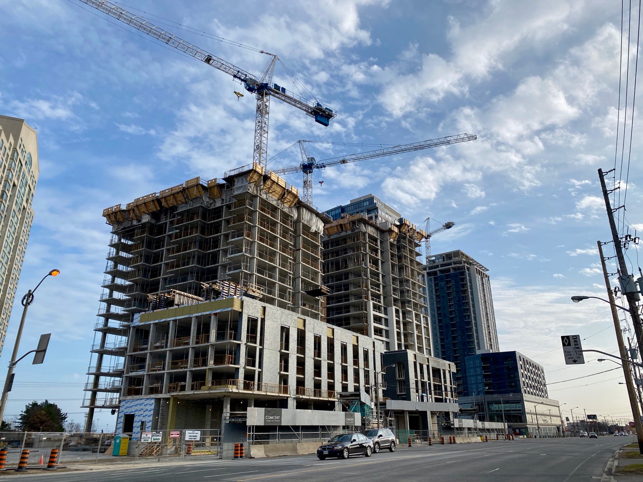
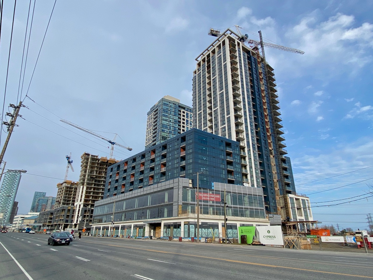
It's been 13 months, 3 weeks since I've been this far west on Dundas, and in that time, what with this and two more buildings rising at The Kip District next door, this stretch has taken on quite a different feel, now that it has some of the density and reinvestment that this street has been crying out for.
In this pic, Cypress at Pinnacle Etobicoke is in the background with the cluster of Kip District buildings finally making this area feel… like a district.
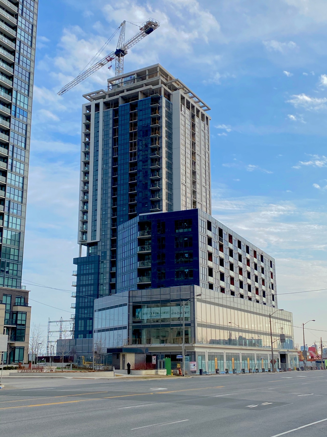
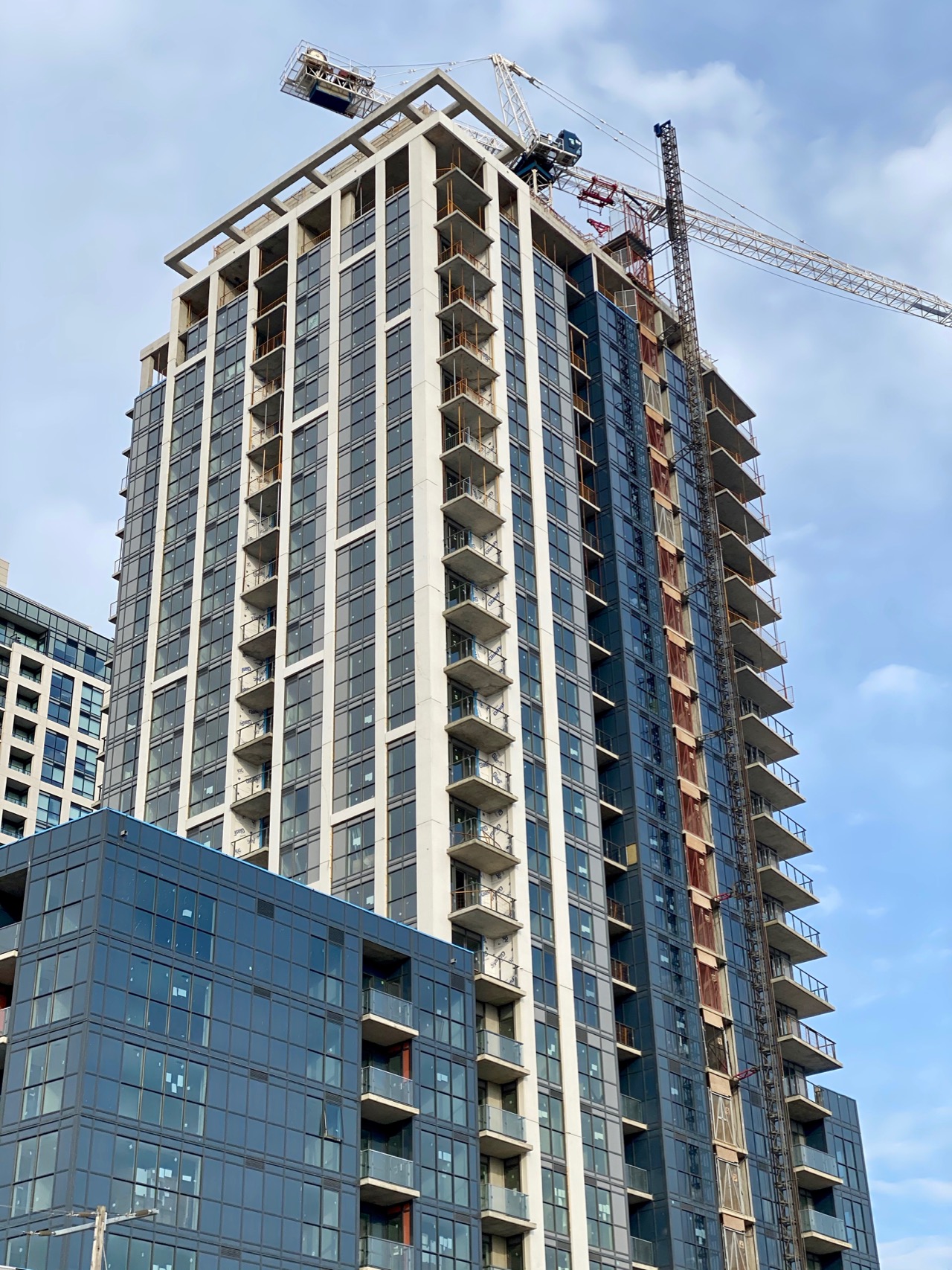
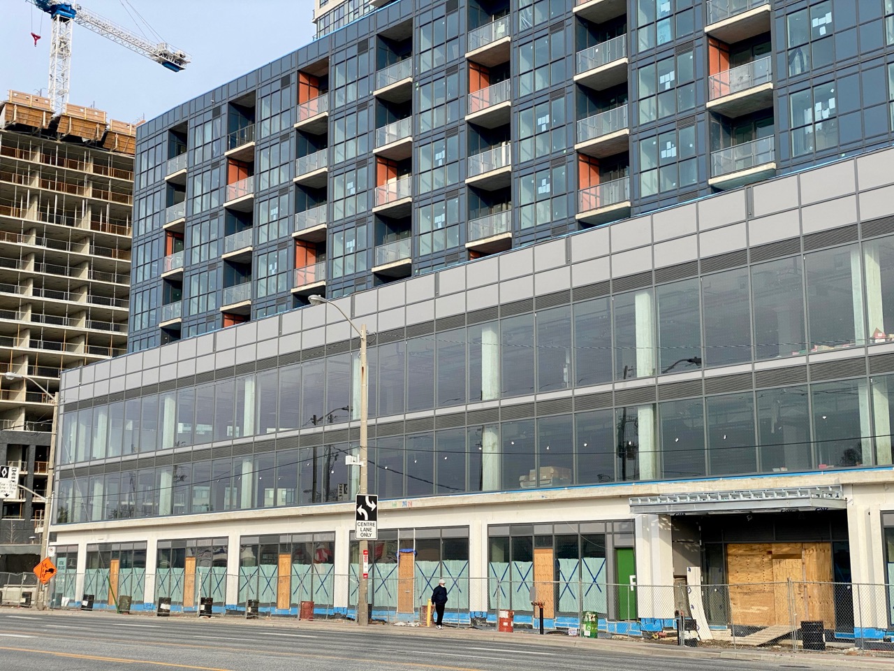
Good to see that the commercial podium has slender mullions and full height windows. It's also good that there is at least some precast breaking the sidewalk frontage into bays… but a little more masonry would have been welcome on more of the building. At least the tower above has some of that, but it and the residential podium floors are standard window wall with waist-height mullions… so, cheap. Glad to see a visor atop the tower: at least there's some money being spent on design up top.
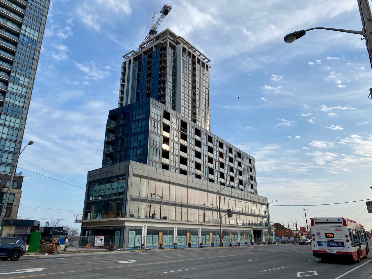
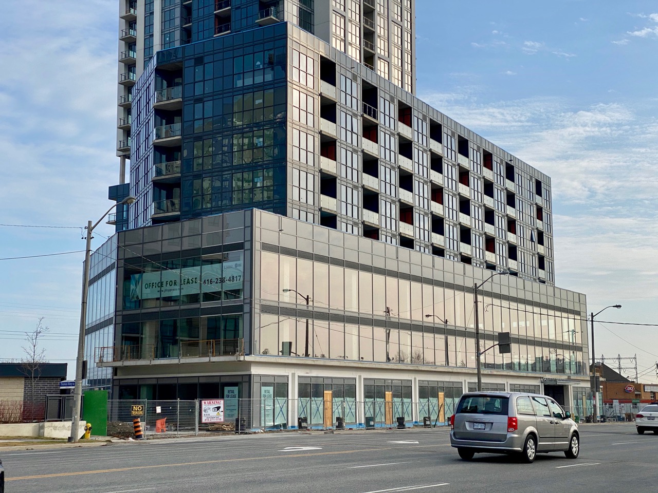
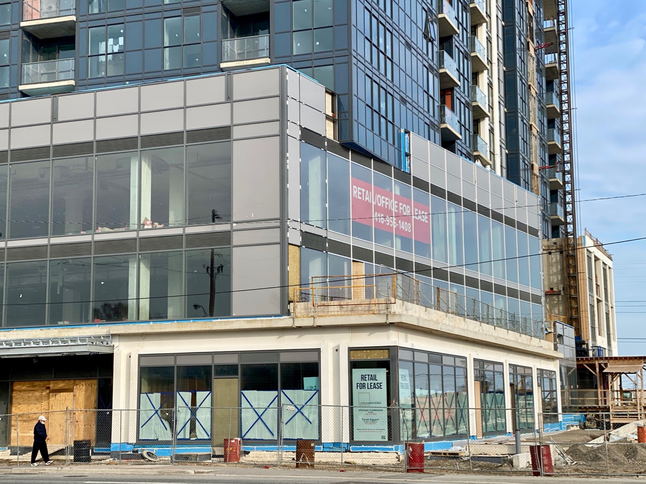
One design nod atop the commercial podium: on its west side, the rectangular residential floors above overhang the trapezoidal commercial floors, and despite the cheapness of the residential cladding, I like that it slices through. The effect won't be complete, of course, until a few more spandrel panels are applied. Again, at least it's something indicating thought put into the design.
42
In this pic, Cypress at Pinnacle Etobicoke is in the background with the cluster of Kip District buildings finally making this area feel… like a district.
Good to see that the commercial podium has slender mullions and full height windows. It's also good that there is at least some precast breaking the sidewalk frontage into bays… but a little more masonry would have been welcome on more of the building. At least the tower above has some of that, but it and the residential podium floors are standard window wall with waist-height mullions… so, cheap. Glad to see a visor atop the tower: at least there's some money being spent on design up top.
One design nod atop the commercial podium: on its west side, the rectangular residential floors above overhang the trapezoidal commercial floors, and despite the cheapness of the residential cladding, I like that it slices through. The effect won't be complete, of course, until a few more spandrel panels are applied. Again, at least it's something indicating thought put into the design.
42