News   Nov 27, 2024
 614     3 
News   Nov 27, 2024
 572     1 
News   Nov 27, 2024
 903     0 

Toronto Crosstown LRT | ?m | ?s | Metrolinx | Arcadis

D
I thought they were pretty much scrap now that the company that built them, has exited the TBM business. I'd think there's be parts issues and rehab issues. Wasn't this their last contract?
Depends on their condition
If they can be refurbished they can be sold off albeit at a steep discount
 
I notice the TBM's will be removed to a storage site. Does this mean they can be reused for other projects? If so, would that make a continuous transit build marginally cheaper than the stop-start approach we follow?
Apparently, it needs refurbishment, and new TBM's are more efficient. For short tunneling**, it would likely be worthwhile to reuse.

** - (such as SELRT from Don Mills to Consumers, Sheppard subway - same stretch, Sheppard subway from Sheppard GO to STC - because the part in between would be cut-and-cover, B-D if it were to go under 401 from STC to Sheppard - since the Kennedy to STC part would be built by cut-and-cover)
 
I notice the TBM's will be removed to a storage site. Does this mean they can be reused for other projects? If so, would that make a continuous transit build marginally cheaper than the stop-start approach we follow?

Also consider that TBMs are a very small part of overall subway construction costs. Cost savings from refurbing TBMs are negligible in the grand scheme.
 
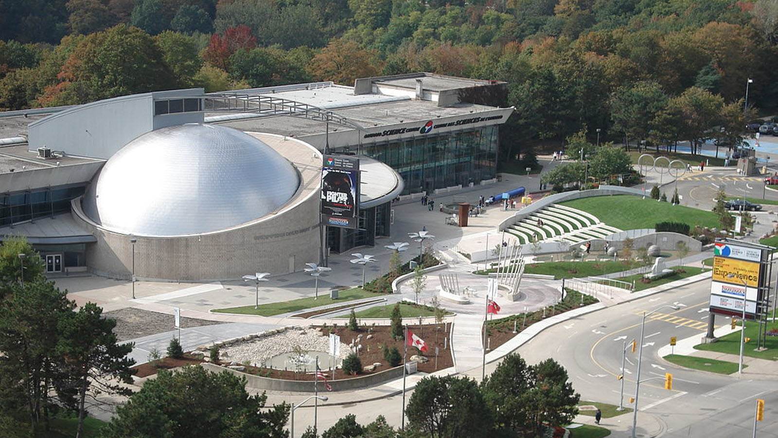
Just wondering if the penny-pinchers will force the building of a "21st century washroom" design for the Science Centre Station, or will they actually build something that will complement the Ontario Science Centre next door to it.

Ontario-Science-Centre_HD.jpg


Or will it come later.
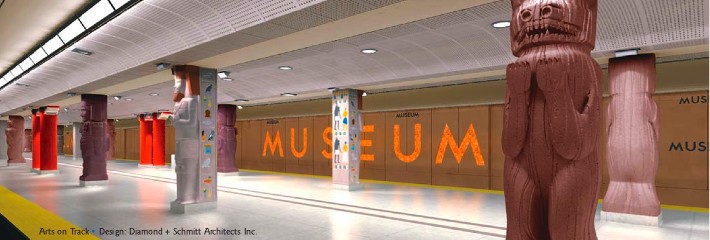
201793-museum-stat.jpg-resize-_opacity_100-frame_bg_color_FFF-gravity_center-q_70-preserve_ratio_true-w_2184_.jpg
 
I'm impressed with the refurbish of the Museum Station. It initially struck me as tacky, but with the new tiles and colours, it really works, and in a relatively compact space.
 
Like this? If you read the desciption, the Red not is Oxygen, and the 2 blue ones are Hydrogen, to represent a water molecule. (although I though the angle between the two is too flat.

That's actually a pretty cool idea, and it'd be great to have more open concept stations in TO. That creator makes a lot of great Sketchup models, some of which can be publicly accessed in the 3D warehouse.
 
I'm impressed with the refurbish of the Museum Station. It initially struck me as tacky, but with the new tiles and colours, it really works, and in a relatively compact space.

Just don't look at the ceiling. It looks like its unfinished.
 
Just don't look at the ceiling. It looks like its unfinished.
Yes, it could very well be...quite a few TTC stations, even the newest ones, seem to have a massive blind-spot in finishing them. It doesn't take much to throw-off the entire visual effect by overlooking what's 'above your head'. I'll check that out next time through there. If that does ruin the look, it would be very easily remedied. lol...easy to say...we are dealing with the very cash-strapped TTC.

I noted that in a poll of the "ten best TTC stations" one of my favourites, Dupont, scored very highly (although some of the surface structure needs work, especially the poured and unfinished concrete at sidewalk level) and Museum also scored right up there. It has a very warm, inviting feel to it, totally opposite to the 'giant washroom' it was prior.

Edit to Add:
Here's both mine and Edward's points made:
BEST

Dupont
Opened in 1978, Dupont is a perennial favourite of TTC riders for its mosaic tiles, dome entrances, and built-in benches. The attention to detail here is far greater than at the vast majority of stations on the line, for which kudos should go to Dunlop-Farrow Architects.

Rosedale
Stop and consider how well Rosedale Station is integrated with the natural landscape in which it sits the next time you pass through. Its rounded entrance has an understated mid-century elegance, which was even more apparent with its original Vitrolite tiles.

Old Mill
Many would argue that Old Mill is the fairest TTC subway station of them all on account of its predominantly glass walls that look out over the Humber Valley. Unlike Rosedale, there's some protection from the elements at platform level, but you still feel outdoors.

Downsview
The nicest of the new(er) TTC stations, Downsview was designed by Adamson Associates Architects and Stevens Group Architects and opened in 1996. Many have noted it has an airport-like feel, though I've always loved the way that that ceiling is rounded at platform level before opening into a multi-storey atrium on the way to the bus bays.

Eglinton West
I've heard this station derided for its ugly concrete, but it's hard to argue against its modernist aesthetic when driving south on Allen Rd. Built into the mound that takes drivers off the freeway and onto Eglinton Ave., this Arthur Erickson design is in fact a lovely bit of architecture, including the original platform-level windows and the green roof added in 2009.

Queen's Park
The closest you'll get to riding the London Tube in Toronto is Queen's Park and its sister station St. Patrick, both of which were hollowed out using a tunnel boring machine so as to lessen the impact of construction on the nearby hospitals. Which station one prefers is usally a matter of colour preference, though the newer second entrance at Queen's Park edges it for me.

Museum
Oh, Museum. Sure to be the most divisive entry on this list, some love the quirky themed design while others lament the loss of a near perfectly preserved 1960s subway station. For my part, I think the novelty of the design is worth kudos even if the budget never allowed for the work to seem entirely finished.
http://www.blogto.com/city/2016/05/the_best_and_worst_ttc_subway_stations_in_toronto/

There's a commonality with the poll I saw elsewhere.

Second Edit to Add: Just looked at the pic of Museum above and more on-line. OMG...the ceiling isn't as bad as some, many they've torn down the white metal strips ostensibly for maintenance work, and not replaced them, just painted the void black, but that is a pretty horrendous view. What were they thinking besides limited resistance to dust accumulation for the glossy white finish? It makes white patent leather shoes look demure.
 
Last edited:
One problem with the Montréal Metro when it first opened in 1967 was that the light fixtures were very inaccessible to reach to change the light bulbs or clean them. Hopefully, the Eglinton LRT stations will have accessible light fixtures for the maintenance crew.

One problem remains with the Montréal Metro is that it is still very inaccessible for wheelchairs, or the elderly, or those with broken legs or baby strollers. Toronto is way ahead, with the last old station to become fully accessible by 2025 (MUSEUM station, for example, by 2024. So there is still work to be done with the MUSEUM station.). See link. The Eglinton LRT will be accessible when it opens.
 
The TBM cutter head from Don is now out of the tunnel. Boy, that sucker is huge. It will be hauled away this evening.
 
Just don't look at the ceiling. It looks like its unfinished.

I know, right. The ceiling was supposed to look like this:

MuseumRenaissance_1.jpg


But like seemingly everything with the TTC, from the non-tiled platform walls in newly constructed stations and lack of grade-separation at the Leslie-Eglinton intersection, pinching pennies seems to be The new Better Way.
 

Back
Top