Toronto Corus Quay | ?m | 8s | Waterfront Toronto | Diamond Schmitt

Maybe they can throw a couple masts and sails on the roof just for you.

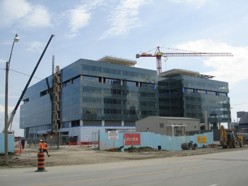
:) Well that's sort of the other end of the spectrum in terms of completely ignoring the waterfront context or pandering to it. Neither are the right approach. There have to be better and more interesting ways, and there certainly are. That said, a square and squat business-park structure is definitely not the right way to go.

This building fits its context remarkably well with respects to the East Bayfront masterplan and it's midrise lakeside promenade. The fact that it is currently surrounded by nothing currently emphasizes its bulk and greyness.

I'm not necessarily criticizing the more quantifiable aspects of context here(building height, zoning, land use etc) so much as the more aesthetic and/or civic ones:

A) This building may be the right height etc. but its bulk makes it feel like a bunker. Its surfaces reflect outwards rather than drawing in. It is heavy and dark with no sense of lightness or movement that would echo the surrounding natural context of wind and water and air. Its aesthetic language screems 'keep out' rather than come by, come in and come through. It is grey, lifeless and dismal which does not in any way reflect the pleasure we feel and go to find collectively and culturally when we are by the shore.

B) Civically this building also disappoints. Torontonians have high expectations regarding waterfront rejuvenation, and rightfully so, anticipating more thoughtful design for this long under-valued and wasted asset. Creating what is essentially a bunker seems contemptuous of these aspirations. For a previous generation it would be akin to Diamond designing a Victorian wedding cake-structure for City Hall at NPS, completely ignoring the aspirations of the post-war generation in Toronto.

I like Corus Quay and think the criticisms have been a little too much about the sackcloth and ashes. But we do need to have something monsterously tacky and garish sitting in our skyline. It'll do us some good.

The issue of 'icons' or cheap tricks on the waterfront is misleading: not every building needs starchitecture-designed masts and sails to fulfill this aesthetic and civic context.

...They'll make a nice set, and look lovely together from the lake - the long horizontals of Corus and Pier 27 - with George Brown no doubt expanding the context they set.

Ladies with those figures shouldn't be wearing horizontal stripes:D
 
This building may be the right height etc. but its bulk makes it feel like a bunker. Its surfaces reflect outwards rather than drawing in. It is heavy and dark with no sense of lightness or movement that would echo the surrounding natural context of wind and water and air. Its aesthetic language screems 'keep out' rather than come by, come in and come through. It is grey, lifeless and dismal which does not in any way reflect the pleasure we feel and go to find collectively and culturally when we are by the shore.

I agree somewhat although it is an office building afterall. The exposed ground level frontages do appear to engage eventhough the atrium roof may not be up to UT's impeccable standards. I still think it's oppessive greyness is by and large a product of its curently oppressive gray surroundings. I believe it will lose much of that quality once the colourful landscaping, promenade, and additional buildings are completed. Sugar Beach is supposed to be the focal point and not Corus. Whether Sugar Beach lives up to its potential remains to be seen.
 
Your reading of color as an antidote to the effects of age however, is an interesting departure from your traditional stance that it is simply the bane of 'good' urbanism.

Nice try, but not borne out by the facts of what I've said - in admiring the use of colour in buildings such as 'X' compared with Spire, for instance...

The blues, reds and yellows of Broadway Boogie Woogie. Mies and Mondrian.

A nice counterpoint to Spire's zippy verticals.
 
It is heavy and dark with no sense of lightness or movement that would echo the surrounding natural context of wind and water and air.

If you look at photographs of the building, taken under varied lighting conditions and posted on this thread by people such as torontovibe, smuncky, grey and drum118, you'll see that isn't the case. It adapts well to ambient lighting conditions, reflecting both sky and lake, as only grey can ( check out the opera house at different times of day to see how that works ). Strongly horizontal and subtly banded it levitates above the clear glass lower floors, helped along by the distinctive overhang.
 
Clear glass lower floors? Maybe on the south side, but that which faces the road is where Jacky the wonder boy Diamond decided to put exhaust vents and other such pieces of the mechanical puzzle. Genius.

You can see it in Torontovibe's photo:

PAINTYERBURGERS-JULY25-09040.jpg
 
Clear glass lower floors? Maybe on the south side, but that which faces the road is where Jacky the wonder boy Diamond decided to put exhaust vents and other such pieces of the mechanical puzzle. Genius.
Ultimately, 'that which faces the road' will be concealed by (an)other building(s) so it makes sense to put the exhaust vents and other mechanicals where they are. OMG, am I defending Diamond?!
 
No, condovo. Unlike peevish PeeEnd, you're defending common sense.

Delivery vehicles won't be rolling through Sugar Beach and backing into the atrium from the south, nor will the public enjoying the waterfront promenade have to deal with the perfectly acceptable and functionally honest location of such aspects of the building, nor will employees and visitors who arrive along the Quay have to enter the building from the south. They're located where they make sense, and aren't disguised as something they're not.

You're right Shocker, that would be the only other way to incorporate those functional elements of this building - silly me.
 
I just got back from Centre Island this afternoon. This building is a stump; it's width feels really awkward for its height. I'm liking the glass and shape, it just needs to be a lot taller.
 
Basically, Toronto gets another warehouse building. It's J.D's version of a c.1910 red brick warehouse. A future loft conversion c.2085?

Well, why not? Fundamentally, btw/the Star, LCBO, Redpath and this, it's the "warehouse district" zone of Queens Quay--even Loblaws and Guvernment kinda fit the scenario...
 
Well, why not? Fundamentally, btw/the Star, LCBO, Redpath and this, it's the "warehouse district" zone of Queens Quay--even Loblaws and Guvernment kinda fit the scenario...

funny enough, the guvernment was called the "warehouse" back in the day.
 
this is where the big boys come to play... look at all those post counts! (and +1 for me too!) Tewder and PE, I really couldnt add much to what you guys say here... thanks for fighting the good fight. Though in this case its a bit hopeless since the thing is already nearing completion...
 

Back
Top