fred
New Member
There is a silver lining though, BSN won't be noticeable from the East side after this is built.
That will be one blessing indeed.
There is a silver lining though, BSN won't be noticeable from the East side after this is built.
Casa 2

If so-called 'minimal design' cost less, why would someone like Taniguchi claim that "if [he] had enough money, he would make the architecture disappear entirely?"
beyond loose application, more like downright incorrect application.
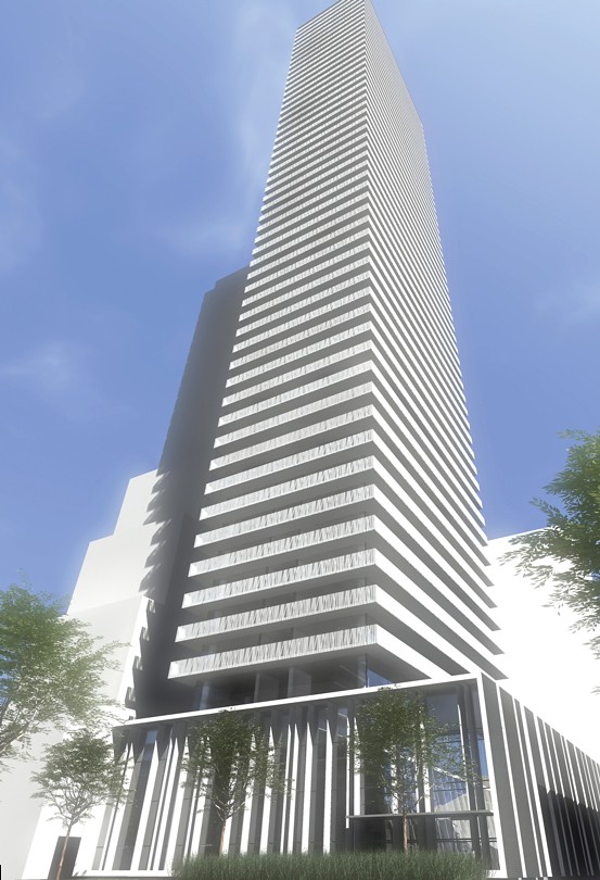
Its a sketch, a freakin massing study. got my hopes so high when i saw the word "rendering"
Sorry to disappoint. My wording was out of context.
Yes it looks just like Casa, hence the name Casa 2.
There is a silver lining though, BSN won't be noticeable from the East side after this is built.
If so-called 'minimal design' cost less, why would someone like Taniguchi claim that "if [he] had enough money, he would make the architecture disappear entirely?"
There needs to be more variation, even in minimalism. With repetition, all that may be achieved is the appearance of cheapness and banality.
With repetition, all that may be achieved is the appearance of cheapness and banality.
There is usually a fair bit of variation between aA projects. They've designed many buildings with a range of design elements such as balcony arrangements, mullion placements, fins, "hats", dabs of colour, podiums, and point towers. The buildings tend to be well proportioned and meet the street well. Typically, the results are above average. There are some exceptions such as this repetition of Casa, but even this project has the better balcony glass relative to that of Casa, and a more engaging podium (at least during the day). It seems to address Casa's weaknesses. But the repetition of the wraparound balcony with glass railings doesn't strike me as satisfactory in that it's very basic. It's tastefully contemporary if done once, but harder to justify on multiple towers.wmedia said:Absolutely. It's not the design per se, but the endless repetition. Any interest I had in aA has been diluted due their total lack of imagination. I cringe every time I now see their name associated with a project, as I know exactly what we'll be getting without even seeing a render.
Surely this is wrong. If you don't like the design, fine. But the repetition of good materials and/or design is the foundation of the best cities and projects. Is TD Centre banal because it has 5 towers of essentially the same design? On a larger scale, look to Paris or New York. Block after block of the same style of building, with no more variation than you would find between Casa and Karma. I always chuckle when people respond to the post of an aerial picture of Toronto with a complaint that everything is brown and grey. Some of the greatest cities in the world are composed mostly of beige stone.
There is usually a fair bit of variation between aA projects. They've designed many buildings with a range of design elements such as balcony arrangements, mullion placements, fins, "hats", dabs of colour, podiums, and point towers. The buildings tend to be well proportioned and meet the street well. Typically, the results are above average. There are some exceptions such as this repetition of Casa, but even this project has the better balcony glass relative to that of Casa, and a more engaging podium (at least during the day). It seems to address Casa's weaknesses. But the repetition of the wraparound balcony with glass railings doesn't strike me as satisfactory in that it's very basic. It's tastefully contemporary if done once, but harder to justify on multiple towers.
Paris would get criticism for the repetition of its 19th century blocks; however, the beauty is in the vistas which showcase individual landmarks, and the comfortable proportions of its streets with superlative refinement and design of the public realm. The repetitive blocks become a harmonious background to the city's grand achievements in architecture and planning. If the repetitive blocks were all there was to Paris, it would be rather unremarkable architecturally. You're right that repetition can be very effective in terms of architecture, but there has to be some evident purpose to it. Advancing a 'vision' of basic wraparound balcony and curtainwall isn't going to cut it.