Toronto Aura at College Park | 271.87m | 78s | Canderel | Graziani + Corazza

July 20th:

vQ9CPFg.jpg
 
July 21

I was taking a photo of the street sign, so I`d know where I was, and all of a sudden this monster skyscraper popped into the frame.

Photobomber :p


IMG_1344.jpg
 

Attachments

  • IMG_1344.jpg
    IMG_1344.jpg
    93.6 KB · Views: 778
Monstrous indeed ^ as much as i like the dominance, to your average viewer, this tower would have been a lot more eye pleasing had the setback been lower on the Yonge side. I've said this before, but having more of the curved portion visible would have been a lot more graceful. but heck, the way it is looks tall as hell!

Today:


DSC_0216 by stevevephotostream#1, on Flickr

*On a side note, does anyone know why my flickr pics look slightly blurry on the forums but much clearer on my flickr page? I've noticed this over the past few months, it could be my screen resolution... hmm.
 
Monstrous indeed ^ as much as i like the dominance, to your average viewer, this tower would have been a lot more eye pleasing had the setback been lower on the Yonge side. I've said this before, but having more of the curved portion visible would have been a lot more graceful. but heck, the way it is looks tall as hell!

I don't recall you mentioning that before but I think you make a good point there. When walking past observers can't even see the top setback portion because it's so high. Flipping the setbacks may have been a good call for that reason plus it's the better looking side and the side that will be more closely observed with all the pedestrian traffic.
 
exactly ^ why they made the west setback shorter than the east hasn't yet crossed me. Especially since the immediate area to the east is relatively low lying and quite the opposite toward bay.

anyhow. this photo below best illustrates the how unnecessary the balconies were down the middle of the building's south side. equally odd how they abruptly stops where the west setback is.


DSC_0223 by stevevephotostream#1, on Flickr

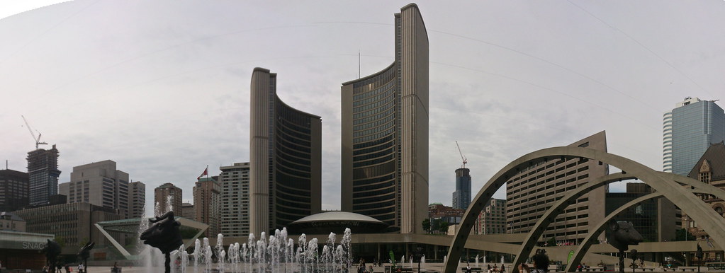
But heck, this tower looks quite stunning from city hall:


City Hall Pano by stevevephotostream#1, on Flickr
 
You may think the balconies down the middle of the south side are unnecessary from a design standpoint, but I would not live in one of them if it didn't have a balcony.
 
That is one hell of a photo MafaldaBoy. Loved all the updates today, but this might be your best shot of the day! Cool to see the crane and first few floors of X2 peeking out from behind Aura.
 
Gotta say, Aura is starting to looking pretty decent, especially in sMT's second to last photo. Nicely framed image next to Eaton's College Park (Winners). Great shot! I'm feeling more optimistic that the building will end up looking good on completion.
 

Back
Top