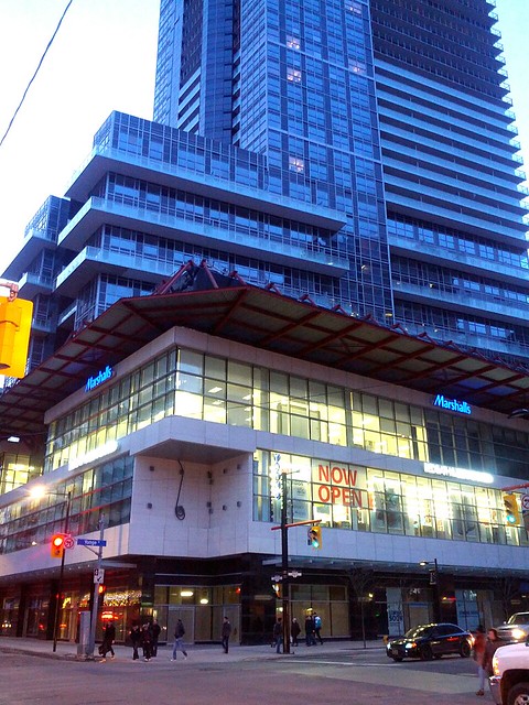
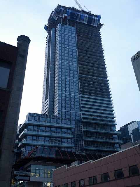
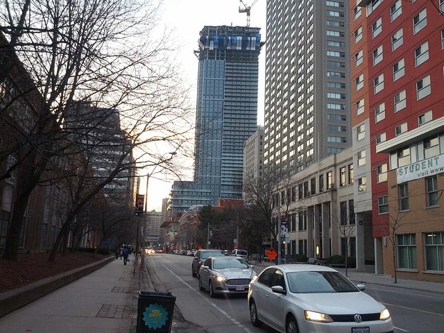
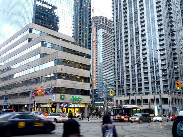
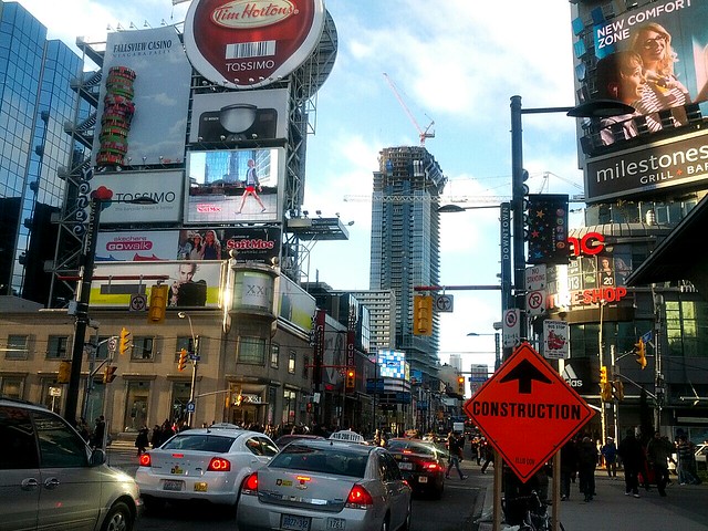
Toronto Aura at College Park | 271.87m | 78s | Canderel | Graziani + Corazza

Toronto - for some quirk of history - doesn't build many notable buildings during non-box phases of skyscraper architectural history.

Good point. I'd always thought the same, although I've found expressing a fondness of PoMo on here is usually met with the same reaction as saying you like Apple products on an Android forum. It's difficult to fathom, considering one of the finest buildings in the city, Scotia Plaza, is an excellent example of said style.

My view is that any healthy city has to have a mix of bad, average, and great structures, of many styles. Anyone who obsesses over a certain level of quality and style is only going to live a frustrated life. That's not to say we shouldn't strive for the best, but we must accept the rest (that wasn't intended to sound like a slogan!)

Aura is impressively unapologetic, and for me, symbolizes massive immigration into a boom city. I think it's still premature to comment on the quality of the external finishes until the building is complete.
 
As a non-sequitur, they've started installing the curtainwall up the middle of the north elevation, where the hoist is/was. I think it's the best view we've had so far of what the curtainwall actually looks like (you can never tell until you get a few floors of uninterrupted wall up, at least that's my opinion), and it gives an indication of what the upper portion will look like (it's darker and greener than I expected). I also didn't realize that the tip of the curve runs all the way down. I guess with the hoarding up I had always assumed the floor slab was squared off on the lower floors.

There's also some activity in the basement. In addition to the one hair salon that had already opened up there's also signs up for a beauty salon and a snack counter, two other units have had interior finishing done but no indication of what businesses are going in, and a few other units have building permits/renderings up of what's to come. I doubt it'll ever be destination retail, but it might at least shape up to be of use to people living in the building

It's amusing but also a little sad that a post on the progress of actual construction had to be introduced as a "non-sequitur.". But thanks for the post!
 
It's difficult to fathom, considering one of the finest buildings in the city, Scotia Plaza, is an excellent example of said style.

I contend that Scotia Plaza is PoMoLite. The Lillian H. Smith Library on College has got to be Toronto's best true PoMo building. I'm just thankful we didn't get any of the OTT Robert Graves stuff. His stuff for Target is much better than his stuff for Portland, etc. (although I might take Graves over Aura).

42
+1

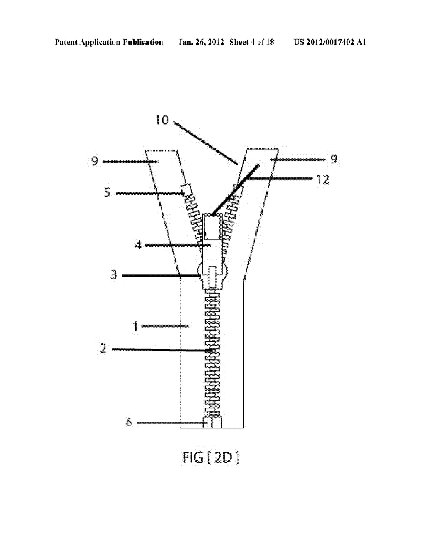
one upside down ziggurat doth not a pomo building make. it does make it look like a open zipper however:

20120017402_05_zpse5866022.png
 
PoMo has to reference history in some aspect. The essence of any post-modern piece of art is self-consciousness. I don't know what Scotia plaza is but it's not pomo.
 
It's post modern in the sense that it came after modernism. We could get into a long debate over what actually comprises postmodernism with reference to a lot of forgotten French philosophers but that'll go nowhere so I will back away.

Anyway I can think of plenty instances where my history contention is untrue. Screw it!
 
Last edited:
I ventured into the underground retail area today. There was literally only one store - a hair salon - open and operating. The few other spaces that were "coming soon" also seemed to be hair salons. The whole place was an utter ghost town. I can't imagine it ever being close to fully leased unless they consolidate some of the spaces.
 
Watching Aura rise is a weird experience these days. From my hovel at Parliament and Carlton in the east, Aura now looks quite tall. When I take a gander from north of Aura at Yonge and Grosvenor, Aura doesn't look so tall at all. Skyscrapers play games with us. I understand that there are 20+ floors to go.

On to the progress, it's overall smart, but the dark-blue greyish black colour doesn't delight this viewer in winter. Let's see if the rather inventive oval top can lighten up what, at this point, is a heavy-handed appearance. From the east, the five-storey grid pattern going up half of the building looks good; it was an excellent idea to break up the surface this way.

I am aware that the top floor penthouses are priced at 7+ million and I'm finding it a stretch that someone who can afford that would choose Aura. But that's me.
 
Even from Gould Street, you can see the curved portion peaking from the roof of the quad and library. I also saw the portion peaking above the Courtyard at Yonge and Alexander. I never realized how prominent Aura would be.

I'll admit, I wasn't a fan of it at first, but the curved portion is certainly making this tower more interesting and less "bulky". Thank god this tower isn't 10-20 stories shorter, or else it'd look so bulky.
 

Back
Top