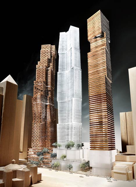
Toronto Aura at College Park | 271.87m | 78s | Canderel | Graziani + Corazza

it does look bulky, especially from street level, however, the curved portion will help A LOT! also, this thing will be razor thin from the north/south on the skyline.

I often wonder why the setback is so high up on the east facing (Yonge) side. not only is there nothing nearly that tall that it's facing, but from street level, the curved portion will only be a sliver of what people see from below. (hope i'm making sense)

You are making perfect sense and I wholeheartedly agree. I have always disliked Aura's placement on the property along with the setbacks being reversed from common sense.

The taller of the setbacks should have been on the West side, giving a three stepping-stone rise in heights with the other two College Park Towers. Then the lower setback on the East would afford more curtainwall to be seen from the Yonge Street side. As a pedestrian, glancing up to that extra 10 floors of curtainwall would have been impressive. And let's be realistic: 99 percent of tourists as pedestrians will see it from this side. I feel it was a missed opportunity.

And the odd angle to the property the east side has (added to afford those on that side a slight view of the CBD) messes up the street-wall and sets my OCD on overdrive.
 
sMTer, the pictures you posted today are really cool. I don't think I've seen this vantage point before. Somewhere around CAMH?
 
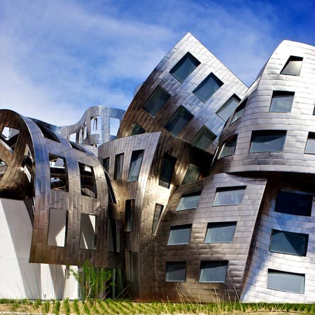
I've always thought it would be cool to design a building that looks like it's falling apart...but really isn't. Call it the "new aged" look. :)

We have tons of those... All designed by Gehry:

mit_frank_gehry_stata_center1.jpg


geh0-030.jpg


dzn_Lou-Ruvo-Center-for-Brain-Health-by-Frank-Gehry-1.jpg


Oh, and we can't forget these eyesores:

dezeen_Frank-Gehry-unveils-designs-for-Toronto_3.jpg


I know I'll get flamed for dissing Gehry... But that one-trick-pony is really starting to piss me off. It's like he's addicted to Dr. Suess architecture.

IMO Just because we can, doesn't mean you should.
 
Last edited:

this is a great pic, even ROCP looks pretty good :)
I see some towers rising on the west side of Bay/College in the near future to fill the gap between the Burano cluster and ROCP. shame they're low rises on either side.
Plenty of development in the immediate area to see rising (and immediately north towards bloor):) glad to see the rest of the skyline finally making a comeback with Aura leading the pack.
 
It's a nice idea, but modern art deco almost inevitably turns into the Uptown Residences on Bloor.

For the record, The Uptown isn't on Bloor, its off Bloor.
 
Oh, and we can't forget these eyesores:

dezeen_Frank-Gehry-unveils-designs-for-Toronto_3.jpg

I agree with you, but I think you could phase it a little better. Such as, the eye looks skyward with wonder at the designs of these beautiful buildings as they soar to new heights in all their glory.
 
Last edited by a moderator:
Enough with Gehry's crumpled paper look. Art-deco inspired would be nice along this stretch.

I know what you mean, but I'd settle for a non-box style of architecture. Incidentally, it seems that Toronto - for some quirk of history - doesn't build many notable buildings during non-box phases of skyscraper architectural history.

This is sort of a "high school" version of skyscraper architectural history, but you'll see what I mean:

Beaux Arts (Box)
Art Deco/Streamline Moderne (Non-box)
International Style (Box)
Brutalism (Box)
Post Modernism (Non-Box)
Neo-Modernism (Box)

We more or less missed the boat when it comes to Art Deco skyscrapers. CCN isn't really Art Deco, the old Bank of Nova Scotia is a pared-down postwar redesign (still good, though), and we demolished the Toronto Star building.

When it comes to PoMo, yes, we built Scotia Plaza and BCE (Brookfield) place, but we pulled the plug on the old B/A. Our other PoMo office towers, like Metro Hall, Confederation Life (Rogers) and the World Trade Centre (or whatever it's called) are not as prominent. Other cities in North America got far more examples of non-box PoMo built in their downtowns during the 1980s.

Nowadays, our non-box towers seem to fit into three camps:

1. Designed-by-committee mish mash: Aura, Trump
2. Essentially a box, but designed with some rooftop flair by a competent architect: Ritz, 1 Bloor, Ice.
3. the L tower.
 
As a non-sequitur, they've started installing the curtainwall up the middle of the north elevation, where the hoist is/was. I think it's the best view we've had so far of what the curtainwall actually looks like (you can never tell until you get a few floors of uninterrupted wall up, at least that's my opinion), and it gives an indication of what the upper portion will look like (it's darker and greener than I expected). I also didn't realize that the tip of the curve runs all the way down. I guess with the hoarding up I had always assumed the floor slab was squared off on the lower floors.

There's also some activity in the basement. In addition to the one hair salon that had already opened up there's also signs up for a beauty salon and a snack counter, two other units have had interior finishing done but no indication of what businesses are going in, and a few other units have building permits/renderings up of what's to come. I doubt it'll ever be destination retail, but it might at least shape up to be of use to people living in the building
 
9 March 2013: When I'm in the area I always make a point of stopping by the empty bathroom :)

rps20130309202121.jpg


rps20130309202248.jpg


I ended up hiding in the basement while the women screaming their thing marched by...
rps20130309202342.jpg


Is this a rub'n tug?
rps20130309202444.jpg


Eventually, I found a way to get outta here:
rps20130309202550.jpg


Did I mention beige is not my favourite colour?

Btw, some Chinese investor types were walking around checking out the Shops. They were stunned but eventually started laughing...it's a joke yo.
 
Last edited:

Back
Top