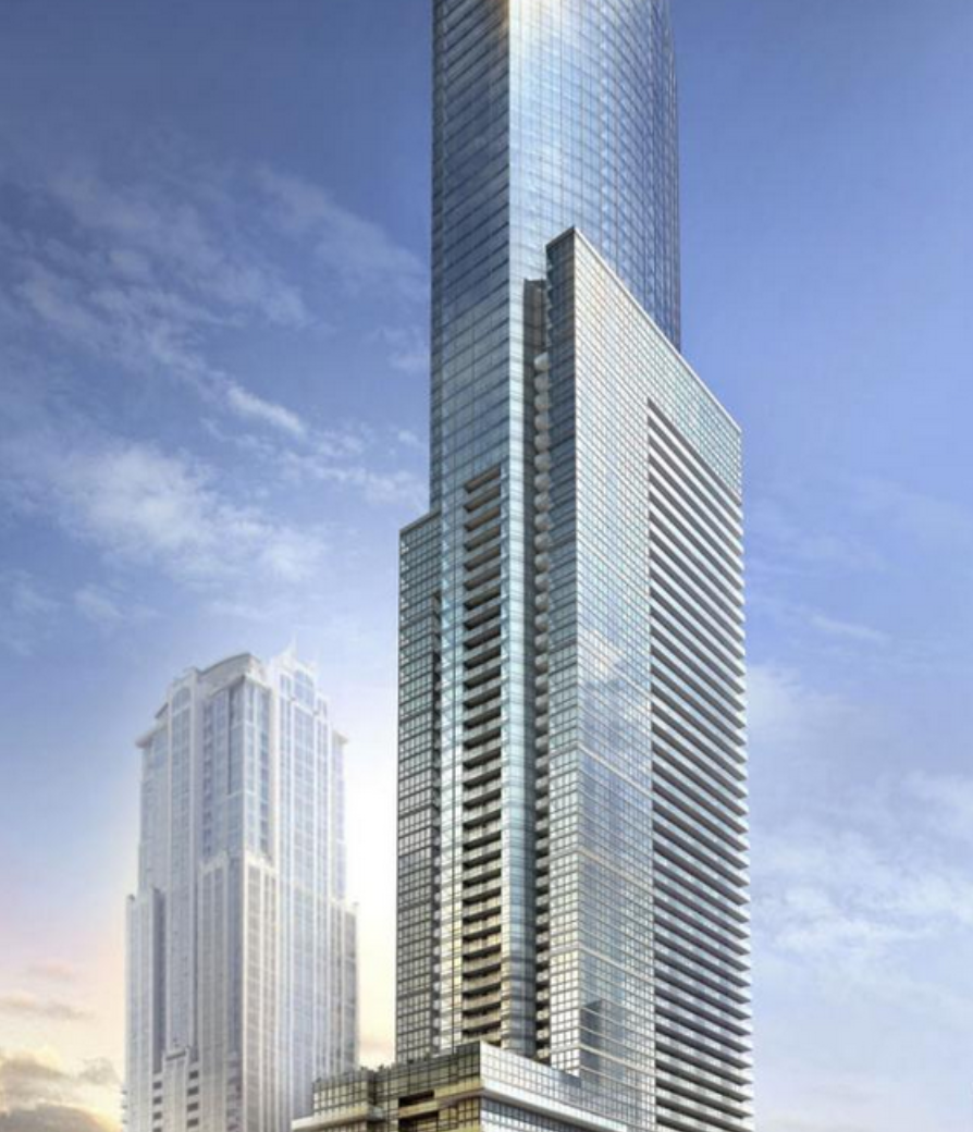
Toronto Aura at College Park | 271.87m | 78s | Canderel | Graziani + Corazza

Or maybe that's exactly the look they were after. Looks pretty darned close to the model to me.
 
I think it would be cool if the retail shops below became a sort of "art gallery" market. Artists, small little foodie spots (think Food Trucks-style) and perhaps tiny little cafes & pubs. Probably not permitted though.:(

Btw, I finally found one thing I like about this building: the shade of blue glazing. (Although will likely look like crap once the solar blinds are installed.)
 
Or maybe that's exactly the look they were after. Looks pretty darned close to the model to me.

not true. in the rendering the balcony glass is the same colour as the curtain wall.

i'm really loving how shimmering and 'light as air' the window wall is in the rendering, and how the pointless metal bands are basically invisible. SO close to what it actually looks like. oh yeah, "artist's impression".

anyway, add it to the list of things that make this thing the biggest and cheapest UglyFest in the city.

Screenshot2013-03-15at85855PM_zps9f373e06.png
 
I think the render above assumes a lot more light than the sun can produce even on it's brightest day. Maybe aura would look like the render above if a nuclear bomb went off right beside it.
 
I find the post of jetsbackincanada offensive. He is a right to express his opinion on this forum as we all do, but there is no reason to use language like that.

Ya... maybe he went too far, but I agree with him on being sick and tired of the same tired comments from the same tired people, over and over and over again.
 
Well, that gave me a bit of a chuckle. Still. Anyone who reacts that vehemently needs to take a break. It's only a building, not a cure for cancer. It's OK if not everyone likes it. Really.

I have been impressed by this building but not captivated by it. The sheer bulk of it has been daunting. I find it quite stolid and ungainly, but now that it's elegantly tapering and curving, it's becoming less brutally insistent somehow. It still feels like a design mired in unfortunate compromise, but it gets better as it climbs.
 
Reading that reminded me of Mel Gibson's crazed drunken rant. The profanity and outrageous insults are completely uncalled for. Apparently Jets is unable to accept the opinion of others. Just like Mel though, I wouldn't be surprised if he's done.
 
If that guy doesn't get banned all hope is lost

Agreed. Like him, I actually don't mind Aura as much as others do, but sheer intolerance of other people's opinions just doesn't work on a forum which is geared toward promoting architectural discussion. If all he wants to do is look at the pretty pictures, there's no need for him to engage anyone in discussion.
 

Back
Top