isaidso
Senior Member
Nothing's worse than Batman & Robin. I don't care if it was meant to be ironic.
Pre 2005 James Bond should have been shelved next to Austin Powers. That is wasn't, I always found alarming.
Nothing's worse than Batman & Robin. I don't care if it was meant to be ironic.
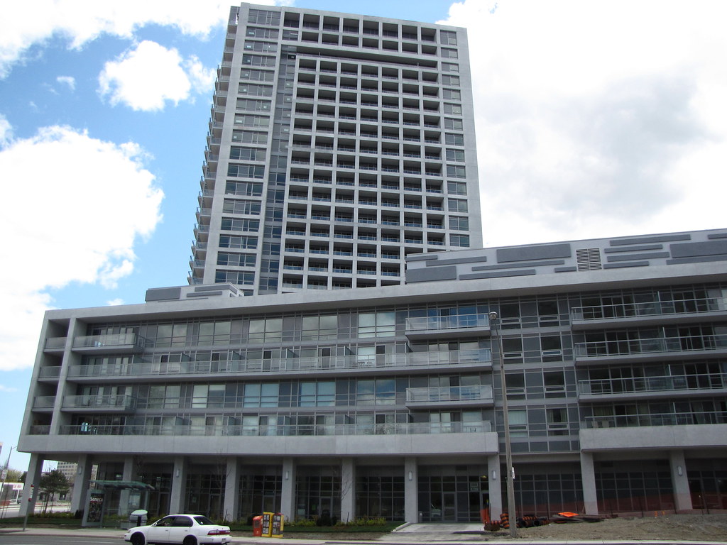
I like Aura.
very nice graphic, but
er, no.
Aura is not "the worst building of all time"
but hey, really what's the difference? its all just personal opinion right?
there is no qualitative difference between these buildings; they are all of equal merit.
(i'm not directing this at you, just en générale)
I do too. It's puzzling how this is getting so much criticism while buildings like Bay-Adelaide got drooled over.
BAC at Street level does nothing. Aura at Street level, is basically making another City meeting place. - Huge Rooftop Patios, Mall, and will bring life to a park that people actually use, instead of some stylized concrete plaza, which is dead 60% of the time. - A welcome relief if the party area a block to the south is too crowded. The outdoor patios give people another option instead of the tourist standbys. - The mall, another place to make a stylish purchase, that that retail mecca a block to the south. The park another place to relax and take in the city, in addition to the more famous square to the south.
On a marco level there is only reason to be optimistic.
 ..I just think were dealing with many people on this forum that just dont like changes, and are very critical of about anything that gets built here in town
a) all of the buildings this architect has ever designed are bad. if you can point me to one remotely notable building by this firm, by all means post it.
We reached a nice understanding in the Clear/Pure Spirit thread in which I suggested that you don't have to like aA's entire oeuvre at once, but as soon as you begin to notice the details which make up one building, an appreciation of the others isn't far behind. In the past, I've written at length about what aA does and why they do it and you have agreed with me (re: proud of their boxes). If my continued insistence bothers you, then just don't respond.
P.s., all, no, all of G+C's finished works to date have been disasters, but we'll get to that a little later (and if ya think that's narrow then so be it, but I make the case against them like I make it for aA - it's in the built work).
Don't get me wrong, I've never once said that Graziani + Corazza was one of my preferred firms. The projects they've built in Liberty Village and on the Etobicoke waterfront are extremely distasteful. There is no question aA is obviously the superior firm. However I disagree with your assessment of G+C's entire portfolio just as I disagree with your opinion on individual aA projects.
For example Ultra has turned out quite decent and Rise looks very promising.
You will of course immediately object. Largely because it's simply not possible for such a talentless firm to ever produce a quality product. To put that in context, I suppose that as long as Rick Nash plays for a losing team, naturally his individual play itself can never be worthy of any praise.
So just what is it that makes Ultra;
and Rise;
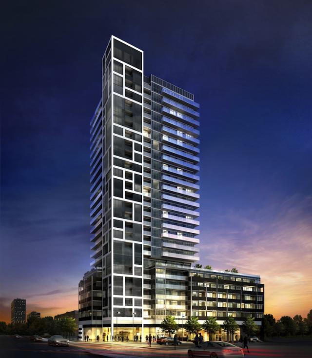
Disasters to you?
Let's take a look shall we...
Unfortunately you haven't made any specific comments on Ultra to date.
We do however have some opinions of the project from your fellow lackeys err... I mean fellow aA compatriots egotrippin & urbandreamer.
Just so there's no confusion on the subject, the 'lackey' comment was in jest. By no means do I believe that the three of you, or any other aA proponents for that matter, conspire to espouse the virtues of aA en masse on UT. On the other hand I really couldn't care less even if you did.
So here's what they had to say about this C+G 'disaster'.
These towers are easily in the top 10 most attractive condo towers built in North York during the past decade. Heck, they're even better looking than much of the stuff built south of the 401!
Behind Dia, I really think this is NY's second best looking development, so far. It's just a simple modern concrete building, kinda 60s' vibe to it really.
This is such a clean, crisp and good looking development. Hopefully more builders will take note and design more of their suburban projects accordingly. Unfortunately the good looking buildings are still vastly outnumbered.
Quite interesting no?
Going through that thread I must say I'm having a difficult time finding any negative comments at all about the project.But I'm sure you can do something about that can't you? No doubt you'd comment on its drab gray color scheme and the massive 'crown of spandrels'. Naturally there would be no notation of its clean lines, the unique orientation of the tower and podium and the visually appealing balconies. Or any consideration for the subtle details shown in the photo above.
I'm not suggesting that Ultra is a master piece on par with the Shangi-la or the 4 Season's. Or even that its proportionate in quality to the next tier down; say a Lumiere or The Met. I would categorize it as being good, but not great. It's just a little too gray and boxy snd the crown indeed is a little spandrel heavy from the south side. Although I don't take issue with its use throughout the rest of the tower. As my opinion on such is summarized here;
Many applaud them(aA) for avoiding or minimizing the used of spandrels, the presence of which is somehow thought of as the instant kiss of death by aA proponents. In truth if their use is not excessive (obvious failures in that respect; Parade 1, Nautilus, Crystal Blue amongst others) and if the color selection does not contrast with the glass (i.e. Trump), their presence is not automatically revolting or even all that noticeable.
I don't expect you to agree with this sentiment. Despite the fact that most aA buildings, however discrete they may be, do indeed make use of spandrels.
In fact judging by their comments it would be fair to say urbandreamer and egotrippin seem to have a higher regard for it than I do.
In conclusion I fail to see how Ultra can be categorized as a disaster.
Next up - Rise
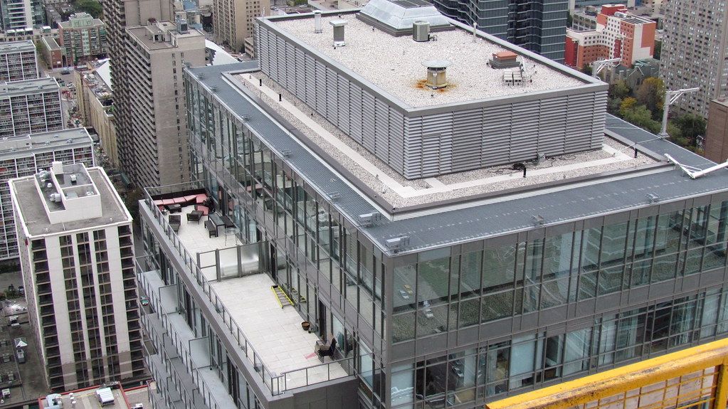
Even if it is the 'best G+C-designed building,' that's hardly indicative of an attractive project. Sure, they've got the massing right, with the taller and more 'iconic' chimney rising from the corner but beyond that it's got all the same rushed, poor-quality detailing we've come to know and expect from this firm. The detailed shots in the dataBase entry show some of this better so go have a look at them.
Notice especially the 'crown of spandrel' adorning the top of the tower, the low quality of the panels themselves (same supplier as Nautilus and other crappy G+C productions it seems) and the clumsy way the whole thing comes crashing down to the street. The podium bears no relation to the design language established by the grid on the tower and its brick detailing is really just something to lean on (it is also topped by a similar 'crown of spandrel'). The Sephora-inspired ground-level again tries to say something 'different' but also just ends up getting its words muddled. I'd give the overall form an 8/10 and the detailing a 4/10 if pressed for numbers.
In some ways I want to say that it's better than what's diagonally across the street, but I'm not even sure of that. At least E.I. Richmond took the time to get the precast detailing on their building to emphasize the verticality of the tower where G+C's mixed bag seems to want to go up and out at the same time.
But again, the real mistake here was not hiring aA at the start.
You stated; Rise has a "crown of spandrel adorning the top of the tower".
Yes its quite the building defining crown isn't it? Though its not even a single story high. Undoubtedly you'd prefer venting in its place to cover the mechanical's. I must say your benefactor aA has quite a knack for this type of 'preferred' treatment;
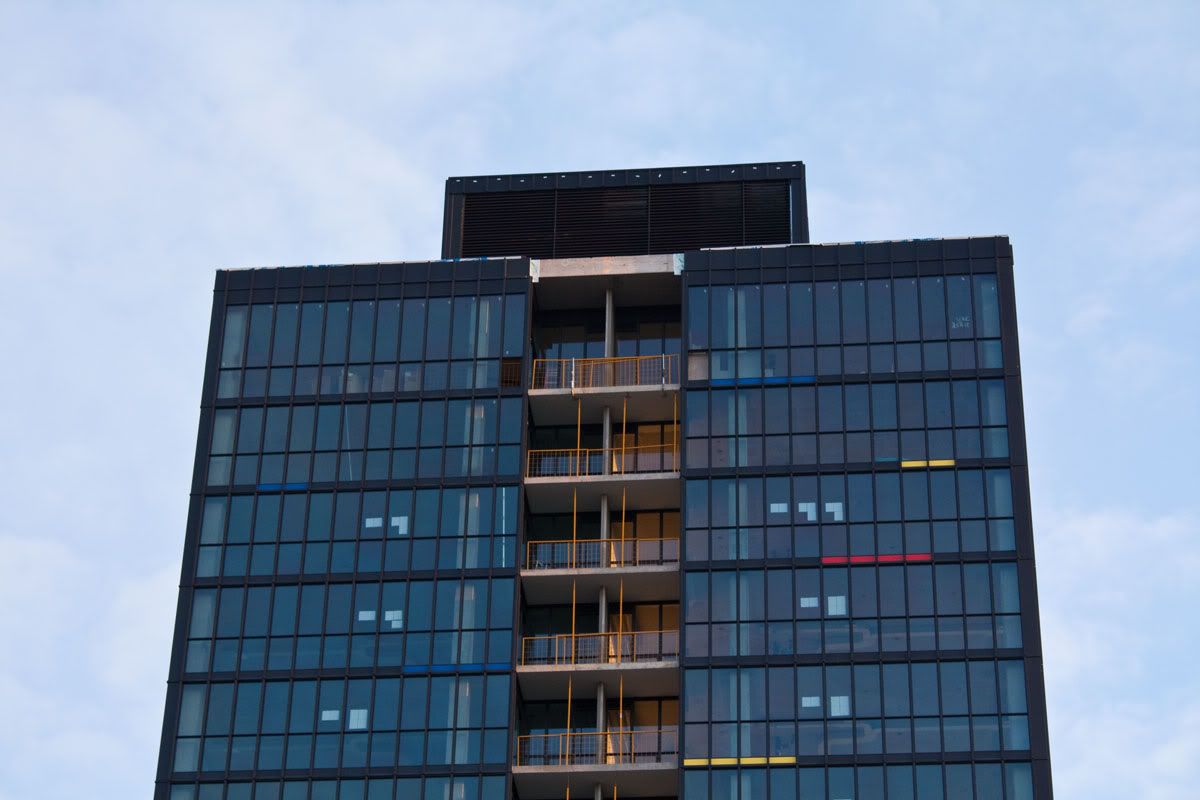
courtesy of dt_toronto_geek
So, is this an example of the attention to detail that you are constantly praising aA for?
I'm also impressed that you can quantify the value of the panels themselves just by looking at a render!
And apparently you feel the built form of the podium and tower clash with each other so much that you'd rate its 'overall form' a measly 8 out of 10.
Wait a second, that can't be right...
But apparently the building is lacking in details, with its off-set window pattern, brick facade on the podium and contrasting black and white elements. Oh that's right, you said 'quality of details'. Because you have such an eye for details, that you can determine their quality based on a render alone.
Unfortunately for us laypeople, we actually require the finished product to make that kind of determination.
Based on the render and as long as the execution isn't flawed, Rise will be a welcome addition to the city. This is an opinion that is not contradicted by a majority of those who have chosen to voice their opinions on the project.
My point is, whether you believe it or not (and you obviously don't) C+G is capable of designing and delivering a quality product. Which is why I am of the belief that Aura, Canderel Stoneridge's showcase development, can indeed be a quality product.
Ultimately the overall design of Aura appeals to me for a multitude of reasons, despite having some comparatively minor flaws (i.e those bulkheads you mentioned). Just as how I find X to be visually appealing in spite of the obtuse mechanical box with vents. Such flaws do not make a building a disaster in my mind.
To complete the sports analogy; Rick Nash isn't the best play-maker around, but does that make him a bad player? Hardly.
Besides, as Ramako so eloquently put it;
You don't have a monopoly on determining what is beautiful.