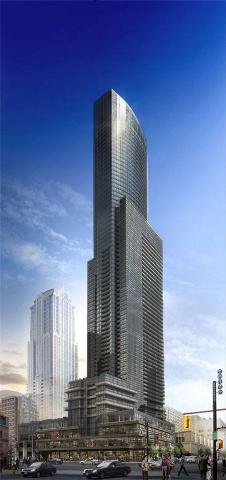
SP!RE
°°°°°°
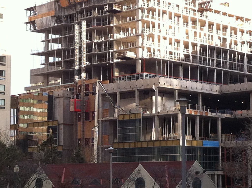
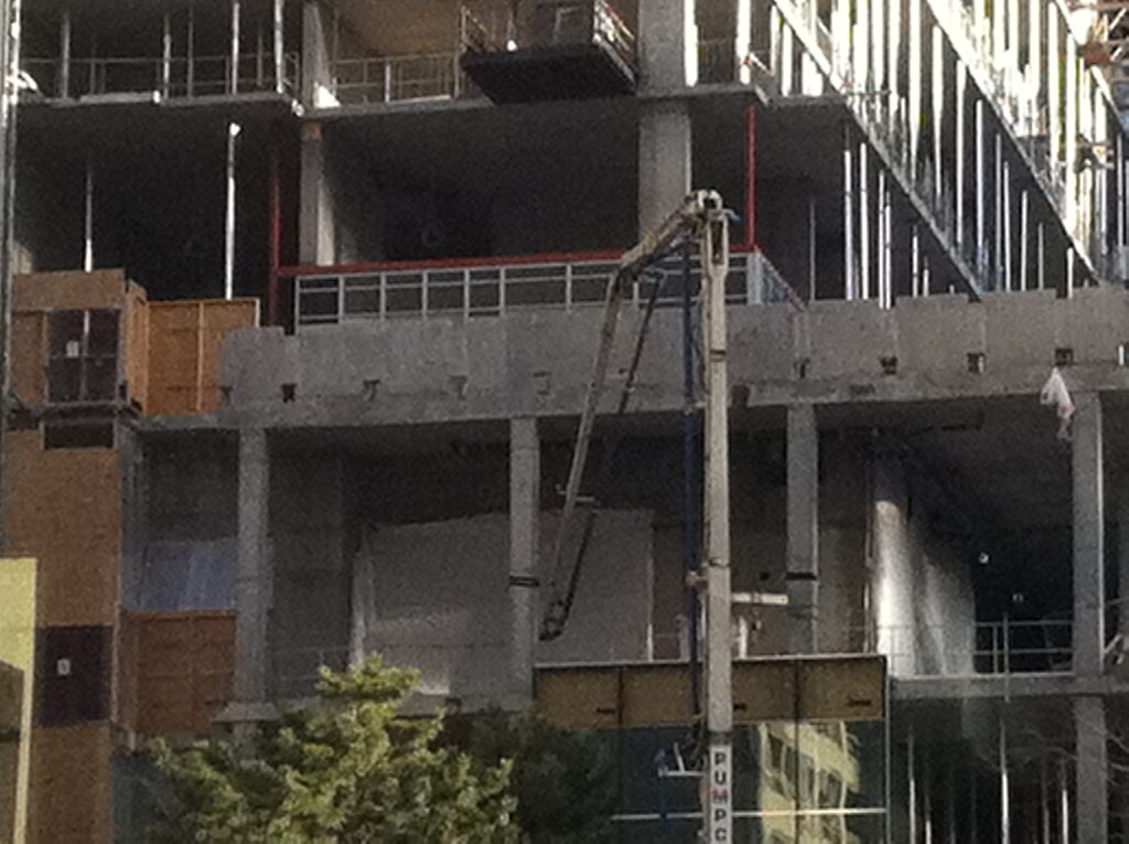
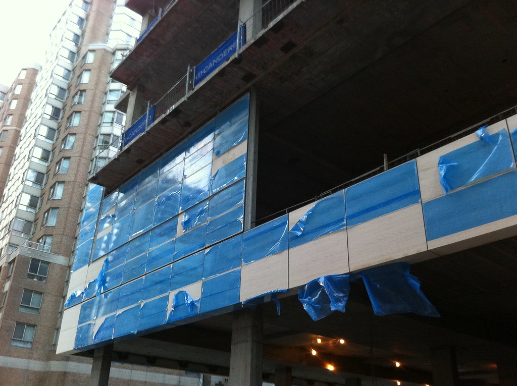
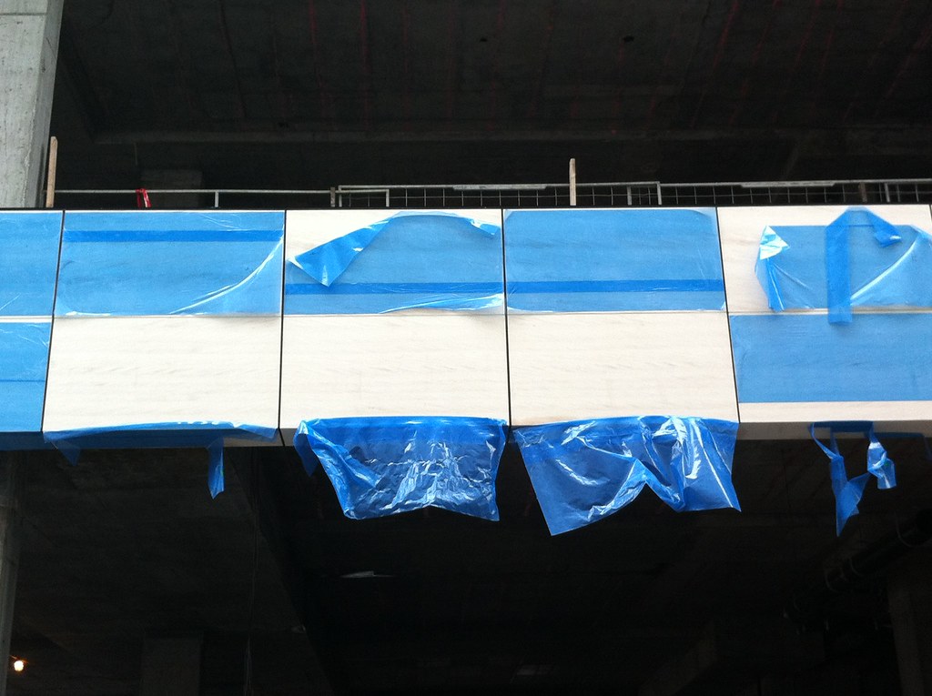
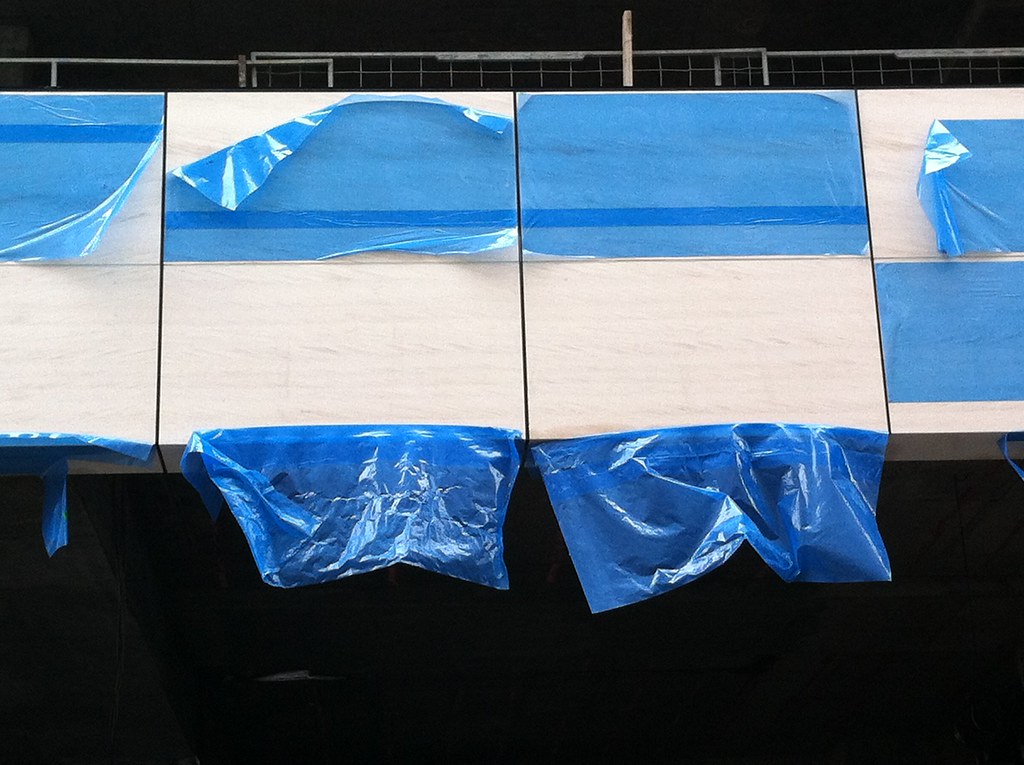
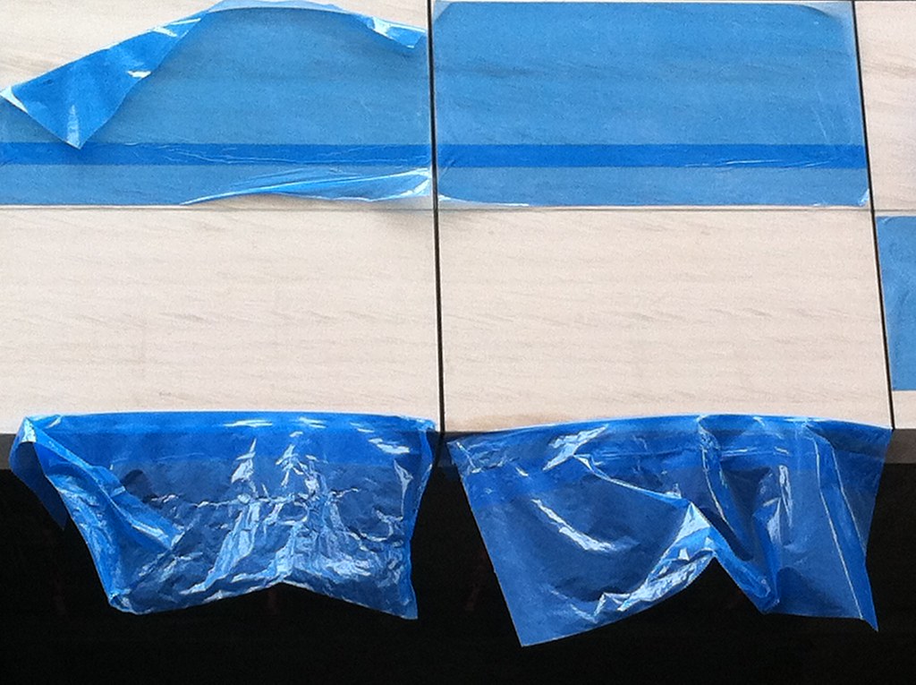
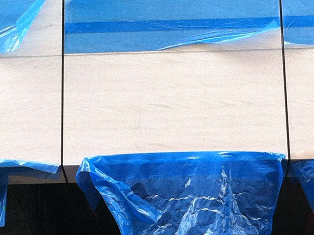
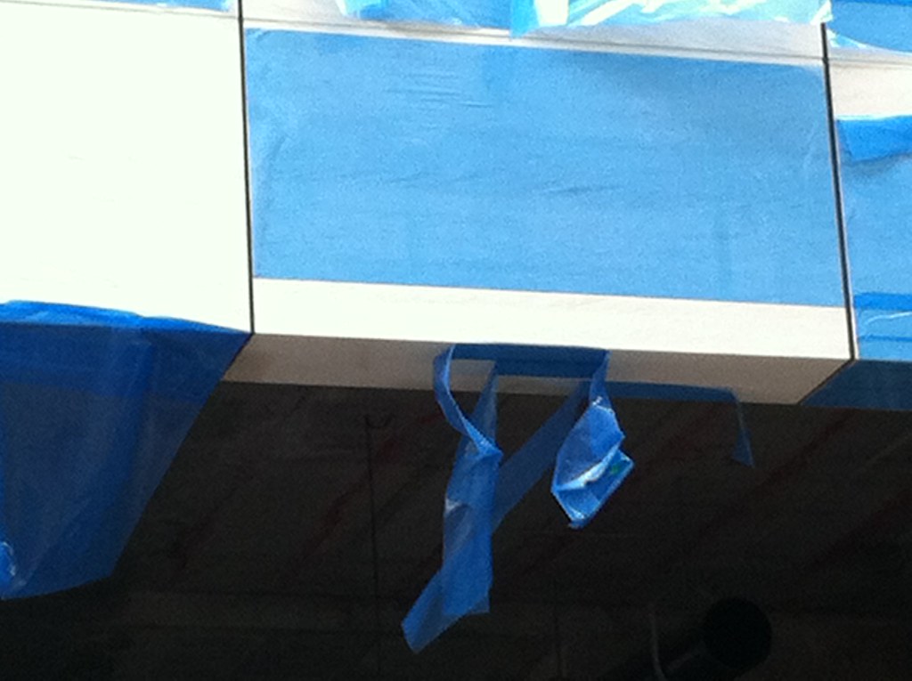
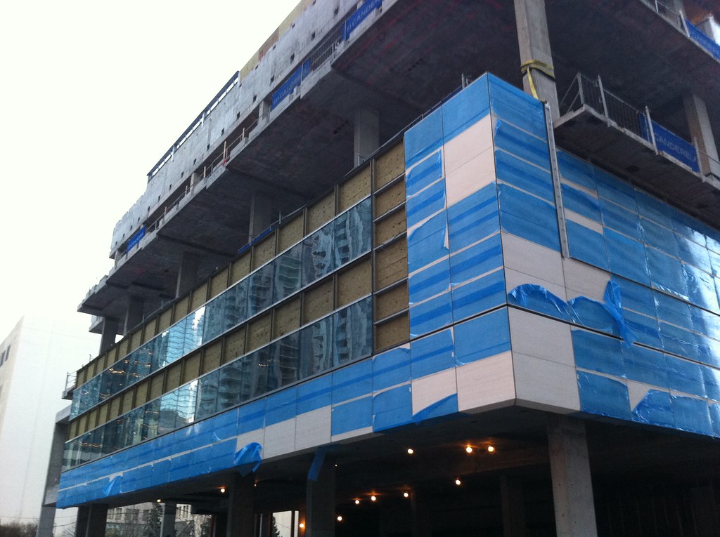
I have lots of photos that i've just taken of the new cladding on the north side residential and south west side of the podium. I'll update the thread with those when I get home this evening.
Can't wait!
")
I have lots of photos that i've just taken of the new cladding on the north side residential and south west side of the podium. I'll update the thread with those when I get home this evening.
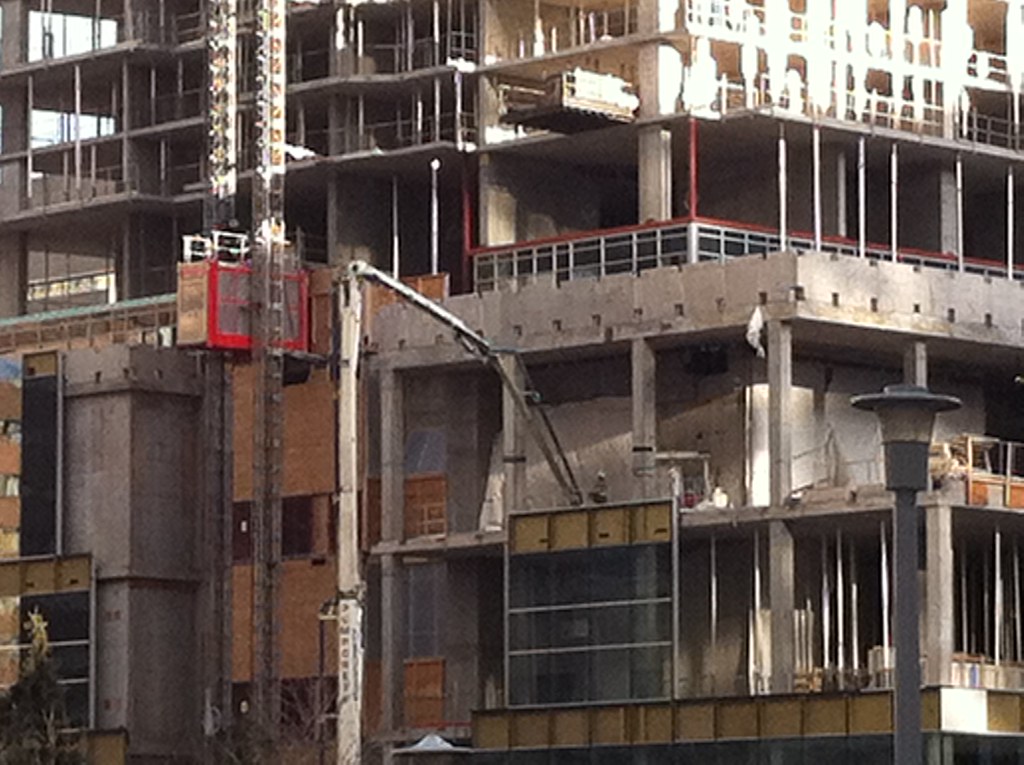
I can see those cranes from my POV too, I thought that they were for the Sick Kid's Research Building
.After further inspection, you are right. It is the cranes for Sick Kids. The Aura crane is yellow and white. And all this time I thought what I was seeing was AURA - damnit!

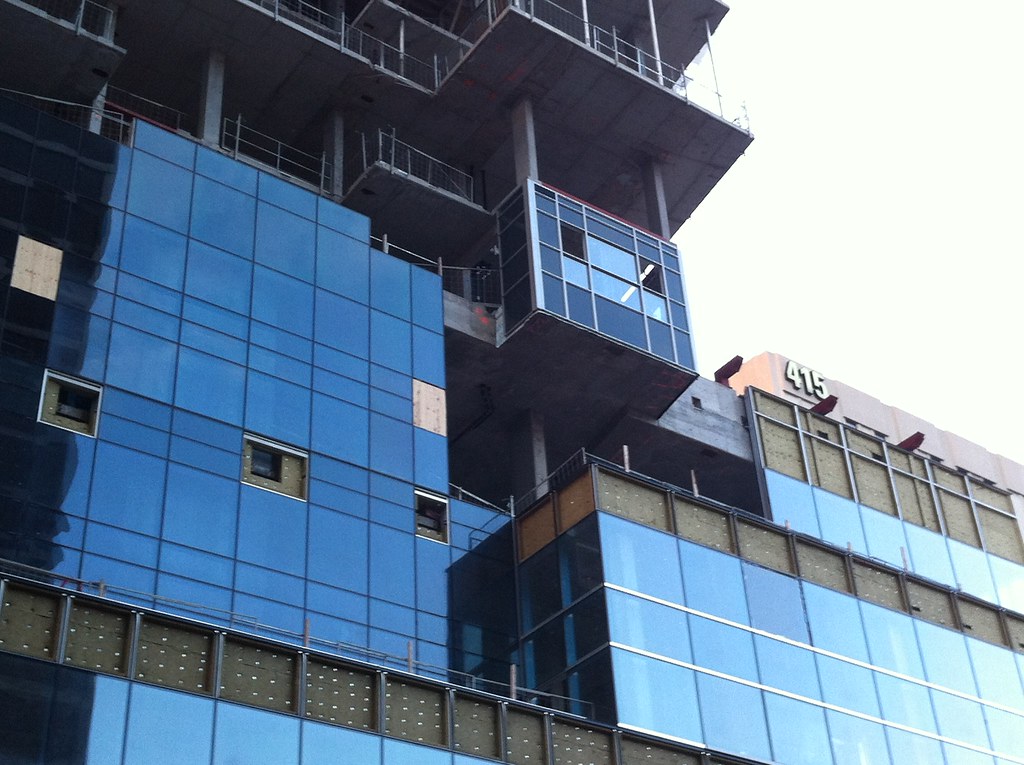
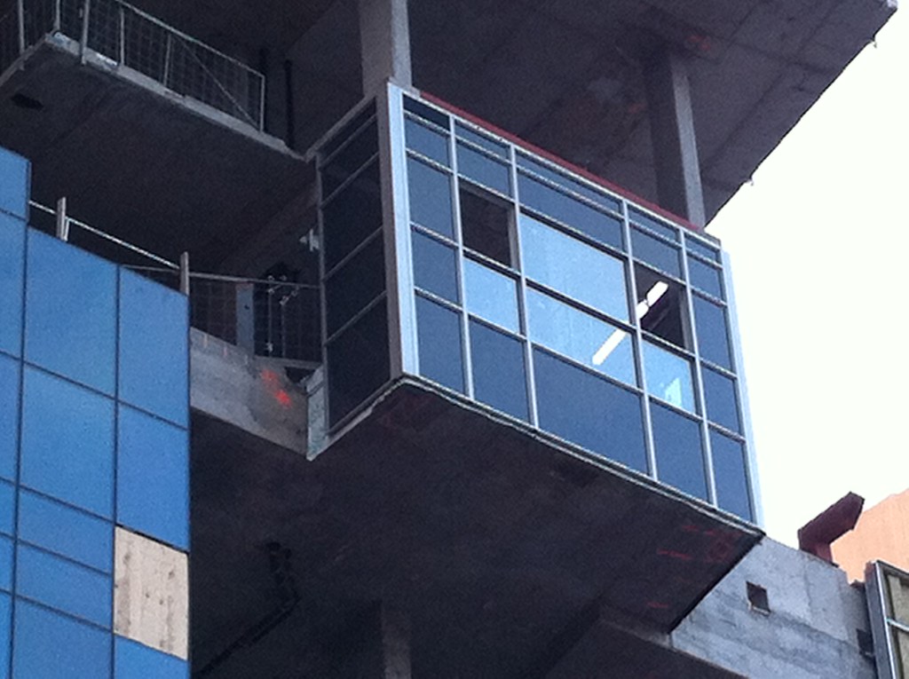
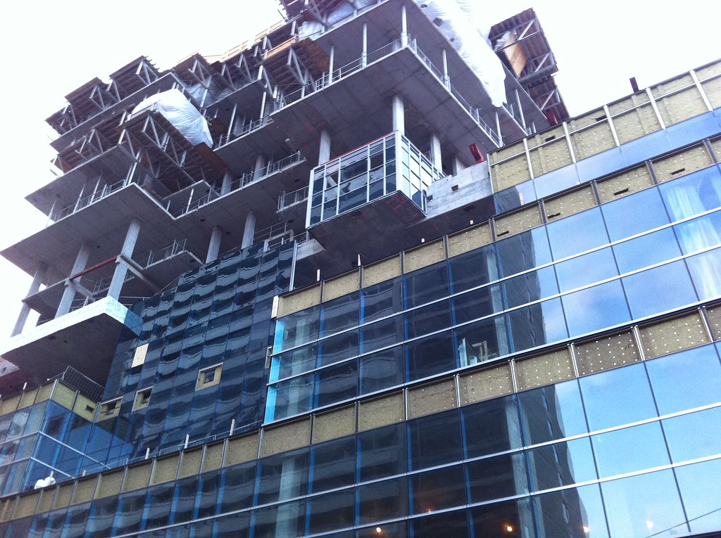

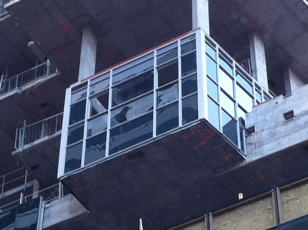

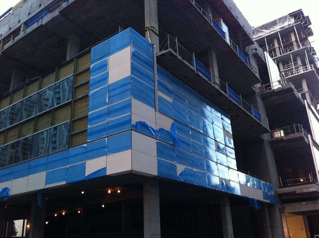
 I wasn't expecting G+C to use mullion-free glass on the residential portion on this project... we knew that they were planning on using window wall. But I was hoping for a dark colour that would minimize the appearances of the window frames. Anyways I'm going to wait for other people's opinions now.