Hamilton Augusta Block Buildings 2 & 3 | ?m | 8s | Core Urban Inc. | Lintack Architects

I think it was posted here recently that it's an elevated Hasty Market of sorts, I thought by you actually no? Maybe someone else.
yeah it was me. But I don't know specifically, like name of the franchise etc. A construction worker just told me it's going to be a small grocery store.
 
It will be under the umbrella of Hasty Market but with a scaled-up grocery offering including some hot foods. I'm not sure exactly what that will look like but I'm picturing something like a Seven-Eleven, a large Big Bee or a small version of Shoppers' food section.
 
Too much Big Bee or Hasty Market convenience shops all across Hamilton. 7-Eleven has two locations in Hamilton one on Upper Wellington and one on Woodward at Melvin. But this is the perfect location for the third 7-eleven location in Downtown Hamilton and not Big Bee or Hasty Market.
 
Well there you go, a grocery store - not a big one mind you, but at least some people should be happy :)

Sooo.. what are we thinking - drop ceiling? Or exposed with hanging lights?
 
There's not a chance dropped ceiling. Those are very out of fashion.

Let's post those images onto this page then for reference, cuz I got a lot to gripe about then lol..

1000003690-png.535209


Sooo then, basically what we see in the image now? That's kinda gross too.. not a fan of all exposed utilities like that.. esp in a grocery store.. I can't think of any grocery store that would look like that... core urban does like their exposed concrete ceilings though.. something I've never been a fan of, feels very unfinished, and cold.. and what's the point of having those giant rounded windows if you're just gonna cover up the view and have pipes running in front of them? This is so bewildering..

*EDIT* nevermind I see the "rounded windows" are their own floor - that's kinda neat. Reminds me of the michelle branch video "everywhere"


1000003692-png.535212


the "foil" tape on the duct is especially jarring, I don't get it - all this work on a traditional exterior and then all that pipework in the ceiling? The contrast is jarring.. it just looks ugly.. I mean the whole point of the old drop ceilings was to cover up all the utility because people found it ugly, now everyone's like "screw it"..

It does look like there is metal track work/steel wall construction not sure on the floor though, for more bulkheads, but they also have "exposed" ductwork in the ceiling.. so.. yeah.. mighty confused on this one, doesn't look nice inside so far - but maybe they'll bulkhead it all in? And where are the lights going? So many questions..

1000003691-png.535210

I don't get the thrill - that kinda stuff to me screams "we're gonna show you all the ugly utility in the ceiling, pay less to not cover it up but market it to you as 'chic'" - doesn't look chic to me, just looks gross lol - esp in this situation where it looks "utility" and not "intentionally exposed to look cool" - it also feels.. unsanitary.. for a grocery store somehow..

Feels like walking through a parking garage.. but I will withhold my judgment until the end - this is core urban after all, if anyone can convince me a final product looks good it's them..

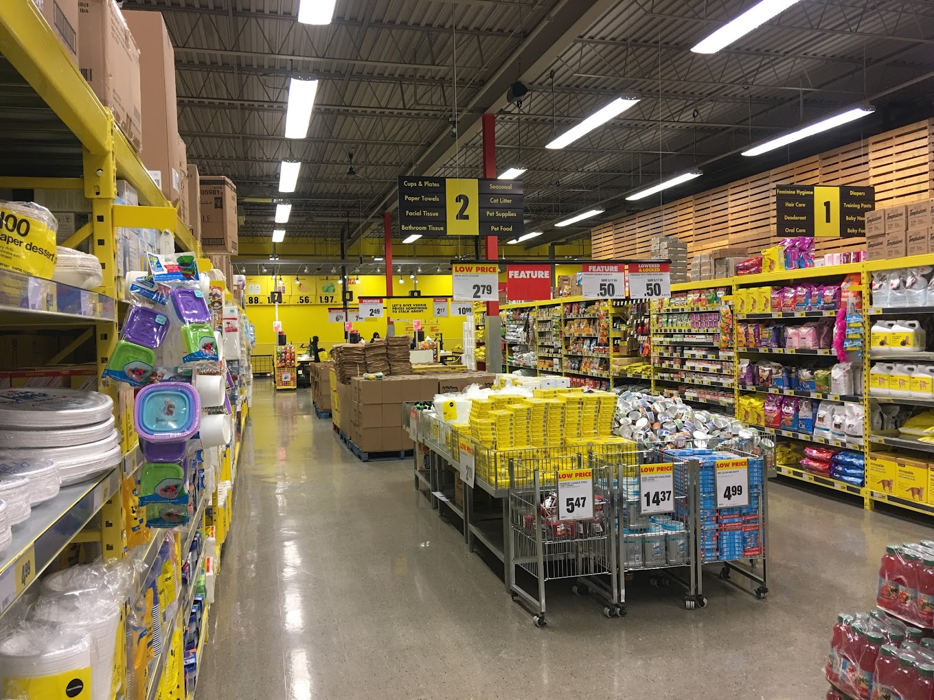
I mean, it's either this, with NO utilities;;

AF1QipP0dOBRpOpDcgyOw3hPG7JstnWcXwiw69RI5JWZ=s1360-w1360-h1020


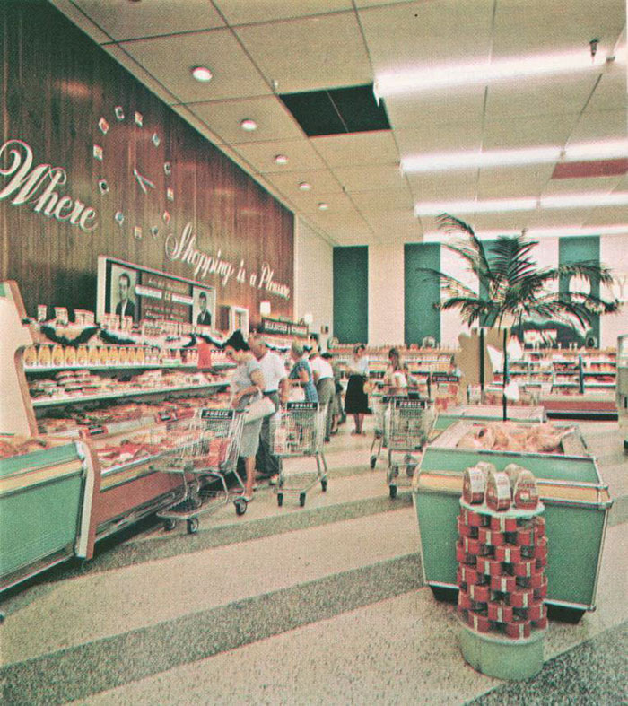
or the old 50s supermarket look

vintage-grocery-stores-usa-old-pictures-51-5b325166913c8__700.jpg


Both ceilings feel clean and sanitized, like a grocery store should.

Looking at some of their other project interiors - looks like they do show utility, but the ceilings are higher, they paint all the utilities black and have wood above it to cap off the ceiling.. if they do something like that it MIGHT be ok.. but the old fart in me is still grumbling lol...

IMG_8158.jpg


I seriously don't get their "exposed ceiling" look though.. it JUST feels unfinished.

Greystone-Interior-17.jpg
 
Last edited:
Also what the hell lol.. how the hell are you gonna put drapes or curtains up?

Greystone-Interior-22.jpg


The back balcony is very nice though :) - always been a fan of deeper balcony vs thinner and longer like mine is..

Greystone-Interior-7.jpg


Also those balcony bannisters rock :)
 
It's great to hear about a mini grocery store, that's sorely needed. Those balcony's are HUGE it looks bigger than the actual living room! These must be the biggest balcony's in the city now?
 
It's great to hear about a mini grocery store, that's sorely needed. Those balcony's are HUGE it looks bigger than the actual living room! These must be the biggest balcony's in the city now?
They are definitely some pretty epic giant balconies.. wish mine was like that.. imo that should be more of the standard going forward - although it sucks for the people in the front - there definitely will be a difference in price since the front units only have Juliet balconies and the second floor not even that - just lunettes. I still don't get why the glass can't be transition glass to reduce sun glare and overheating of the unit - it seems a shame to see all the lunette windows curtained up inside. We install so many windows to make things appear "open" and everyone just blocks them up, what's the point?

I am still bewildered by the ceiling of the main floor - it's not like they took over an existing building and had to work around it - they DESIGNED this themselves - thus it all just looks so odd...

but.. they've somehow made it work for their other builds.. so.. just trust core urban...
 
That brings up an interesting point.. where are they going to put the signage..? Is it gonna be on that black strip between the lunettes and the main windows?
 
I still hate the exposed concrete ceiling and random concrete exposed wall thing they got going on in their interiors - it feels like they are trying to make "not finishing the building and thus saving money" some sorta design chic thing.

It doesn't look chic. It just looks unfinished.
 

Back
Top