Toronto 88 Scott Street | 203.9m | 58s | Concert | P + S / IBI

But this is a site for people of all kinds of tastes who are interested in Toronto development.

True - though the opinions of bored suburban housewives from Burlington, who only come to town to sit in Yonge-Dundas Square and stare slack-jawed at the American Apparel billboard all day, obviously count for little.
 
What's even more amazing is how jizzed some get over yet another derivative minimalist box... if it were a movie it'd be like watching the same remake over and over... and over again. No matter how mannered the film it's just the same old tired flick after a while.

TEWDER'S LAW

Tewder's Law states that: "As an Urban Toronto critique of a second-rate piece of architecture grows more effective, the probability that an expression such as 'well at least it's not another derivative modernist box ...' will be introduced to derail the discussion approaches one."
 
There is evidently a great divide in opinion about this project, some loving it, and others hating it. I have created a poll about 88 Scott Street here, please vote and we will have a better idea about how the UT community feels about this project.
 
Man, I go away for five days, come back, and this whole thing is still going on?

Can't we all just agree that Urban Shocker and friends are smarter, more tasteful, and generally superior people to those of us who like this building?

The strange thing is that I don't even particularly like this building. I just think it is a decent and adequate addition to the fabric of the city, but I've felt forced to defend it against what seems to me to be a knee-jerk reaction against anything with a whiff of historical reference, and a platform for all types of snobbish put-downs. "Of course, tastes do not necessarily converge. I am not-so-secretly delighted by your inability to see the aesthetic truth of the matter, as it helps to bolster my pre-established opinion that I am categorically better than you." (paraphrasing)

I think I find this particularly irksome because the paragon of design that this thing is held against is Architects Alliance. Not BIG, or OMA, or Renzo Piano, and not even great Canadian firms like Patkau, Saucier + Perrotte, Moriyama + Teshima, or even Montgomery Sisam, but Architect's Alliance. I just don't get it. aA is a totally capable, admirable architecture firm. Their buildings are well-detailed, well-executed, and generally attractive, but with a few exceptions they are fabric buildings just like this one. They are not provocative or particularly conceptual. They are neither utopian nor critical. They are buildings that blend in and create the city's texture. This is perfectly fine, but to think that an admiration of these buildings makes you the Canoe sommelier of architecture? Come on.

Whether or not this building will stand up to the standard of the typical aA building will be decided in the details. It very well may fall short. But all we've seen is a couple of overall renders, so critique of the building's execution is most definitely preemptive. I think the critiques leveled so far (and particularly their tone, Parkdalian's insightful post aside) are more about a slavish devotion to a narrow aesthetic ideology than they are to any particular faults in this desgin.
 
I think I find this particularly irksome because the paragon of design that this thing is held against is Architects Alliance. Not BIG, or OMA, or Renzo Piano, and not even great Canadian firms like Patkau, Saucier + Perrotte, Moriyama + Teshima, or even Montgomery Sisam, but Architect's Alliance. I just don't get it.

I don't get it either. You'll have to ask those who have invoked Tewder's Law - rather than discuss this building and explain to the rest of us why they like it - why their aA fixation keeps on cropping up.
 
I don't get it either. You'll have to ask those who have invoked Tewder's Law - rather than discuss this building and explain to the rest of us why they like it

Okay, I'll bite. I'll explain why I'm reasonably partial to this design without using the word "aA" or "box" once.

6355697465_f73d239de3_o.jpg


I think that the architect's chose to introduce the first setback at exactly the right place, making the tower fairly well proportioned. If you introduce it too high up, you end up with something like One Court Square in Queens, NY, where the ziggurat feels like an afterthought. If you introduce it too low, it looks like a stubby mast on top of a thicker base (no examples, because a design like this would be ridiculous). I think the choice of using stone-like cladding at the base makes sense because it is a natural transition from the podium, which is an existing grey stone structure.

I don't think this building is a knockout, however. The skyboxes are a little fussy, and I would prefer if the building were clad in the same material the whole way through. In general, I don't like towers in which the facade is clad in two or more materials or colours.

I have a soft spot for PoMo or classical architecture if it is done properly. The MesseTurm in Frankfurt is my favourite skyscraper of all time (hard to believe it's only 850 ft tall), and I also am very partial to I.M Pei's Four Seasons hotel in New York, with its pencil thin sillhouette that snubs its nose at late 20th century "bottom line" thinking that suggests that small floorplates are not economically justifiable. Now that I think about it, that's one of the things I appreciate about PoMo towers; they defy conformance to economic rationality with their hats and ornamentation and marble and setbacks. We live in such a dry world of forced austerity, and all of us know that the money just gets burned by someone else, somewhere else...so why not give in to a little frivolity in our architecture?
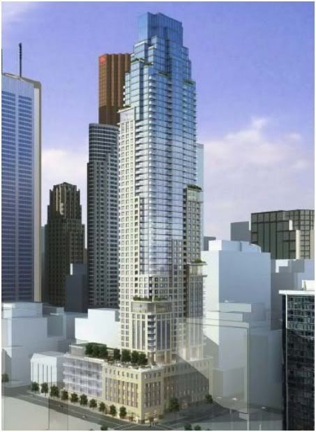
 
I like the building as shown, we'll see what further renderings bring to the table down the road. My only qualm is this is an appropriate site for more height.
 
Okay, I'll bite. I'll explain why I'm reasonably partial to this design without using the word "aA" or "box" once...

A cogent and reasoned critique Hipster, unlike US's rote 'it isn't a grey box' ravings that consistently interrupt informed discourse...

I don't get it either [... bla, bla, bla...] why their aA fixation keeps on cropping up.

Who dislikes aA??

The poor thing flails out at me desperately, which might be harmless if it didn't have such psychotic undertones... and really how do you have a meaningful exchange with somebody whose design vocabulary is confined to grey straight lines, who admittedly cannot comprehend or register new ideas, and who becomes disturbed and aggressive if one doesn't agree with her? It's like trying to debate with coco the chimp for god sakes!
 
I'm generally an aA fan and despite being a little fatigued by the conventionalism of some of their more recent designs, I ultimately feel safer entrusting them, more than almost any other high-volume local firm, with high-profile sites. They likely won't give you anything spectacular or ground breaking, but you can count on them to produce some very high quality infill.

That being said, I also really appreciate the variety of forms, styles, materials and textures that are the hallmark of North American skylines and cityscapes. While 88 Scott isn't the best example of faux-historic architecture (if One St. Thomas were a 10, Uptown were a 4 and NY Towers were a 1, I'd probably give 88 Scott anywhere between a 5 and an 8, depending on how it is executed), I appreciate that it brings an under-represented style to the city. We've been inundated with so much of the same style during this boom, that I'd go so far as to call 88 Scott "fresh", which is ironic given that in any other circumstance, that would be the last adjective I'd use to describe a historicist design.

In summation, I can support this design as an abstract concept but what will really make it or break it for me, as was the case with Uptown and Trump, is the execution, attention to detail and quality of materials.
 
I like it too. But it depends on the glass and materials used. The finished product could either look great or ugly.
 

Back
Top