dt_toronto_geek
Superstar
I like it too. But it depends on the glass and materials used. The finished product could either look great or ugly.
That's exactly why I was careful to state "I like the building as shown..."
I like it too. But it depends on the glass and materials used. The finished product could either look great or ugly.
Building Form and Articulation
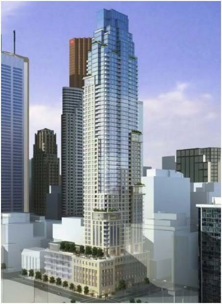
Members were generally comfortable with the tower design, but did feel that it would benefit from a simpler, contemporary expression. Members were interested by the concept of relating various levels of the tower to neighbouring towers, however they felt that this neighbouring context would be likely to change over time. Subsequently, Panel was unconvinced by this concept, and encouraged the proponent to focus on making a grand and contemporary design that is unique to the subject building.
I'm generally an aA fan and despite being a little fatigued by the conventionalism of some of their more recent designs, I ultimately feel safer entrusting them, more than almost any other high-volume local firm, with high-profile sites. They likely won't give you anything spectacular or ground breaking, but you can count on them to produce some very high quality infill.
That being said, I also really appreciate the variety of forms, styles, materials and textures that are the hallmark of North American skylines and cityscapes. While 88 Scott isn't the best example of faux-historic architecture (if One St. Thomas were a 10, Uptown were a 4 and NY Towers were a 1, I'd probably give 88 Scott anywhere between a 5 and an 8, depending on how it is executed), I appreciate that it brings an under-represented style to the city. We've been inundated with so much of the same style during this boom, that I'd go so far as to call 88 Scott "fresh", which is ironic given that in any other circumstance, that would be the last adjective I'd use to describe a historicist design.
In summation, I can support this design as an abstract concept but what will really make it or break it for me, as was the case with Uptown and Trump, is the execution, attention to detail and quality of materials.
Okay, I'll bite. I'll explain why I'm reasonably partial to this design without using the word "aA" or "box" once.

I don't mind the asymmetrical placings of the sky-lobby boxes (or whatever they are) on an otherwise symmetrical design. I think the randomness works and breaks up the formality of the shape of this building. This could work, although I will not be surprised if the choice of (cheaper) materials brings it down a notch or two.
Is there a particular reason to think Concert will go cheap on materials or is this a general distrust of developers? I have some direct but limited (two buildings) knowledge of Concert's work and haven't seen anything that would make me think they would go cheap.
Is there a particular reason to think Concert will go cheap on materials or is this a general distrust of developers? I have some direct but limited (two buildings) knowledge of Concert's work and haven't seen anything that would make me think they would go cheap.
I like the way it looks ..... the random boxes have yet to grow on me, but I'll give it some time ...