You are using an out of date browser. It may not display this or other websites correctly.
You should upgrade or use an alternative browser.
You should upgrade or use an alternative browser.
Toronto 561 Sherbourne | 128.01m | 43s | Medallion | Arcadis
- Thread starter Peepers
- Start date
stjames2queenwest
Senior Member
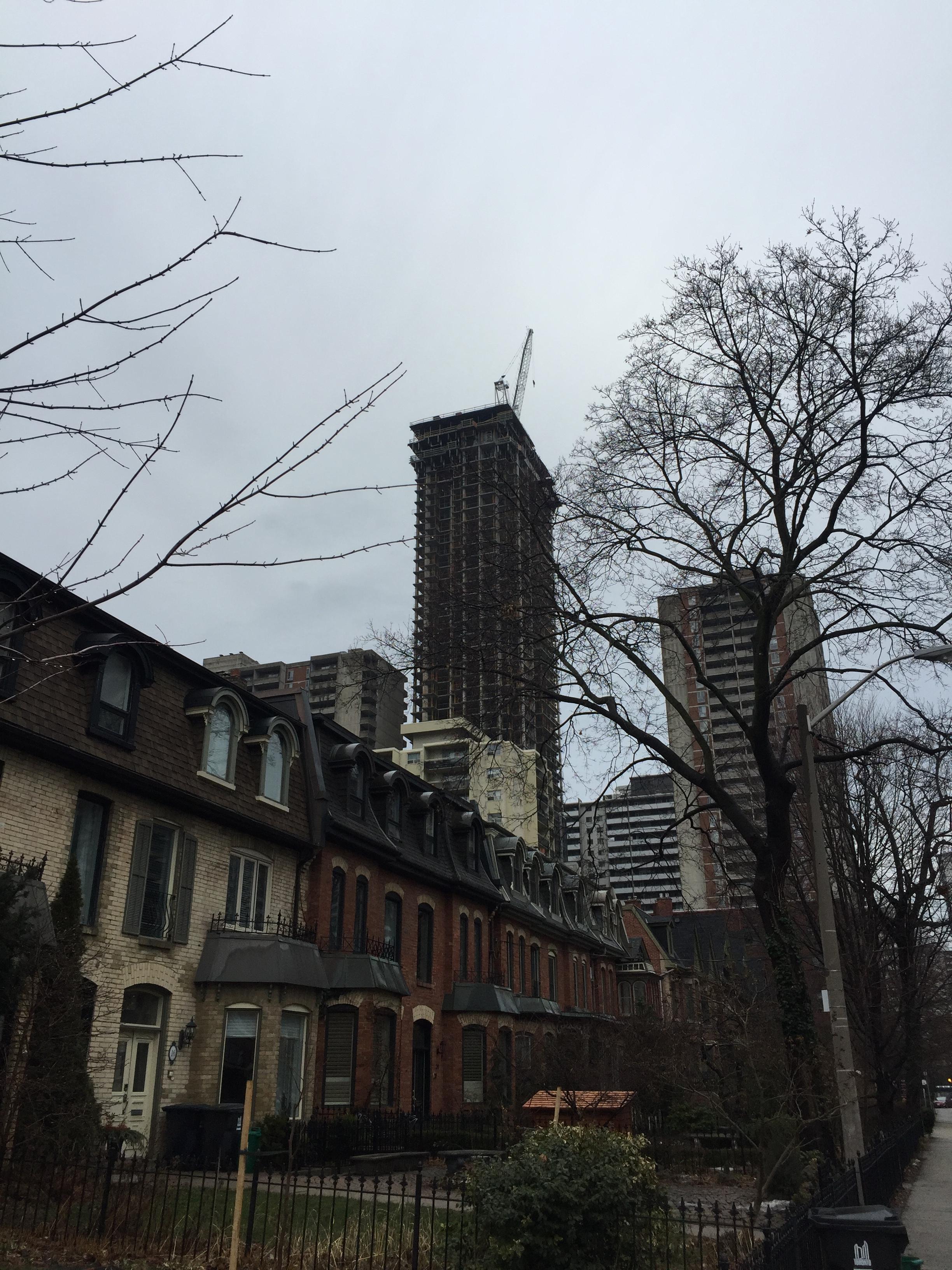
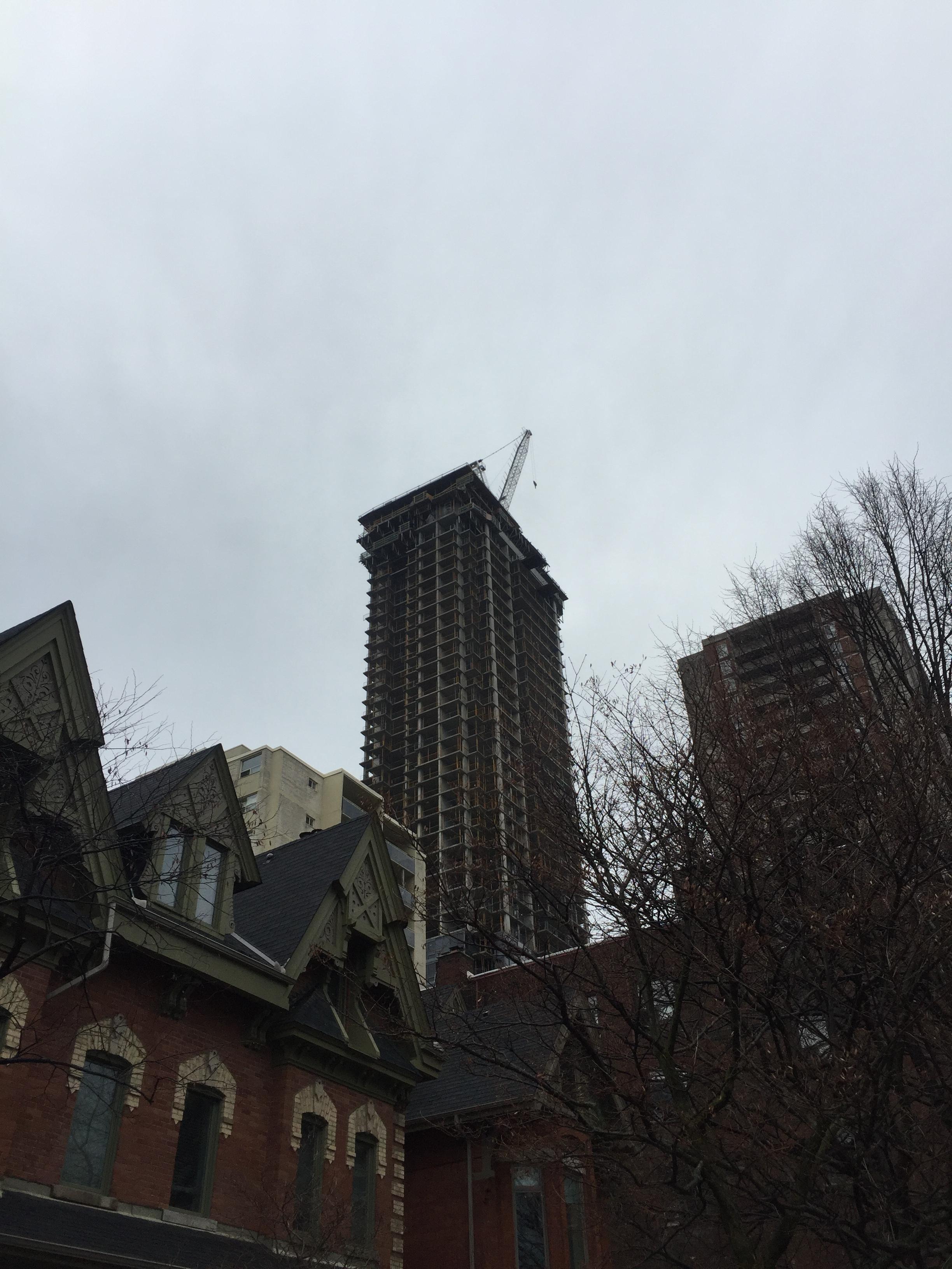
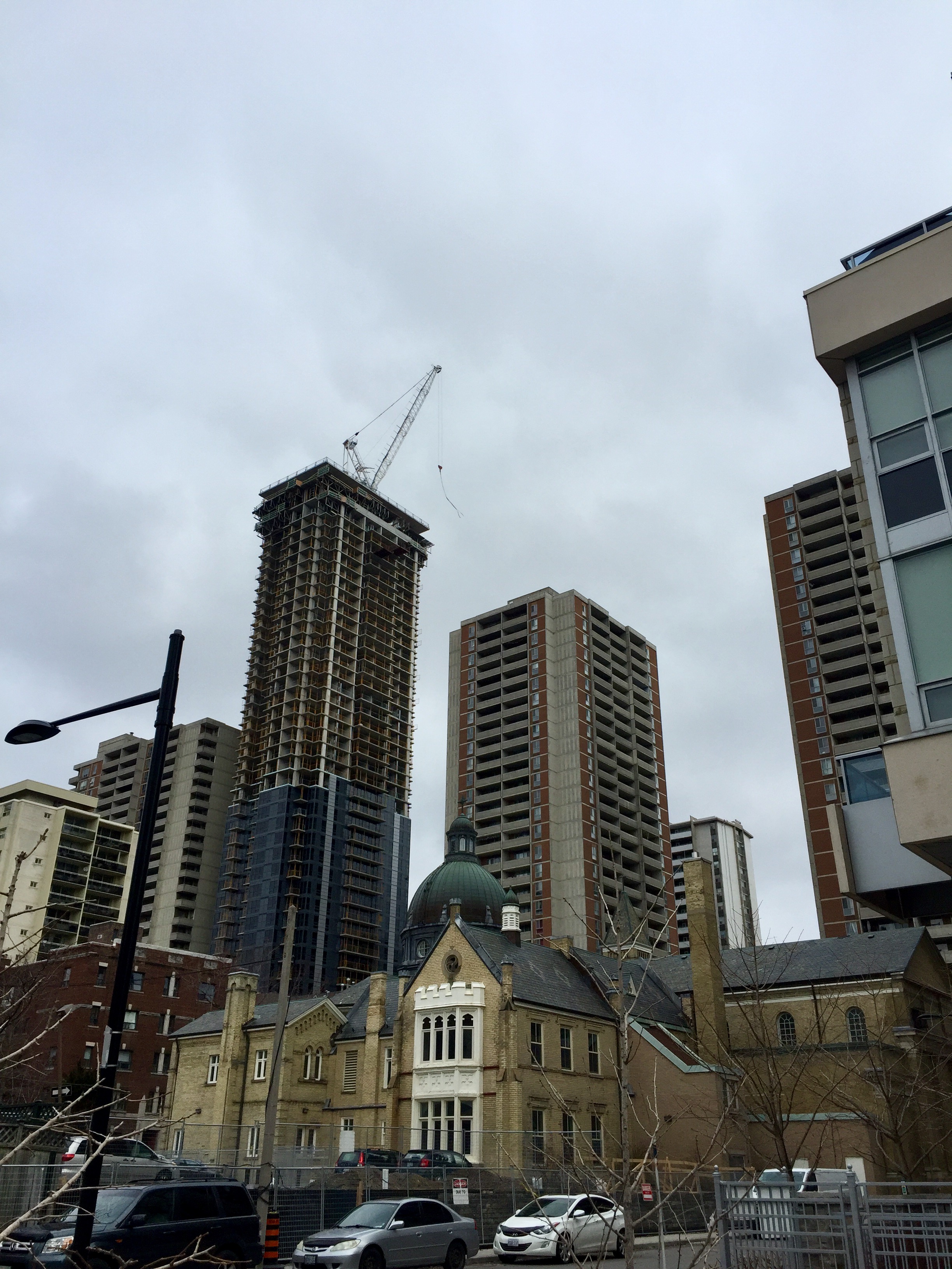
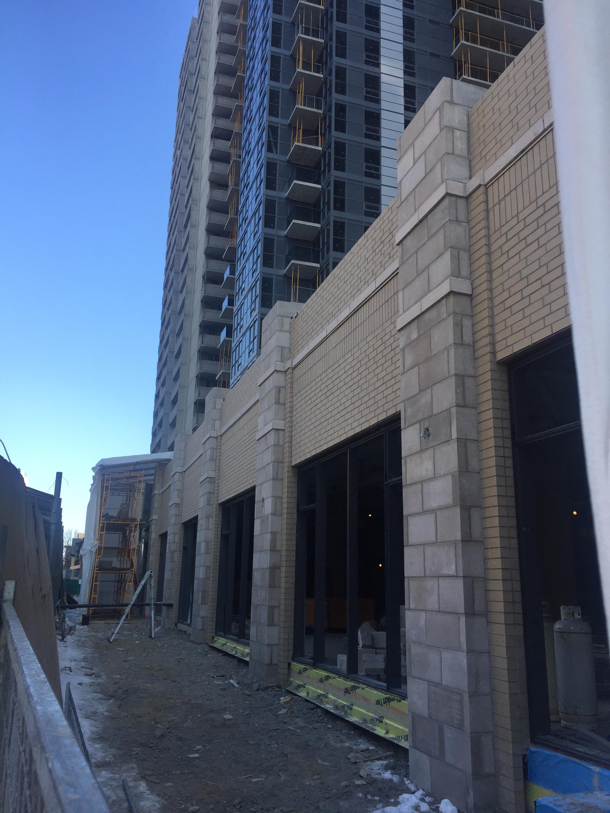
From earl st. a couple days ago.
stjames2queenwest
Senior Member
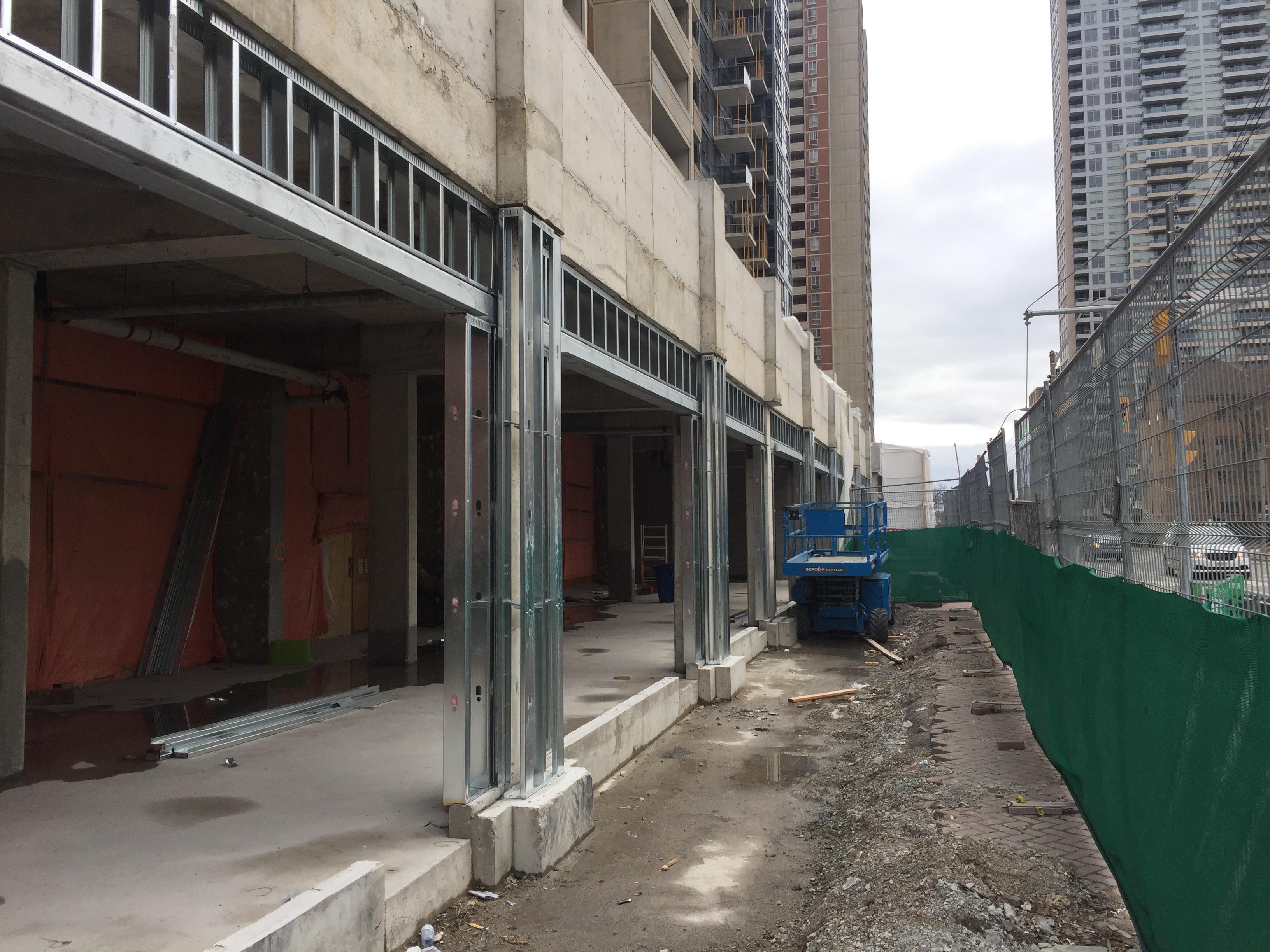
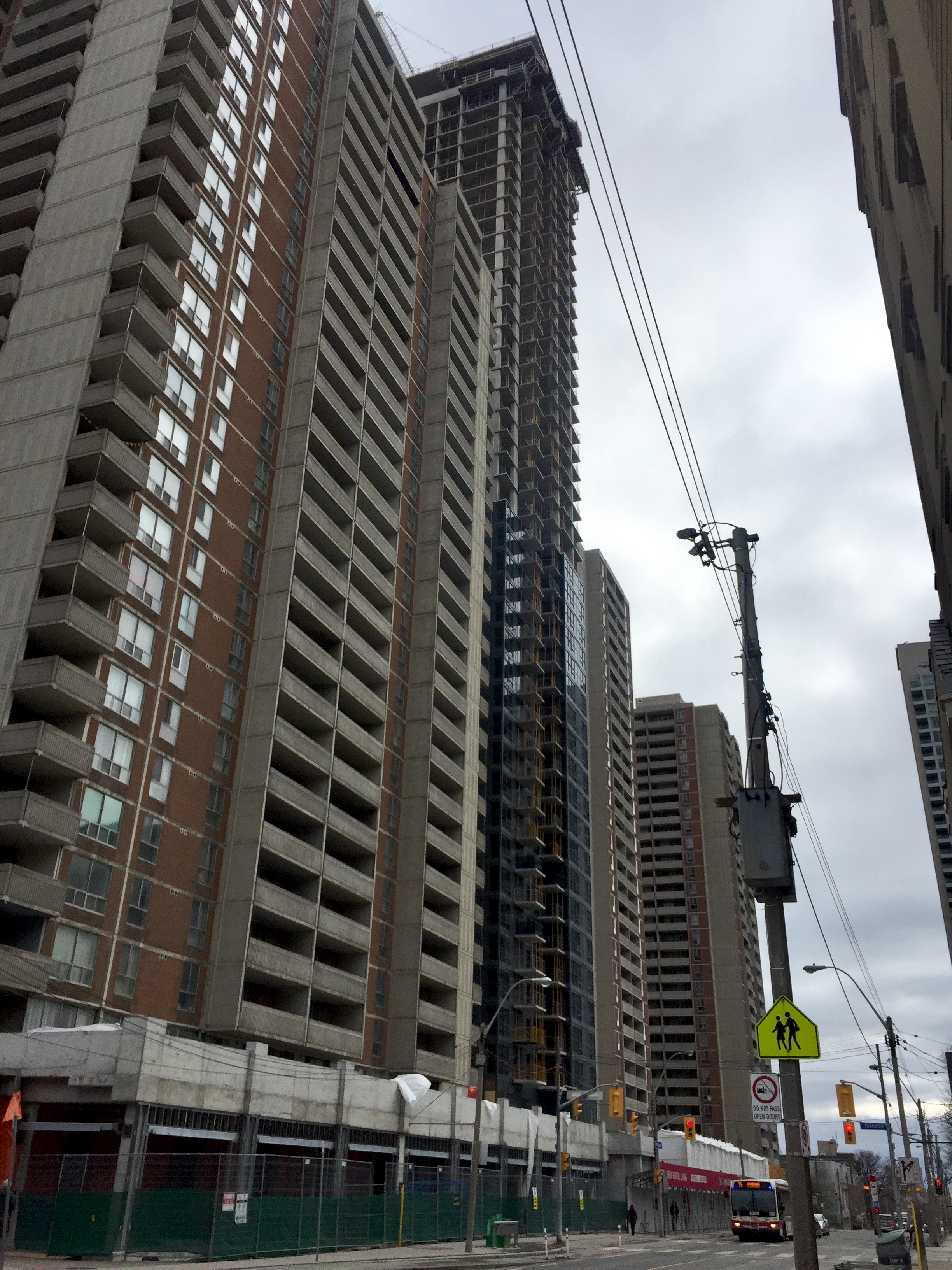
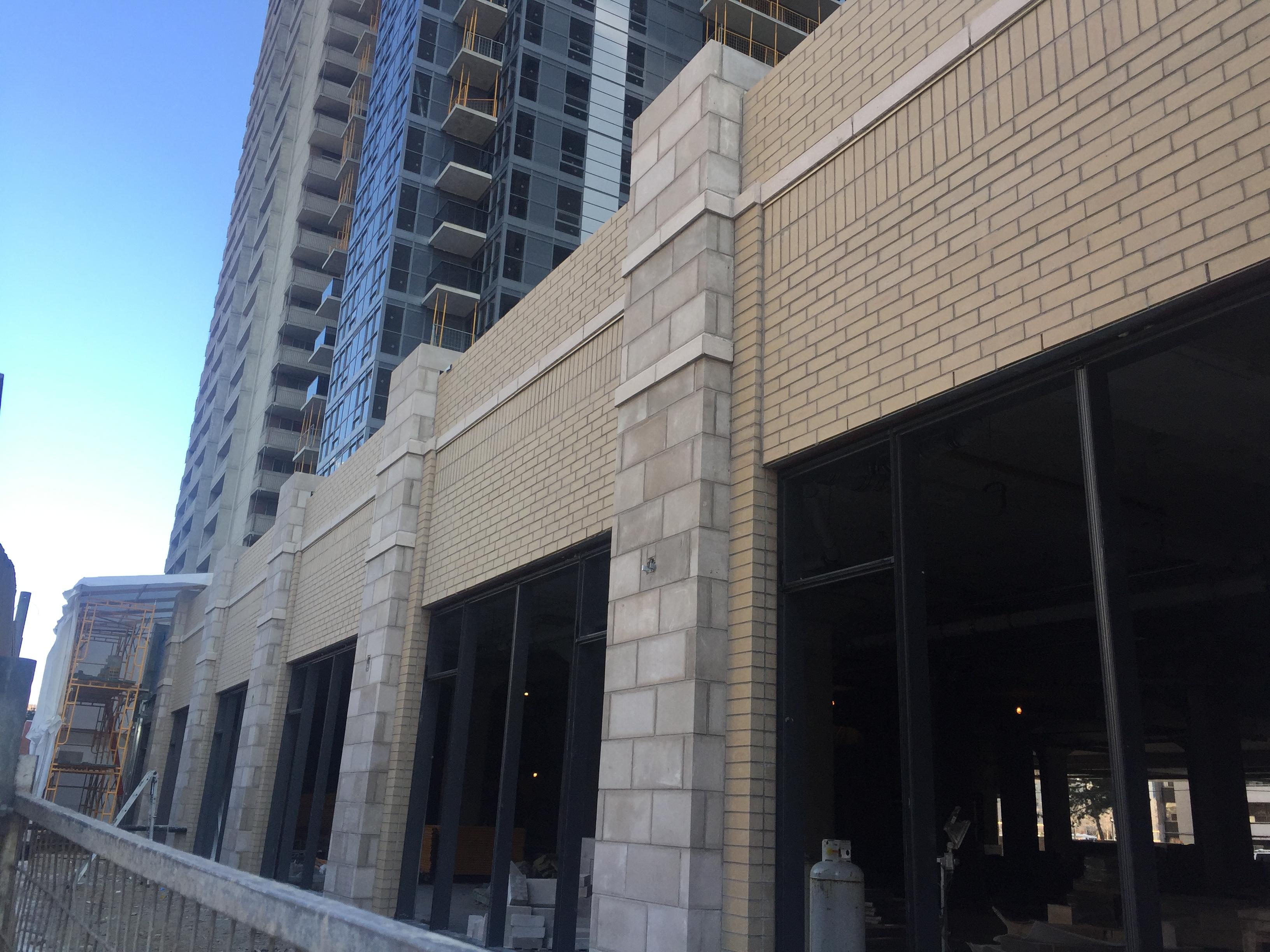
There has been a lot of work on the retail space in the podium recently. I guess freshco wants in sooner than later.
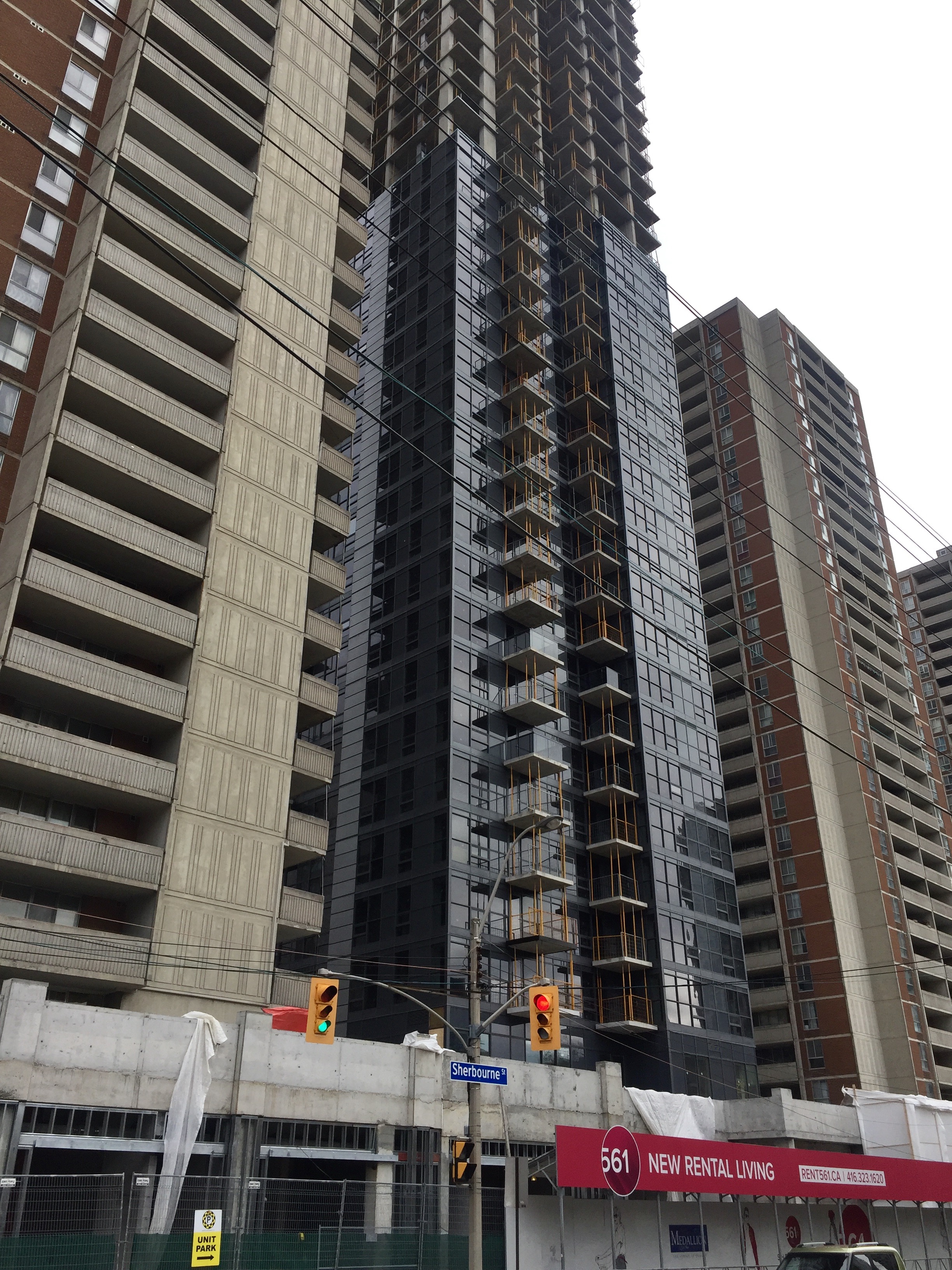
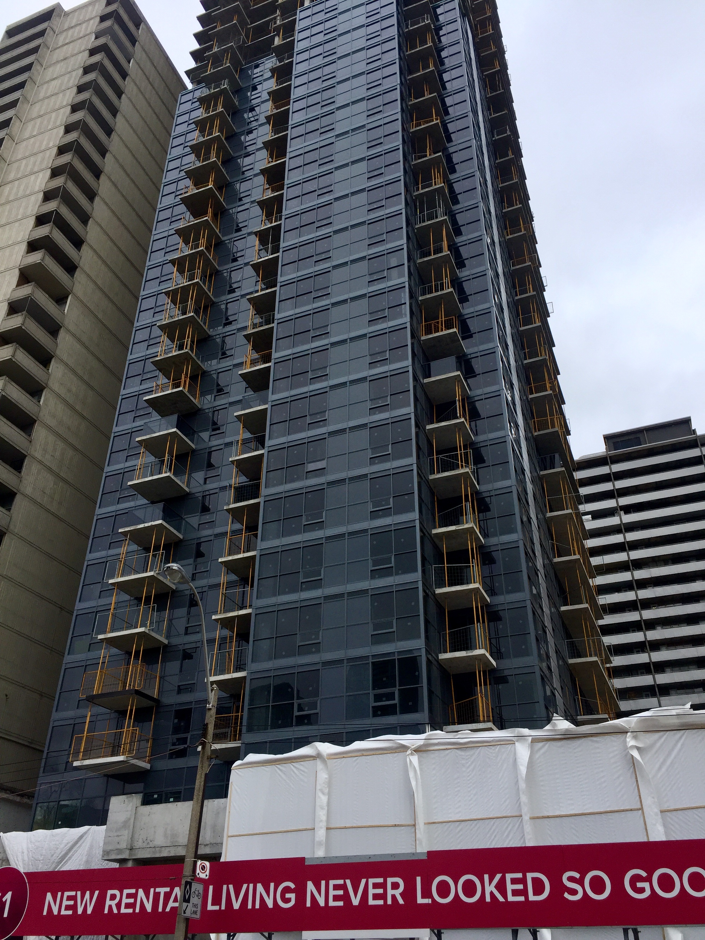
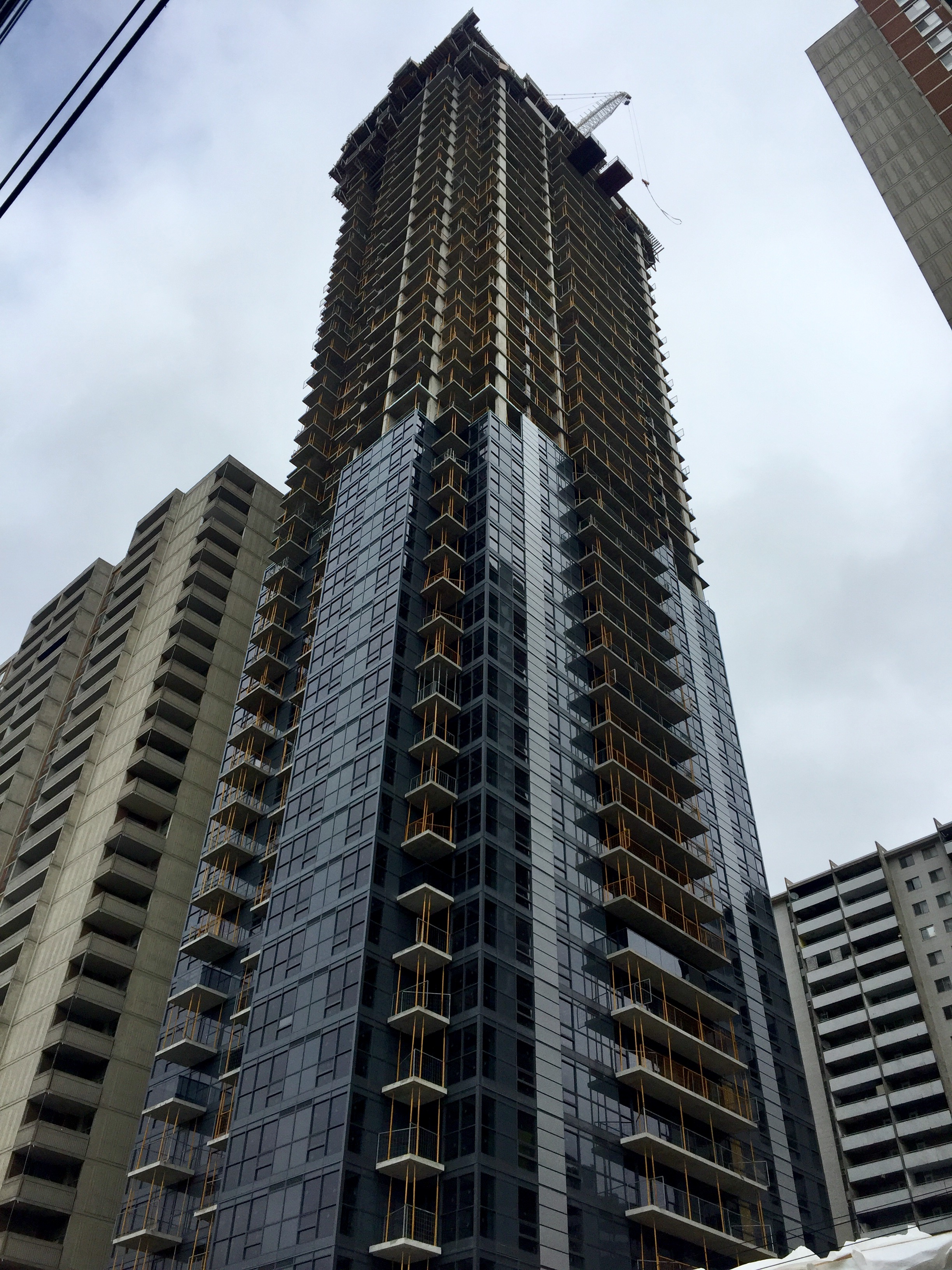
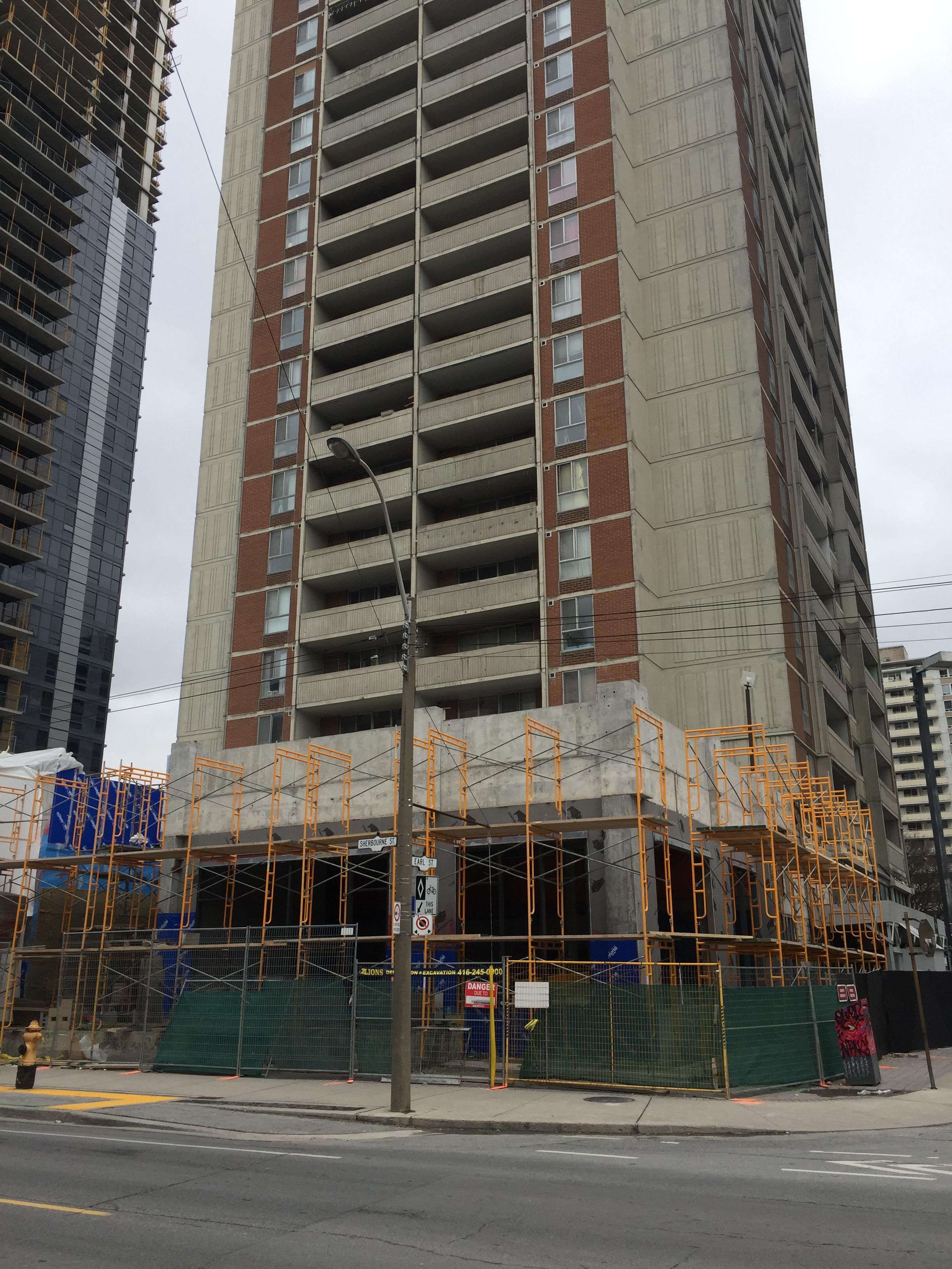
Solaris
Senior Member
hmm... this might even be darker than (what was) NOIR condos 
steveve
Senior Member
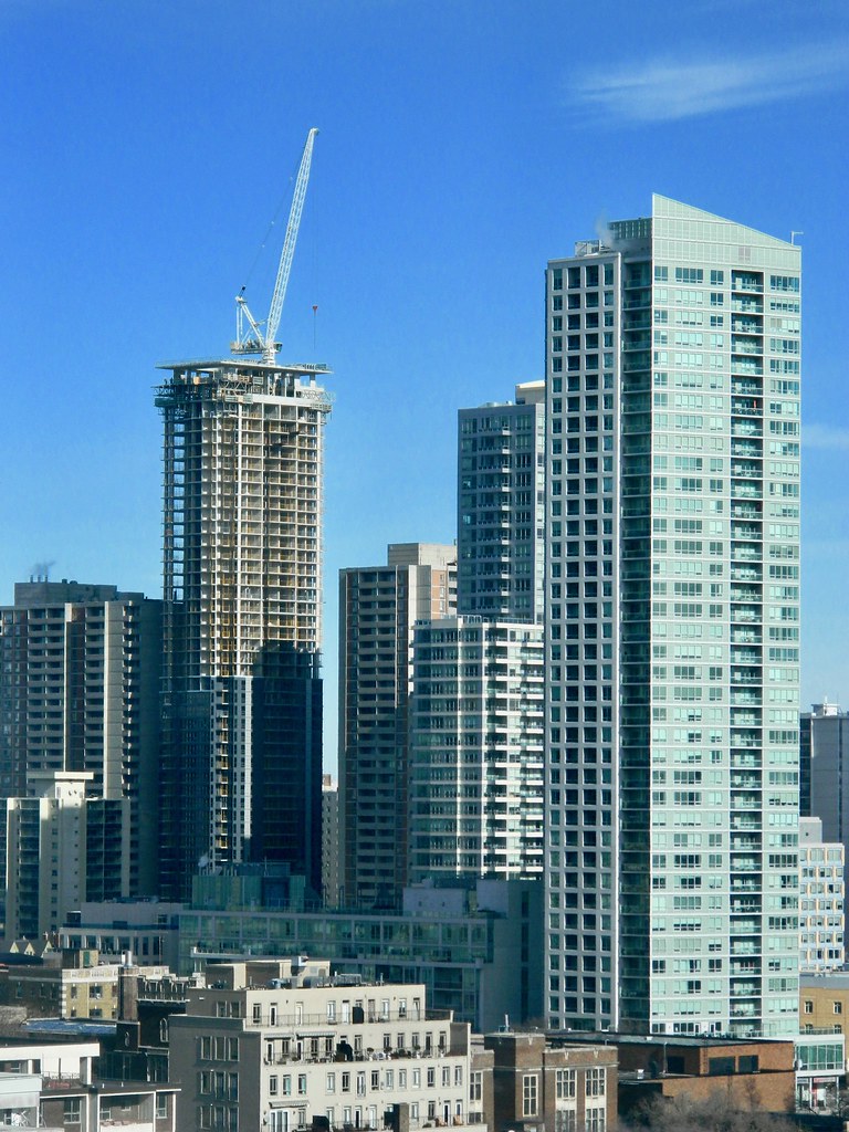
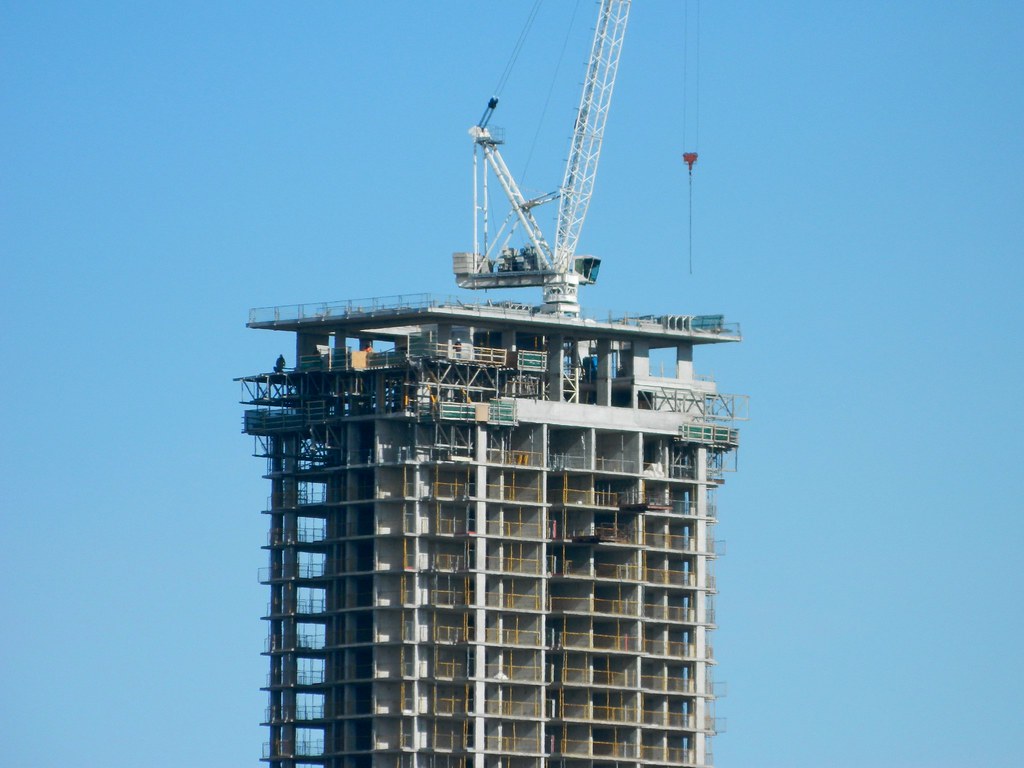
The roofline looks like it protrudes a bit, similar (but not quite as elaborate) as the original Casa hat.


Momin
Senior Member
111
Active Member
Miscreant
Senior Member
Member Bio
- Joined
- Oct 9, 2011
- Messages
- 3,616
- Reaction score
- 1,795
- Location
- Where it's urban. And dense.
This just strikes me as a bizarre development. I don't really know why they decided to stick something between both these apartments, and the apartments themselves now look especially bad.
LUVIT!
Senior Member
For the money
stjames2queenwest
Senior Member
Feb 16
maestro
Senior Member
This just strikes me as a bizarre development. I don't really know why they decided to stick something between both these apartments, and the apartments themselves now look especially bad.
It's always a sound idea to add more floor space when doing a major renovation of a property. It may not look it but, the existing towers have going through some expensive upgrades.
TheKingEast
Senior Member
I actually do like the base but I'm not sure if the yellow brick really works. It works with the area I guess, but such a stark contrast with the tower. The tower is terrible IMO. Would have been fine with a blue/green glass over the black. Makes the connecting rental towers look dreary and completely out of place.
modernizt
Senior Member
Woah - how did a strip plaza from Vaughan end up at the bottom of this tower?
innsertnamehere
Superstar
looks like LCBO architecture.
TheKingEast
Senior Member
LOL it does look like LCBO


