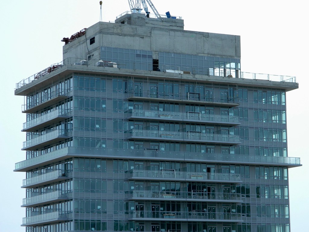
Toronto 365 Church Condos | 102.1m | 31s | Menkes | Wallman Architects

Why that shade of grey? Why the same ugly grey coloured mullions? This could have been way less offensive. I have come to terms with it now though.
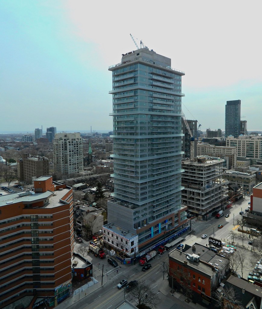
 
I agree! The smallest changes, like colour or even frosted white glass on the balconies, could have made a huge difference here. I have not come to terms with this building, it pains me to just walk past it!
 
I appreciate that they're keeping the rebuilt building at the corner of Granby and Church as shitty as it was in the beginning. Right down to the fine details of the low quality windows.
 
Why that shade of grey? Why the same ugly grey coloured mullions? This could have been way less offensive. I have come to terms with it now though.

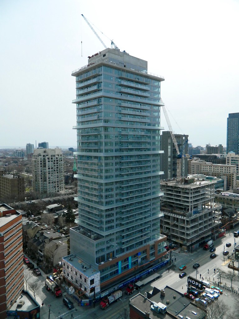
Experimentation with new colours and materials? That happens once or a twice a decade. LOL The last time was probably the shift from green to grey.
 
IMG_4348.JPG
IMG_4349.JPG
IMG_4350.JPG
 

Attachments

  • IMG_4348.JPG
    IMG_4348.JPG
    284.4 KB · Views: 557
  • IMG_4350.JPG
    IMG_4350.JPG
    332.4 KB · Views: 615
  • IMG_4349.JPG
    IMG_4349.JPG
    376.1 KB · Views: 525
The 'backward' balcony glass on the lower level of the podium looks odd. Surely it could have been installed to match the balconies above. Is it perhaps unfinished?
 

Back
Top