Bogtrotter
Senior Member
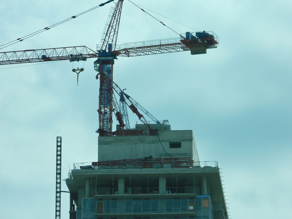
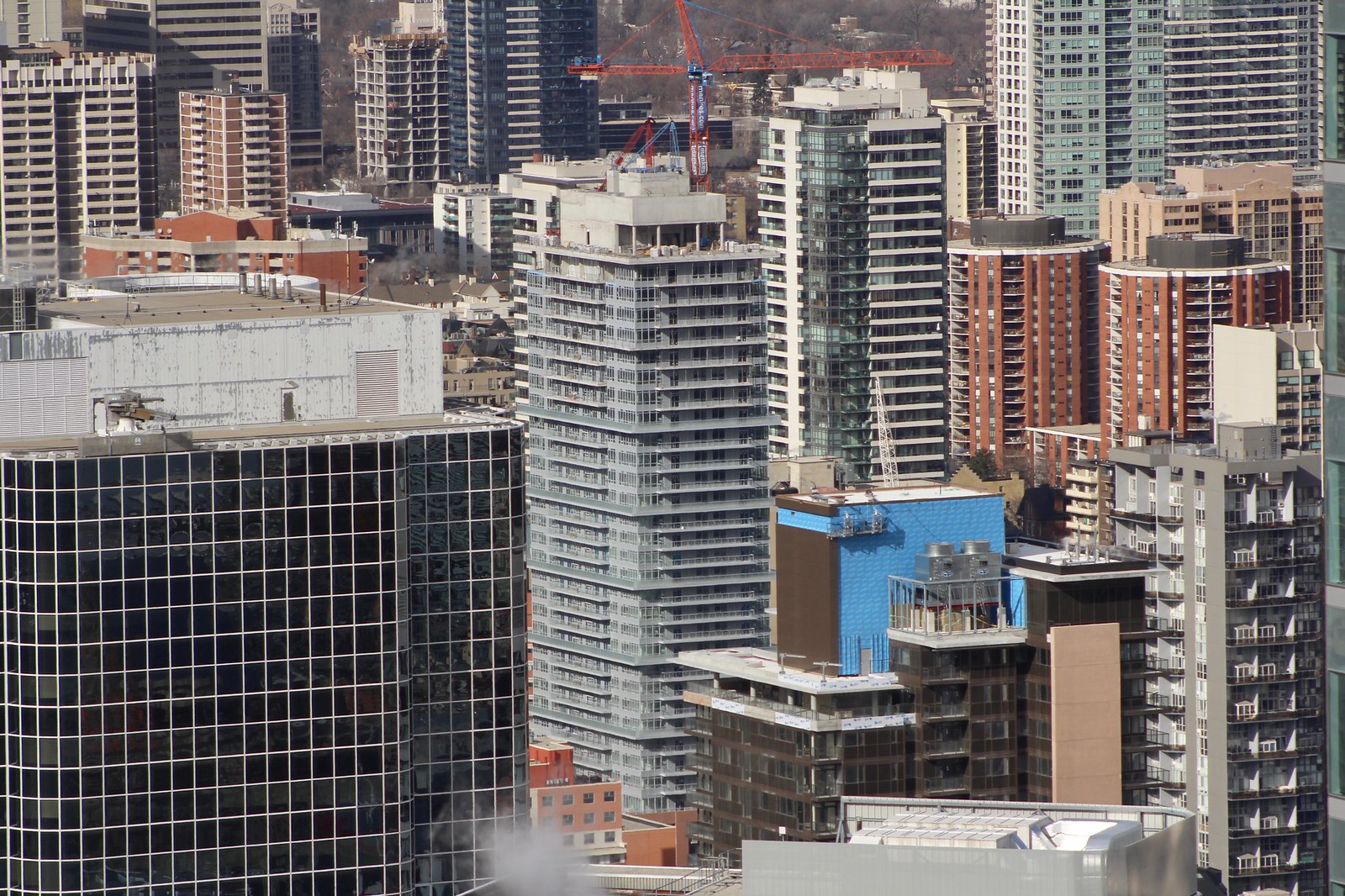
Is that pic Toronto or Volgograd- it makes 300 Front look classy from that angle. Perhaps with the addition of balcony glass it will improve.


I think this might be a candidate for the worst materials award.

Are you referring to just 365 Church or the picture content? given that Velocity at the Square is also in the image.This is so bad.

Are you referring to just 365 Church or the picture content? given that Velocity at the Square is also in the image.
365. Though Veloshitty is no better.
I agree, but at least it "Veloshitty" has some colour!
Yes, lots of brown.
That doesn't even look blue/green. It looks like a dull, ugly grey to me!