Toronto 1Thousand Bay | 104.85m | 32s | Cresford | a—A

27189261050_f7d38c7595_h.jpg


27431422886_0cbde3acc2_h.jpg


27189263680_6b50eecbc7_h.jpg
 
Last edited:
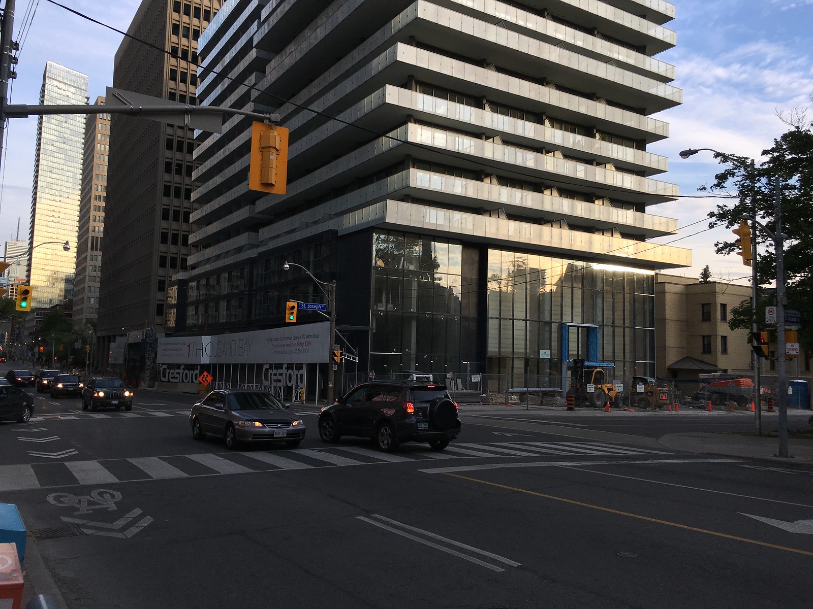
As seen in a couple other recent photos, hoarding is now completely down on the Bay side.

Screen Shot 2016-06-13 at 10.15.58 PM.png


Screen Shot 2016-06-13 at 10.15.51 PM.png


Screen Shot 2016-06-13 at 10.15.35 PM.png


Screen Shot 2016-06-13 at 10.15.43 PM.png


Screen Shot 2016-06-13 at 10.16.09 PM.png
 

Attachments

  • Screen Shot 2016-06-13 at 10.16.09 PM.png
    Screen Shot 2016-06-13 at 10.16.09 PM.png
    1.2 MB · Views: 730
  • Screen Shot 2016-06-13 at 10.15.58 PM.png
    Screen Shot 2016-06-13 at 10.15.58 PM.png
    846.8 KB · Views: 744
  • Screen Shot 2016-06-13 at 10.15.51 PM.png
    Screen Shot 2016-06-13 at 10.15.51 PM.png
    718.8 KB · Views: 700
  • Screen Shot 2016-06-13 at 10.15.43 PM.png
    Screen Shot 2016-06-13 at 10.15.43 PM.png
    678.7 KB · Views: 712
  • Screen Shot 2016-06-13 at 10.15.35 PM.png
    Screen Shot 2016-06-13 at 10.15.35 PM.png
    799.2 KB · Views: 733
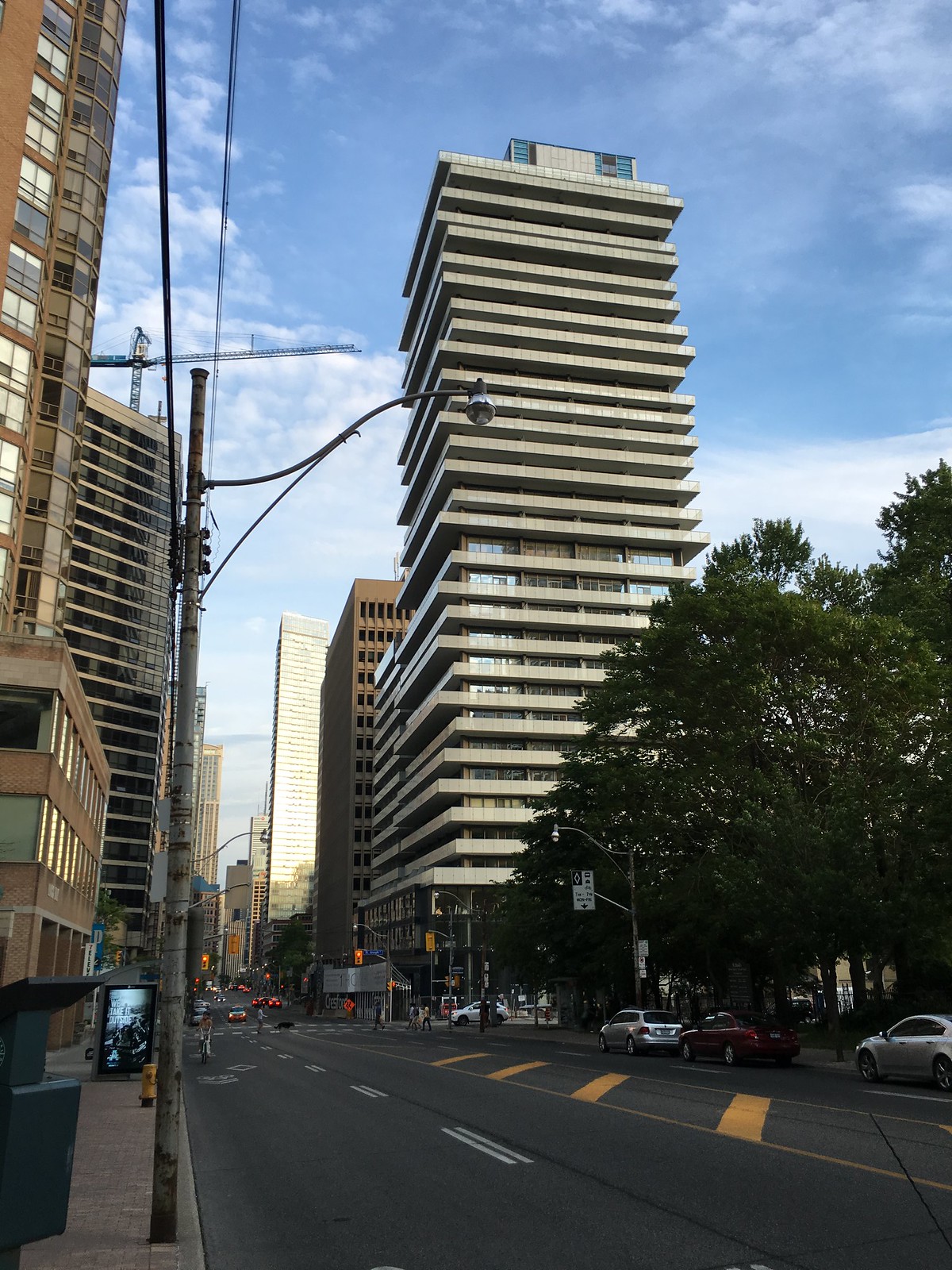
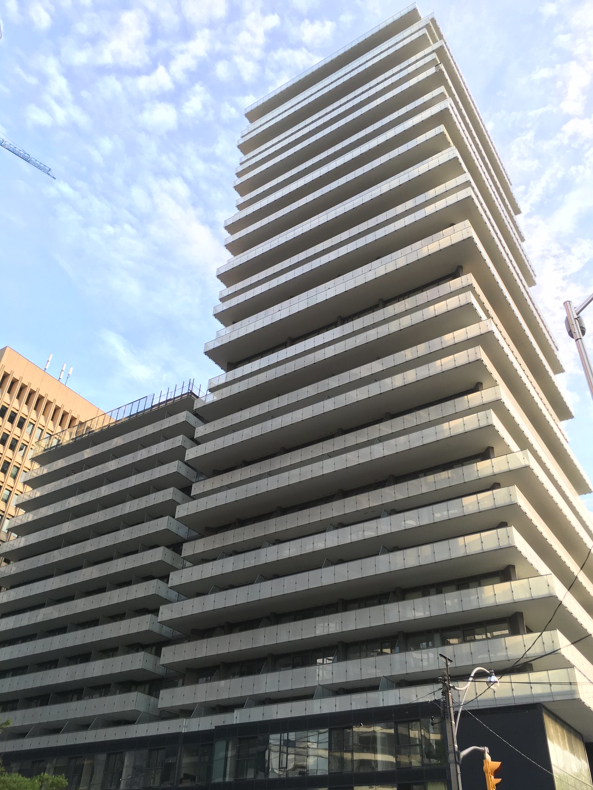
From this morning.
IMG_7492.jpg
IMG_7493.jpg
IMG_7494.jpg
IMG_7495.jpg
IMG_7497.jpg
 

Attachments

  • IMG_7492.jpg
    IMG_7492.jpg
    1.3 MB · Views: 1,371
  • IMG_7493.jpg
    IMG_7493.jpg
    1.4 MB · Views: 1,357
  • IMG_7494.jpg
    IMG_7494.jpg
    1.4 MB · Views: 1,382
  • IMG_7495.jpg
    IMG_7495.jpg
    1.3 MB · Views: 1,341
  • IMG_7497.jpg
    IMG_7497.jpg
    1.3 MB · Views: 1,343
While I understand the logistics of having vents on the mechanical units, why must they be so obvious? I find that it always ruins the overall look for me.
 
While I understand the logistics of having vents on the mechanical units, why must they be so obvious? I find that it always ruins the overall look for me.

That's a fair question, but the mechanical engineers demand a certain size of opening between vents for the volume of air that has to pass through them. Architects can try to choose something that blends in or that isn't easy to see through, but it's not always a choice when you're dealing with mechanical equipment that has stringent requirements to operate properly and safely.
 
Good points - one of my biggest pet peeves is when the mechanicals aren't better integrated into the overall building design. I would imagine that's often on the developers rather than the architects, though, as a better treatment would sometimes increase cost depending on the design.
 
I've have to say, unless they're truly egregious, mechanical elements have never bugged me. In fact, a small setback and a confident box have always appealed to me more than any muddled attempt to 'conceal' or 'hide' something that a building actually requires to function.

That said, I think it's more down to each individual project's treatment. For example, I quite like the the way some of the first Cityplace buildings (Matrix, N1, West One) featured only glass so as to expose the machines within. Wallman's similar capping of Minto30Roe has also saved that building for me. Look a bit south at The Madison however, and while the treatment is the same (extending the exterior wall up to 'cover' things), the opaque spandrel makes everything just seem heavy, lazily finished and like something is trying to be artificially concealed.
 

Back
Top